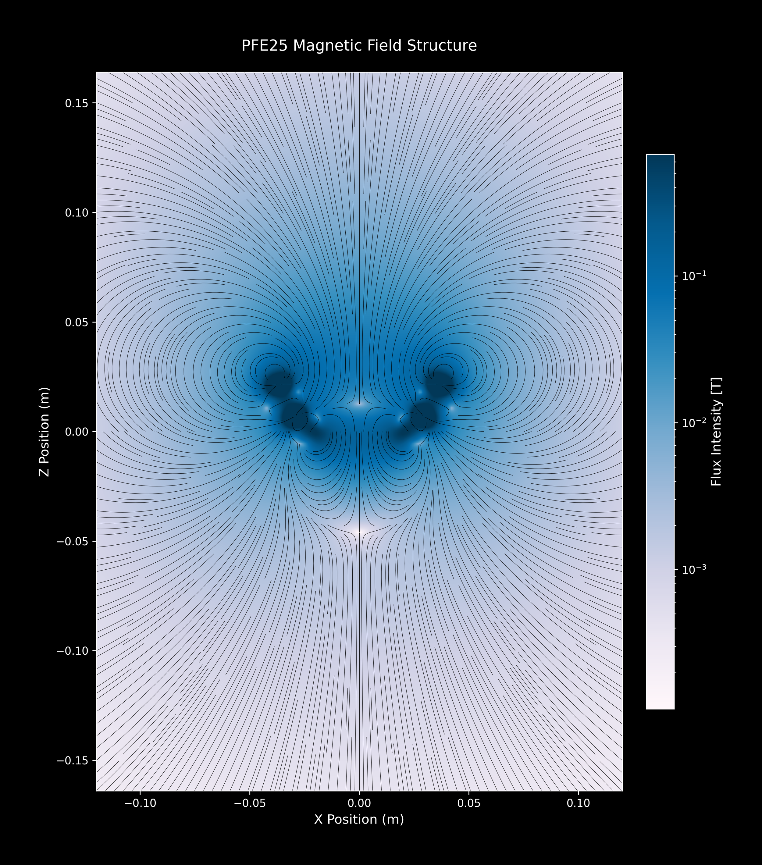
PFE25™ Magnetic Field Plots
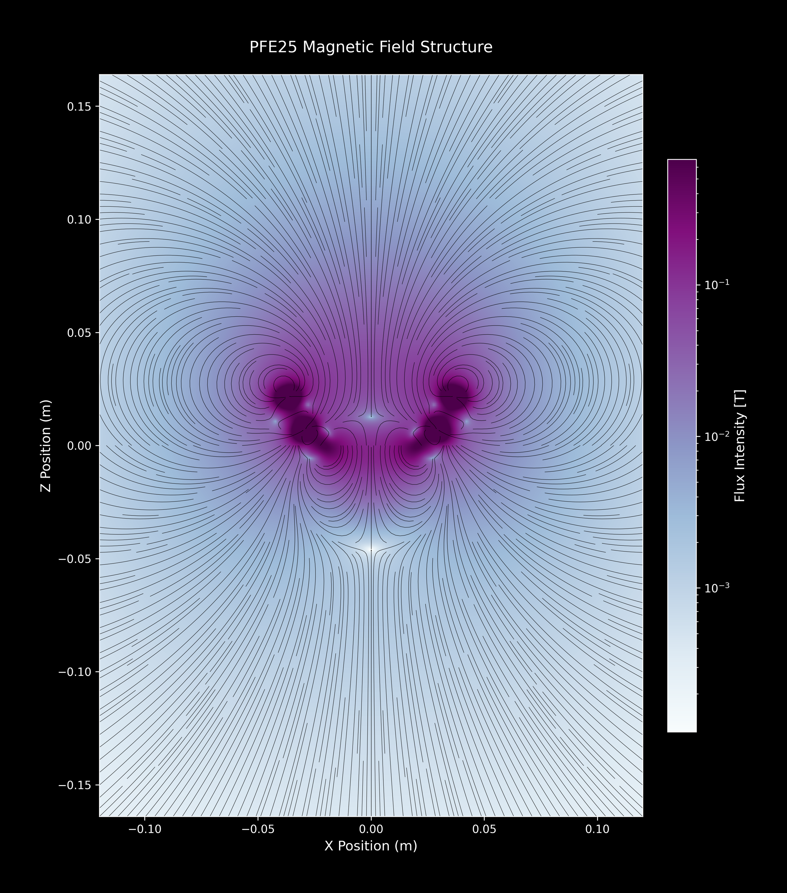
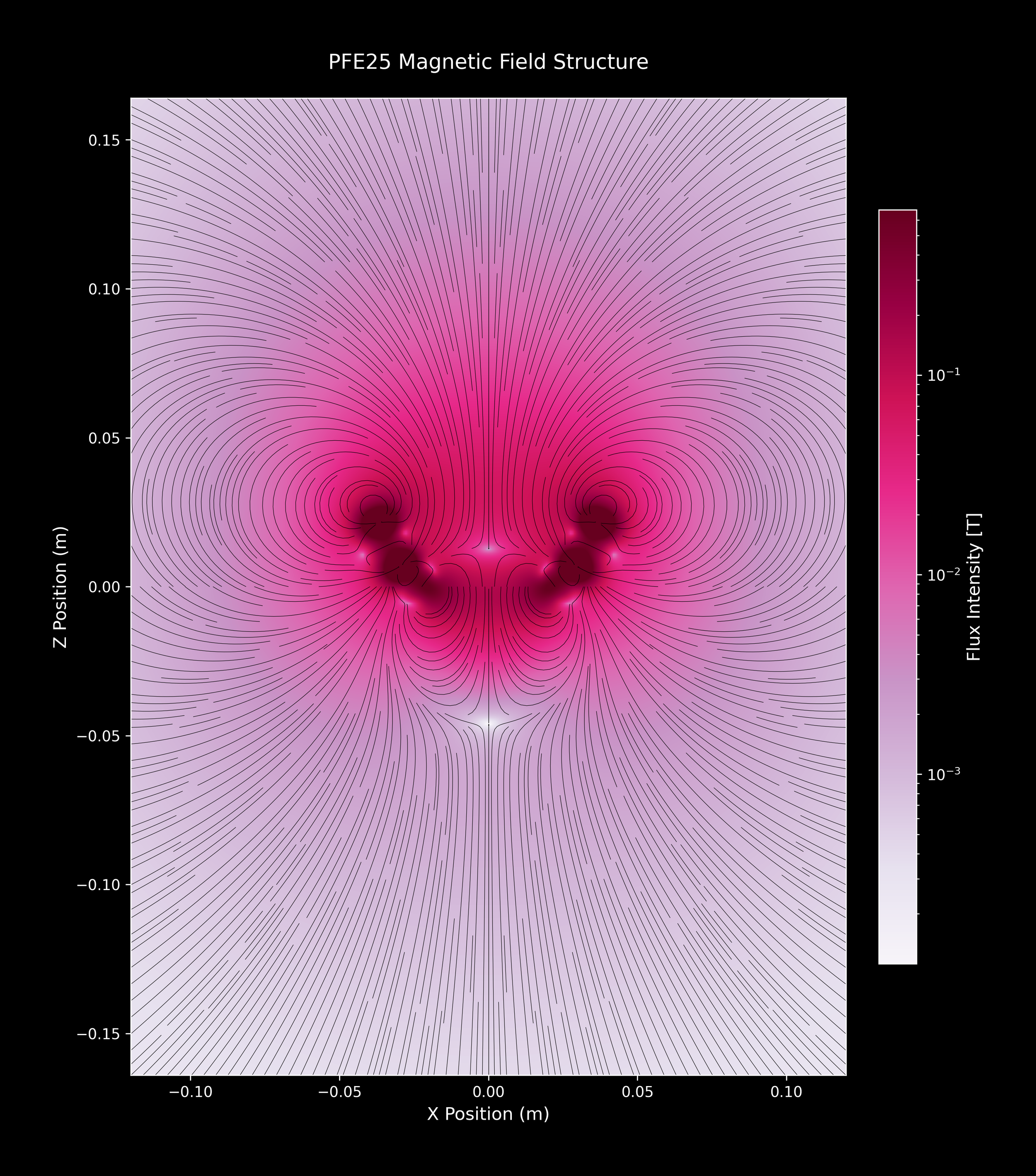
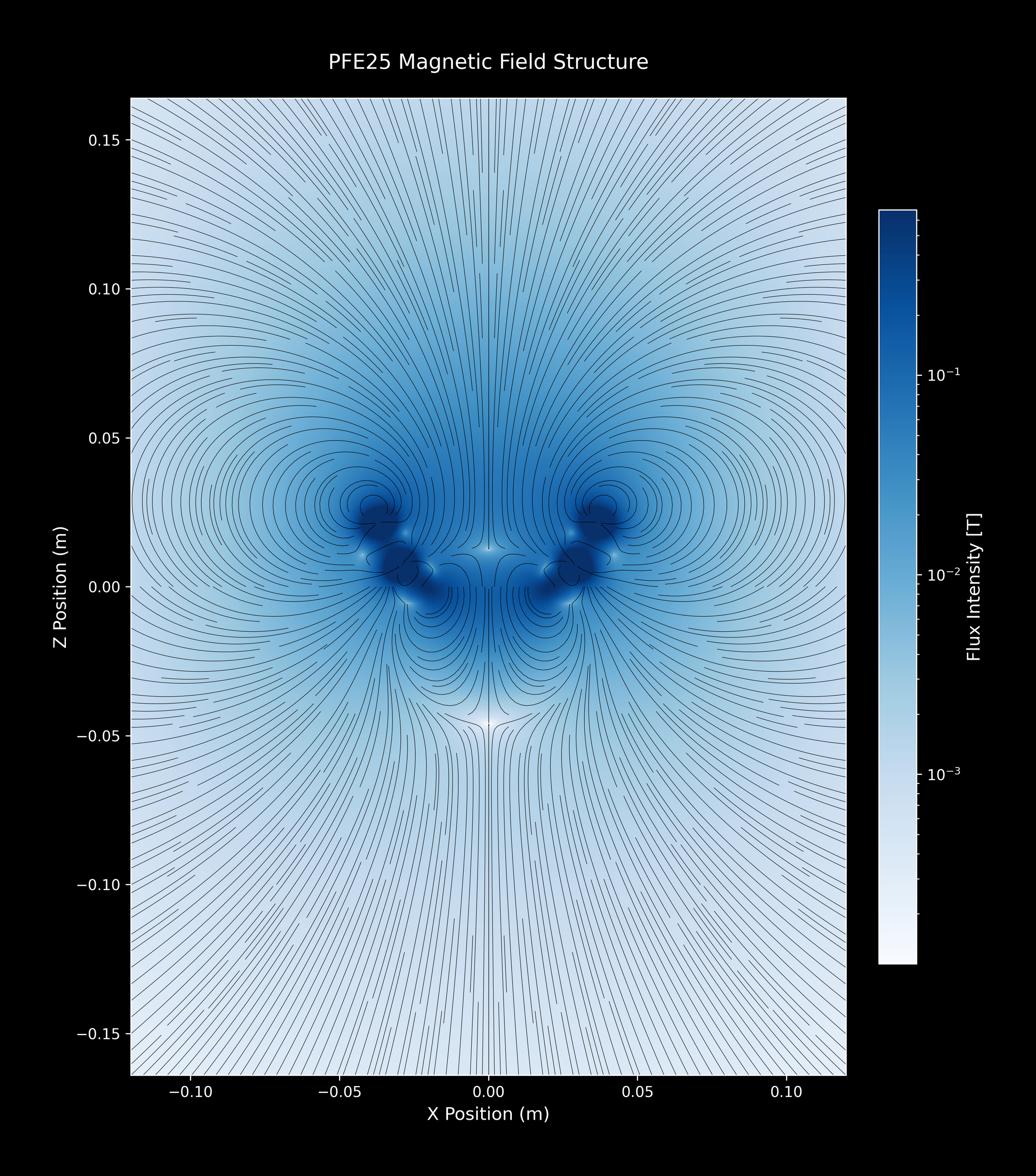
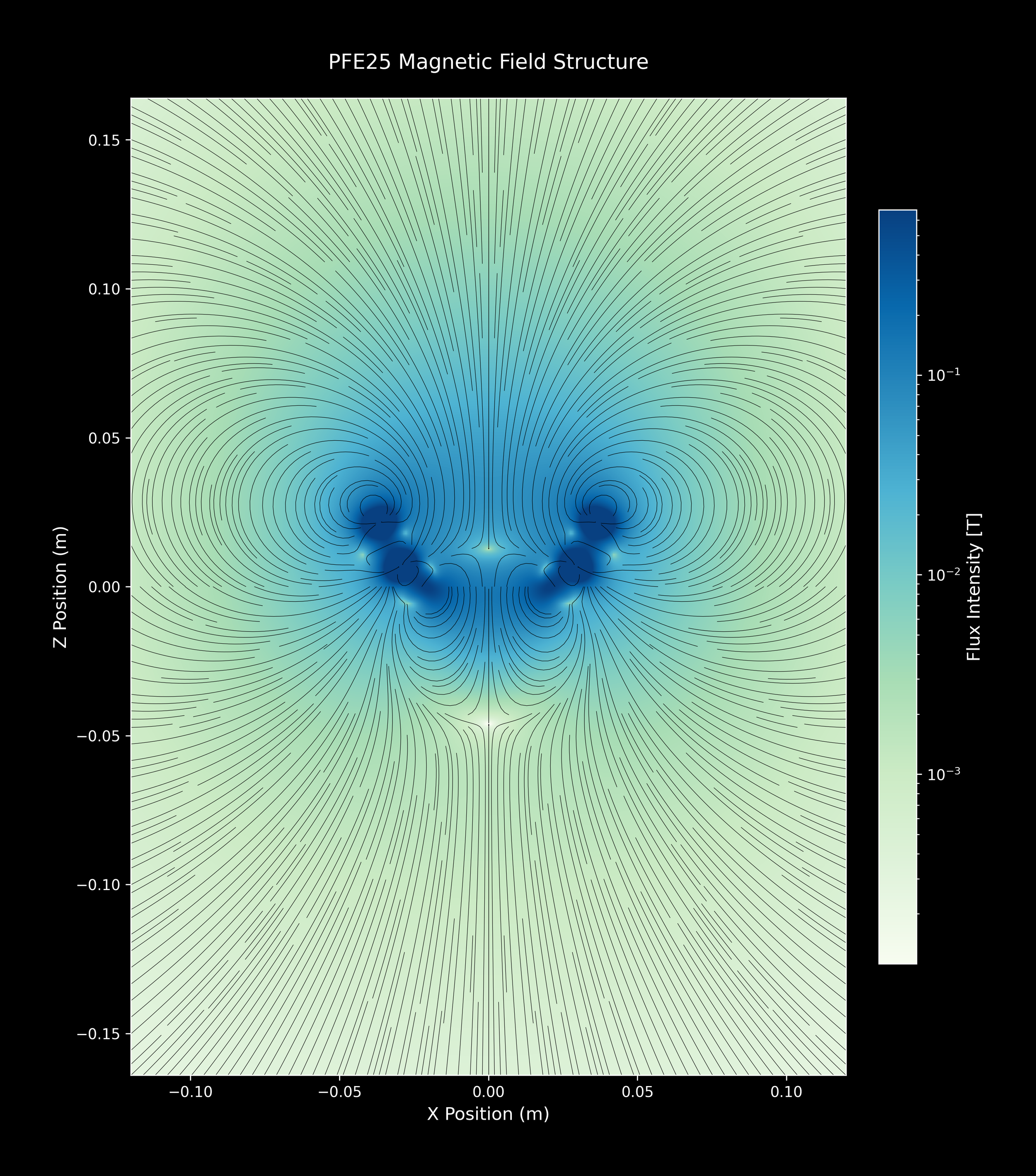
PFE25™Close-up plots:
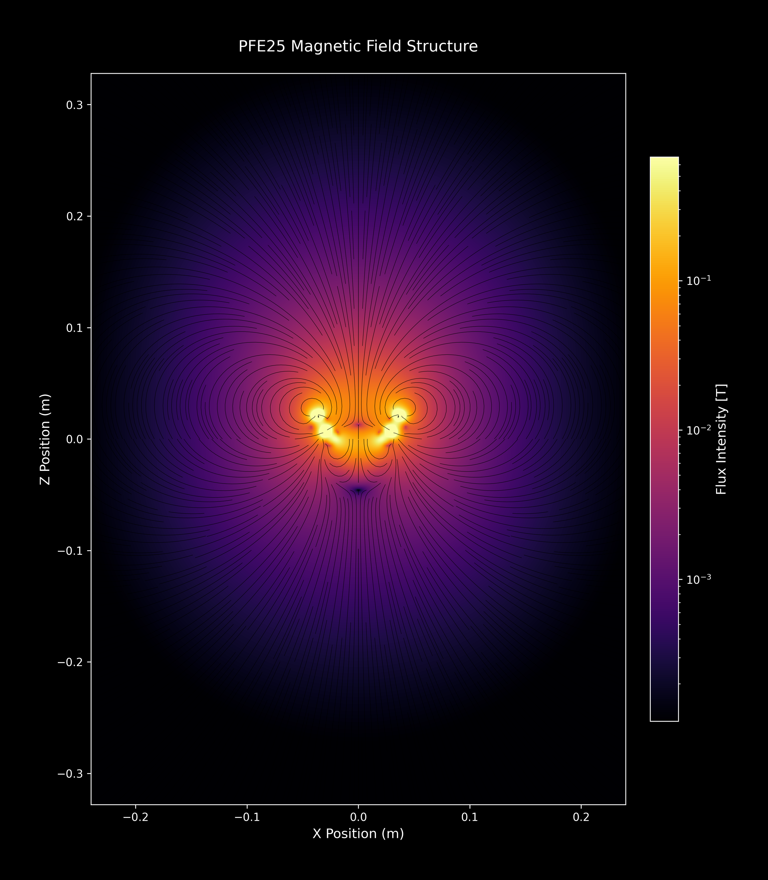
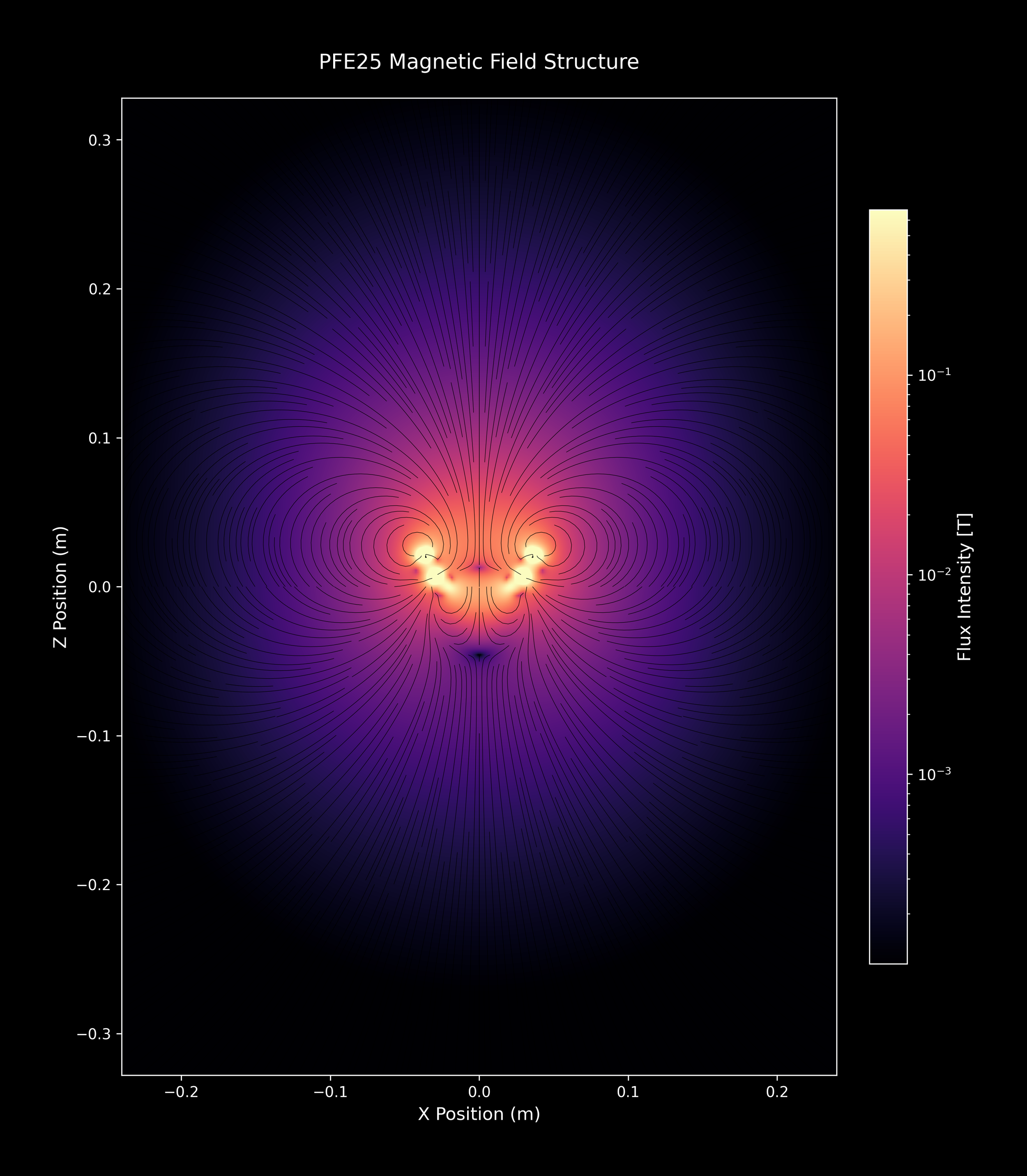
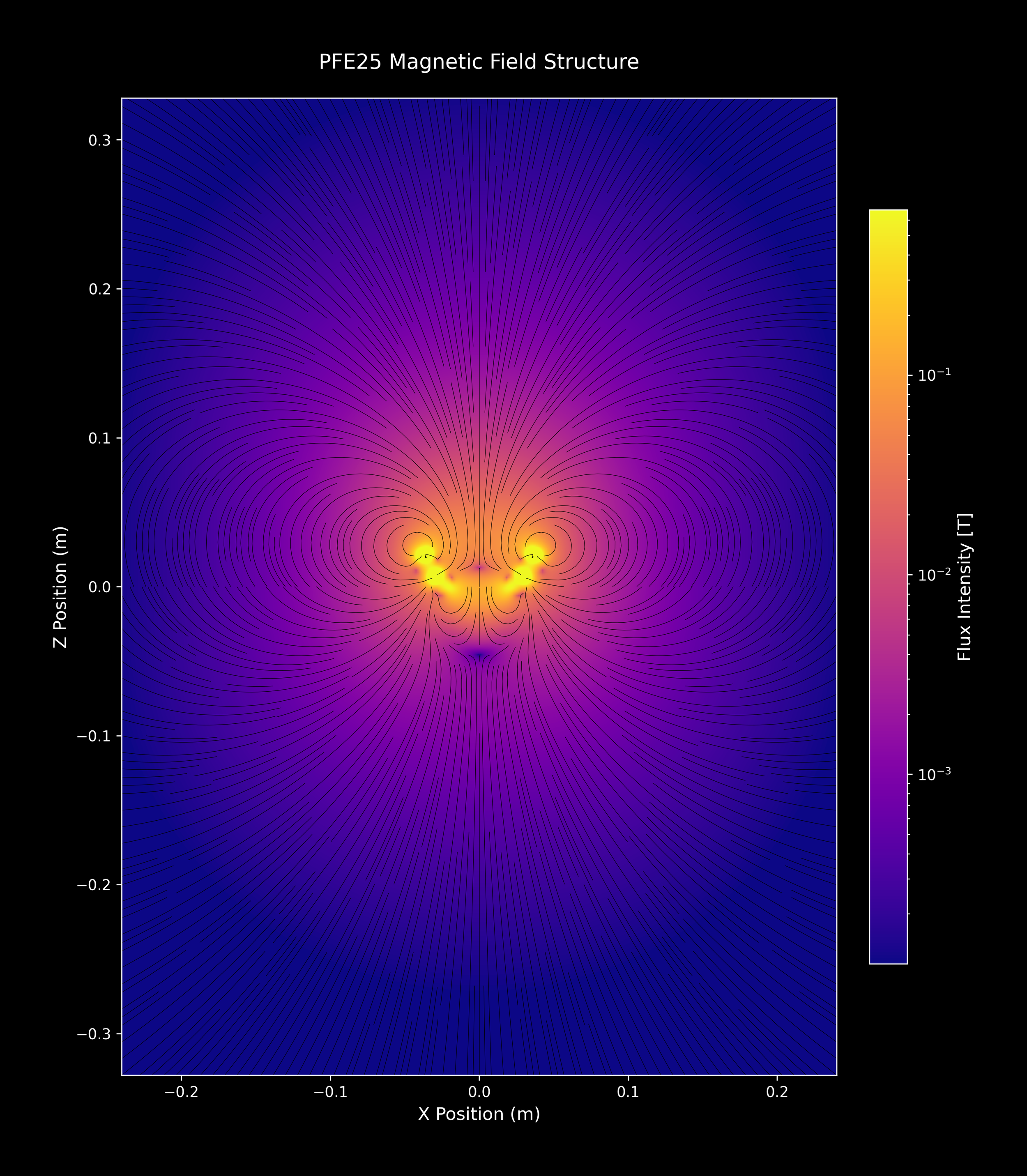
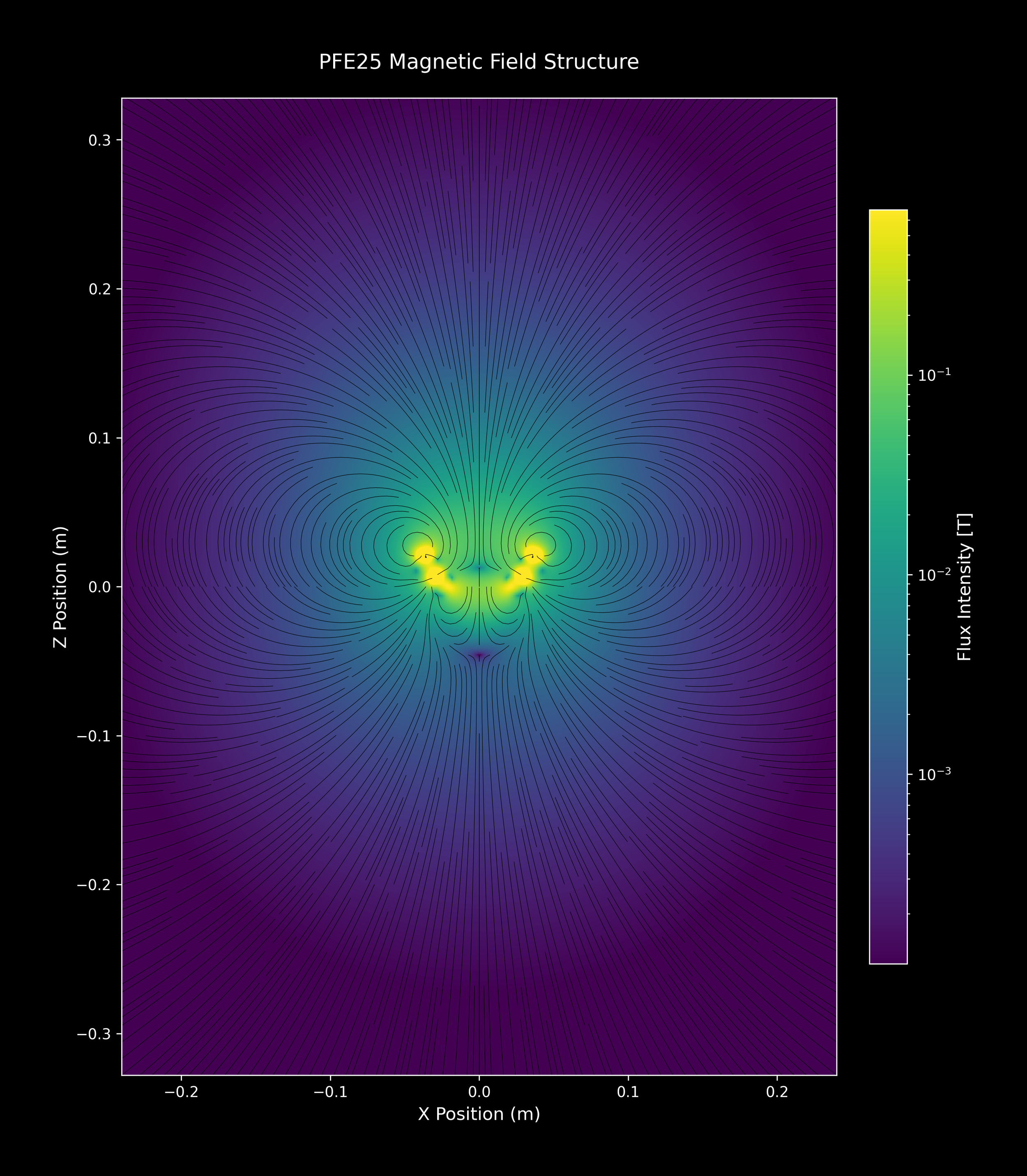
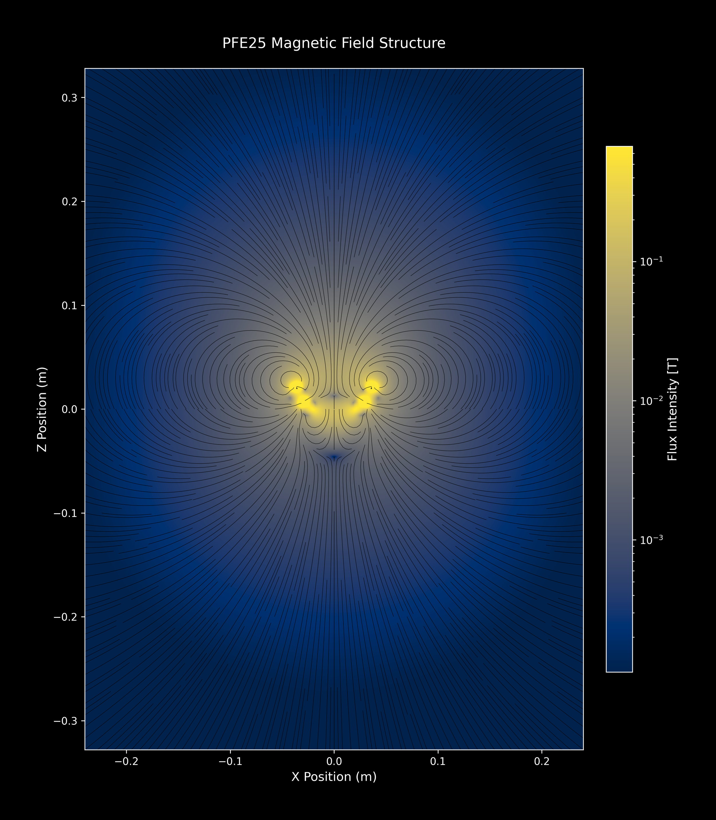
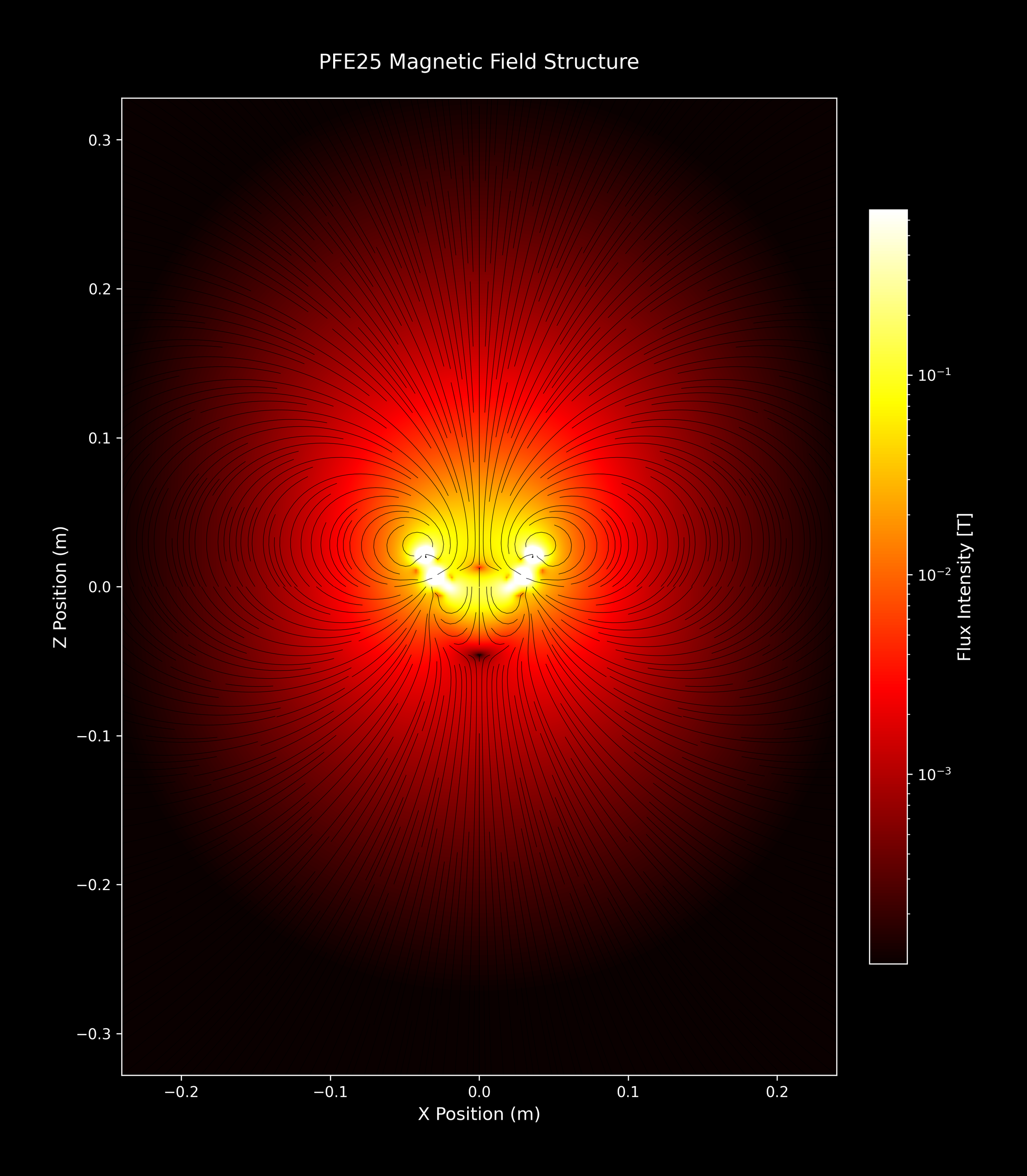
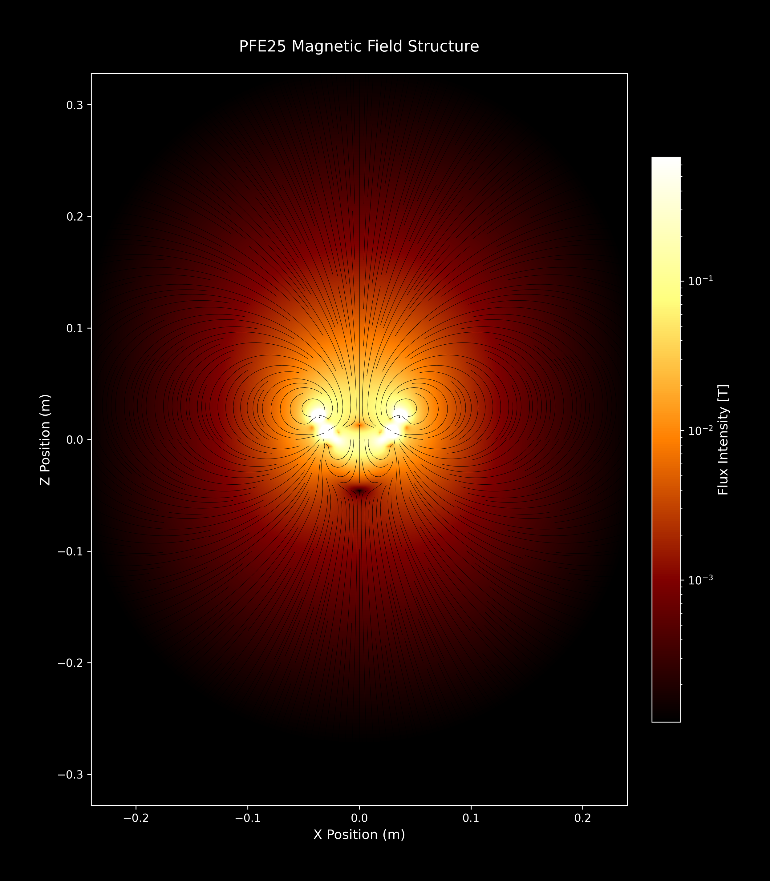
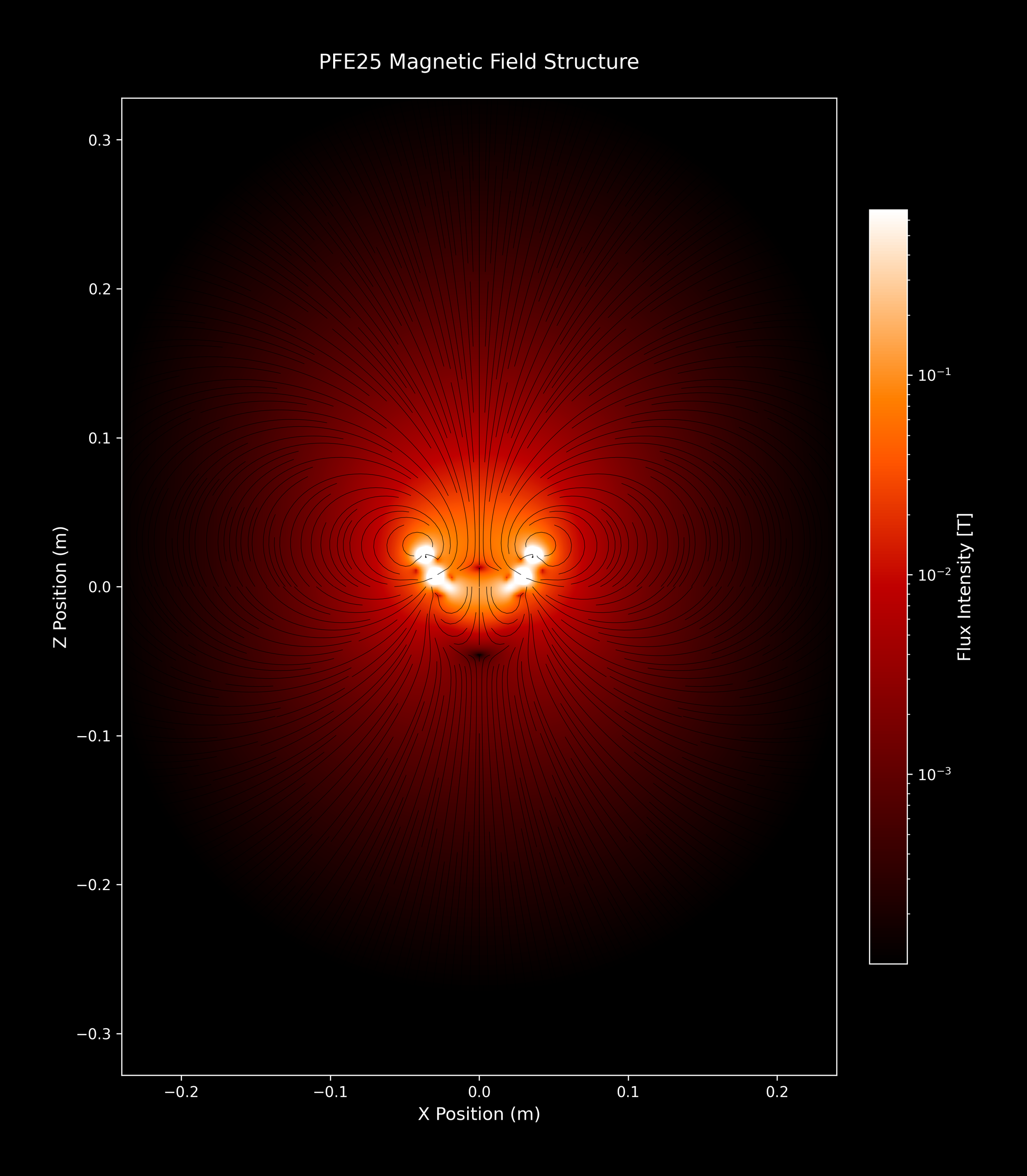
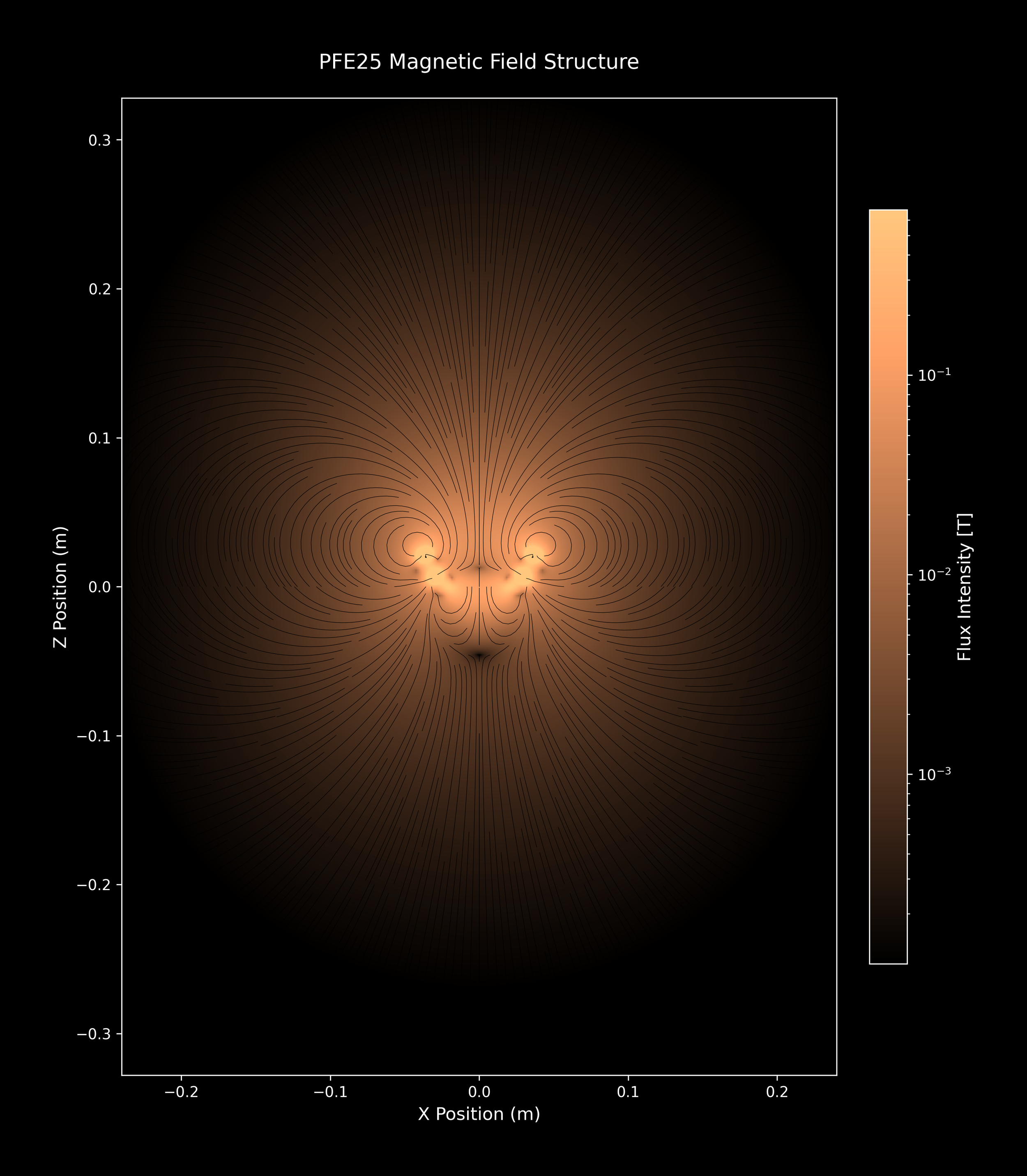
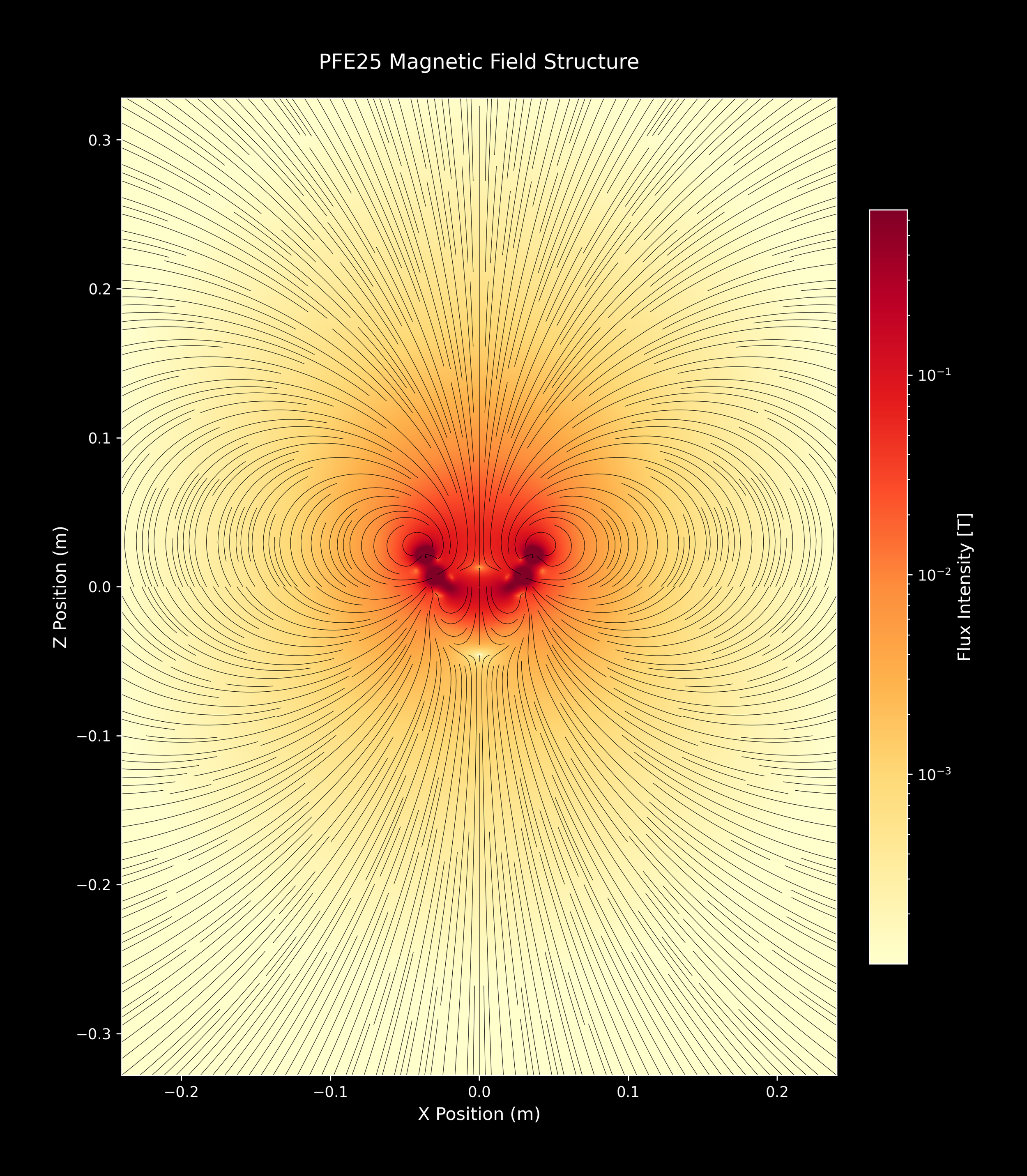
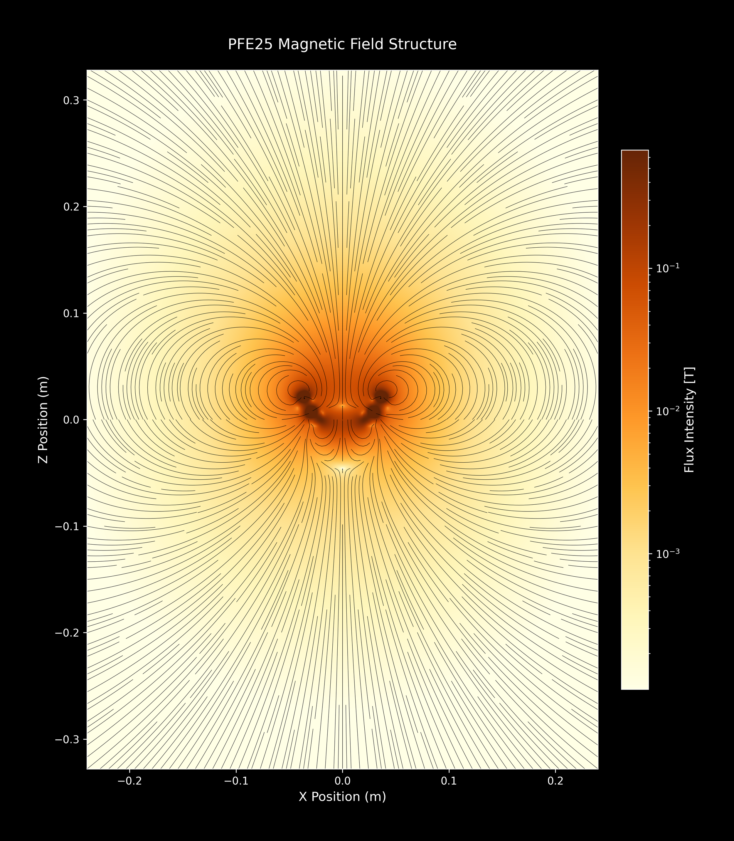
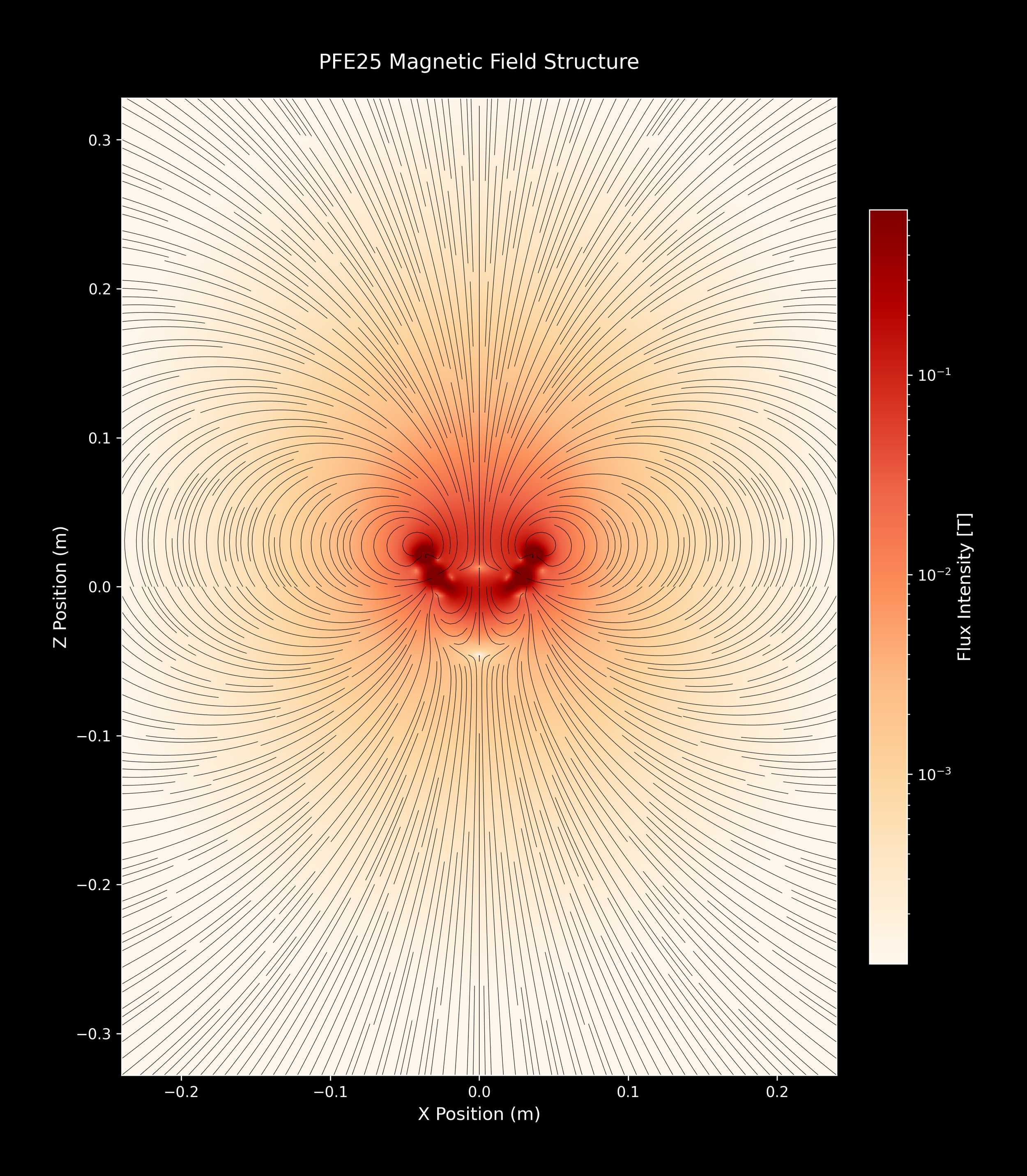
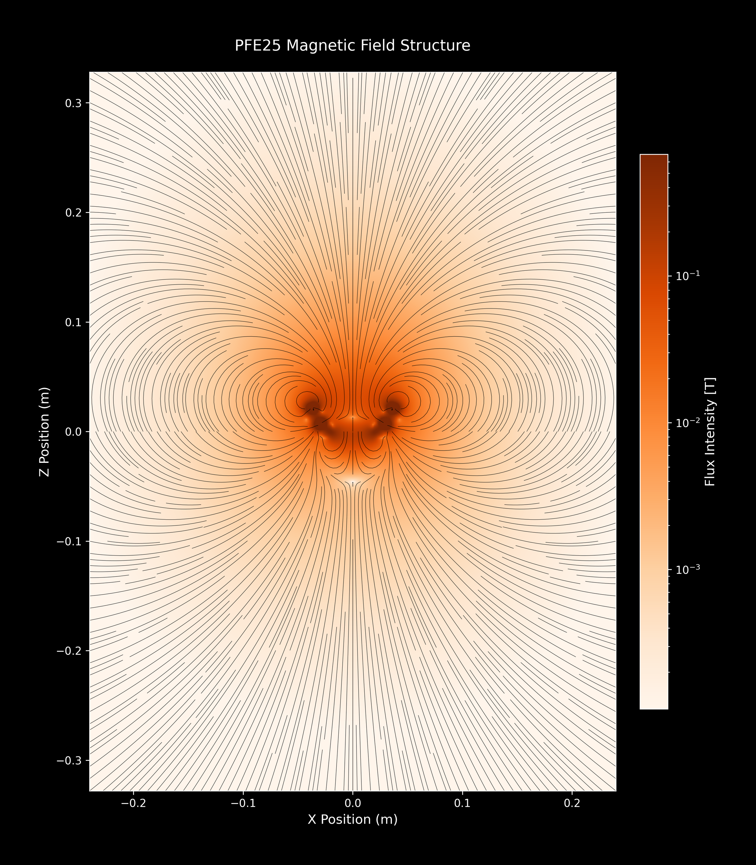
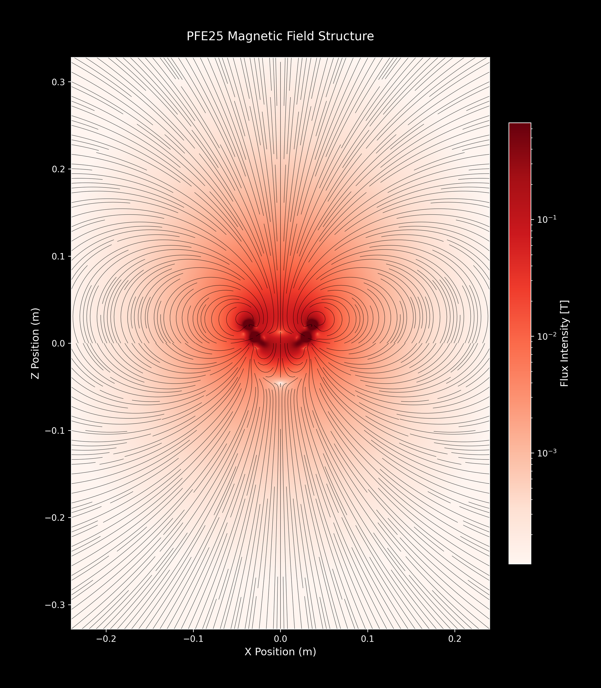
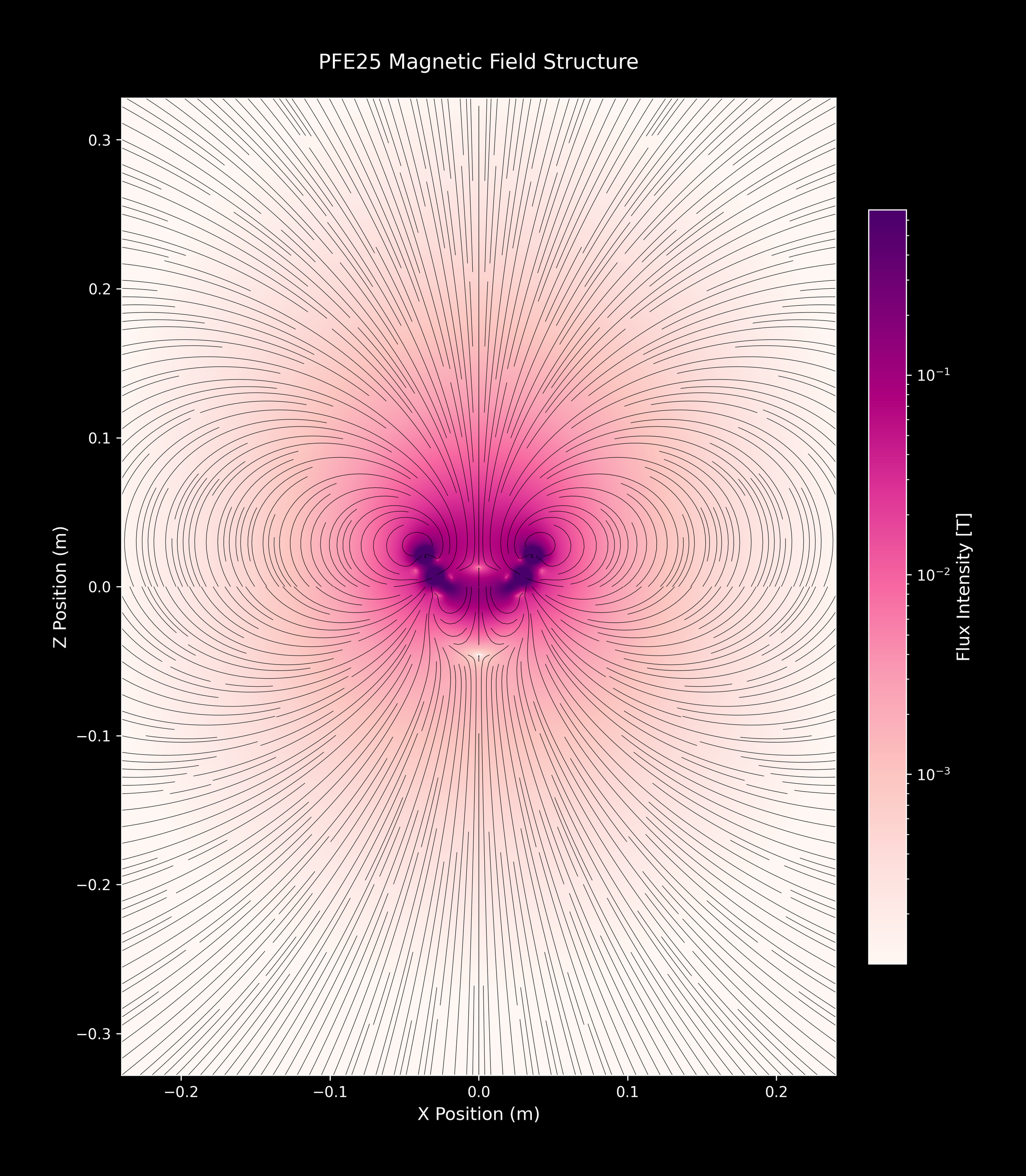
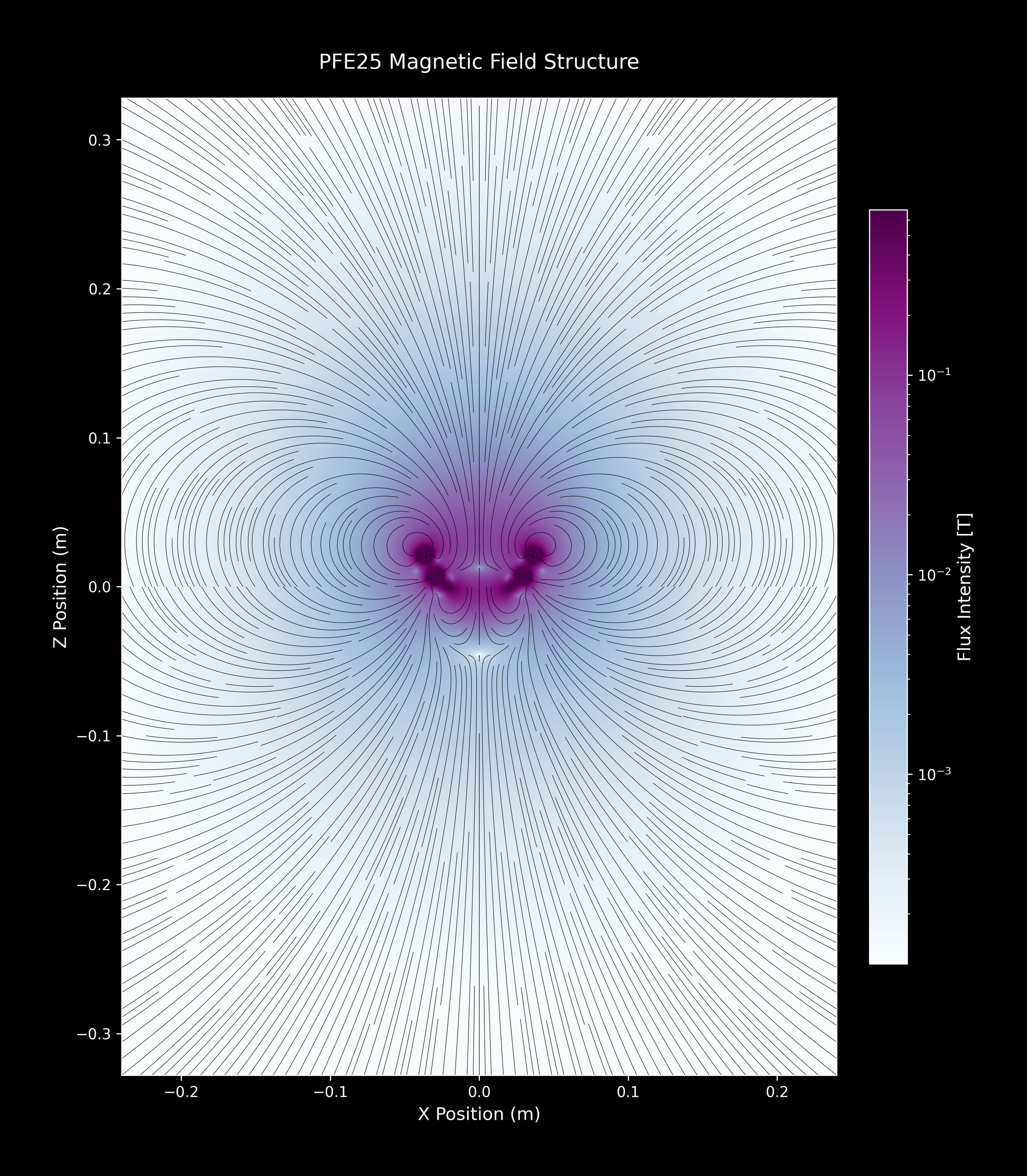
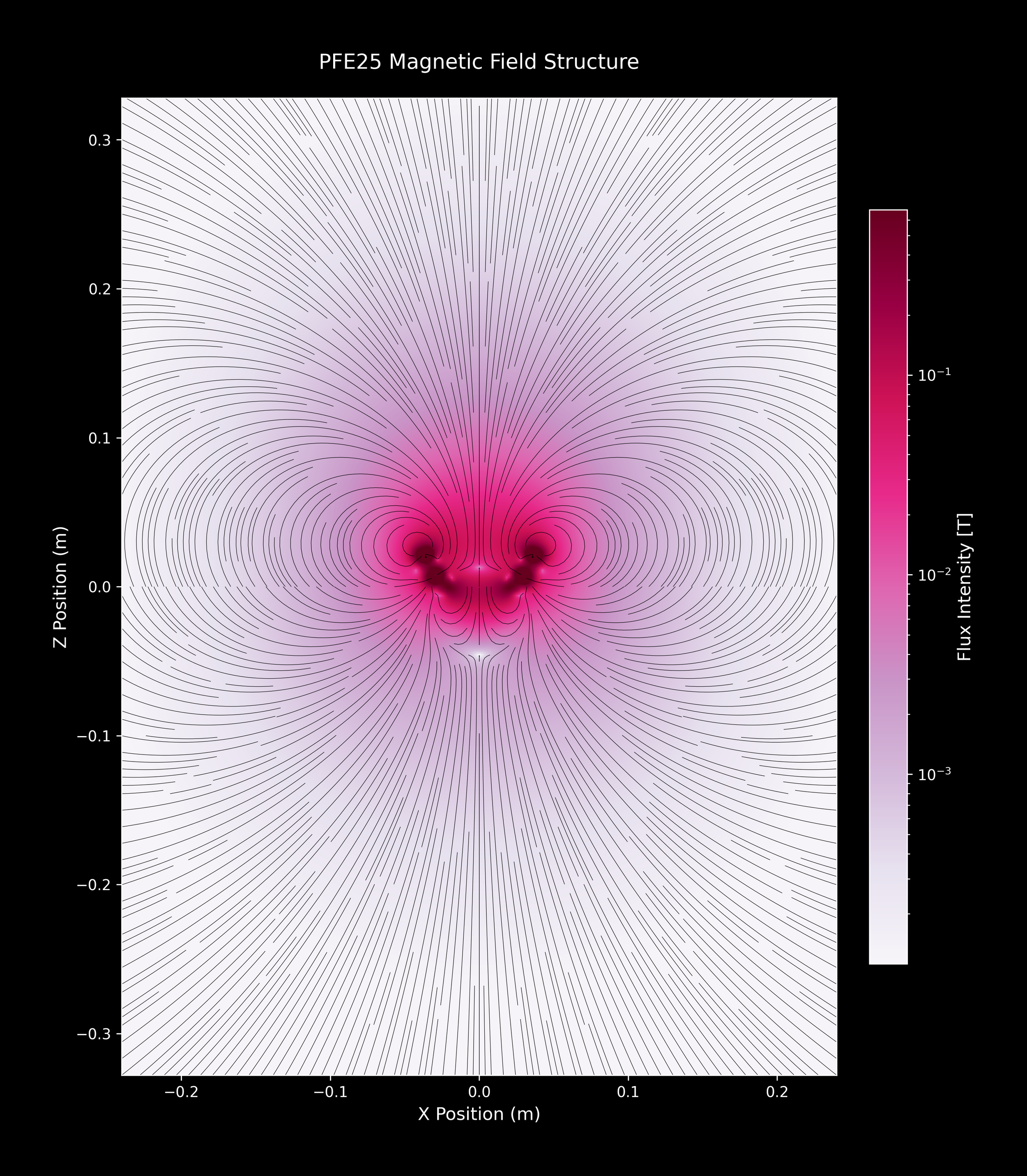
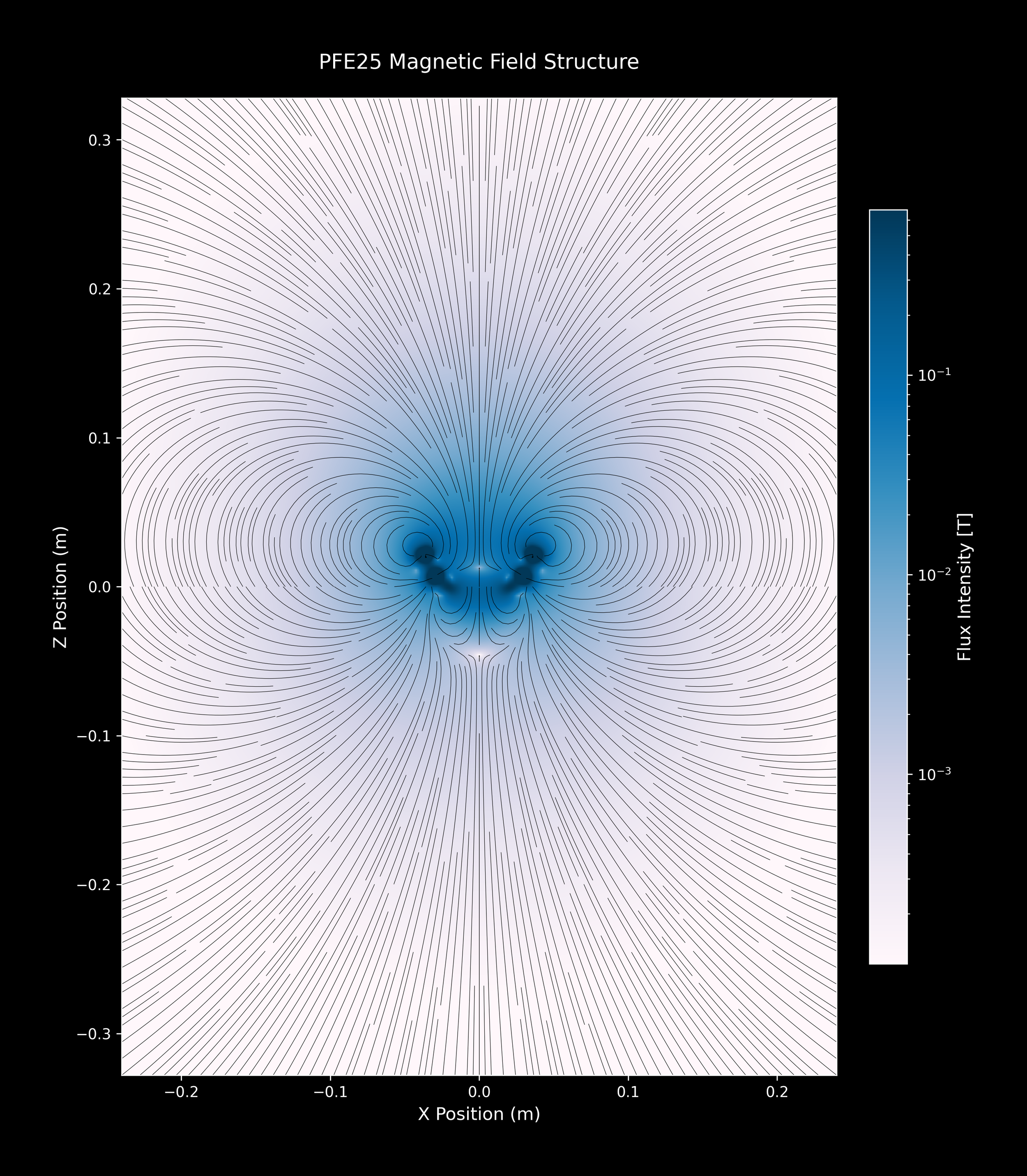
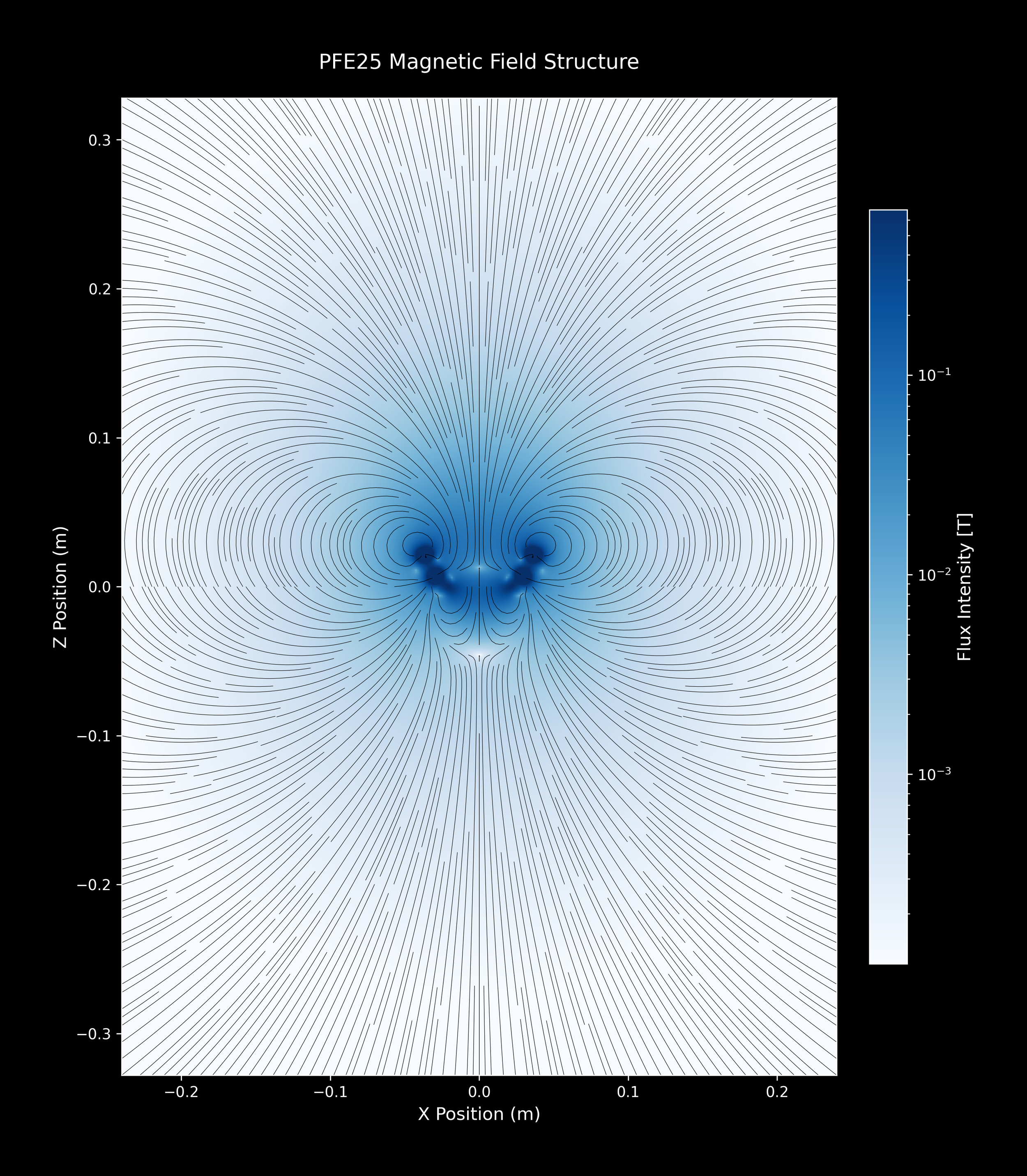
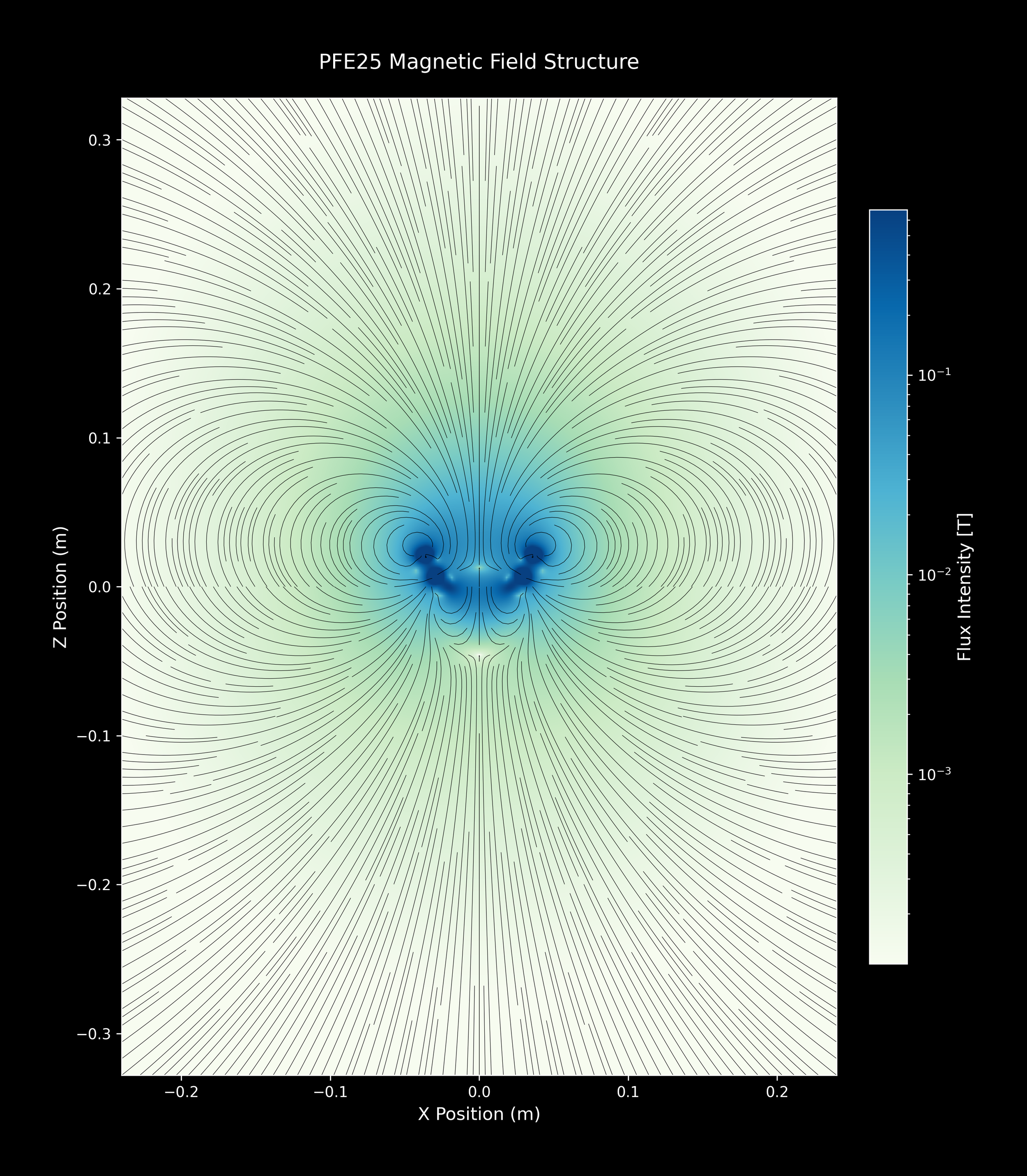
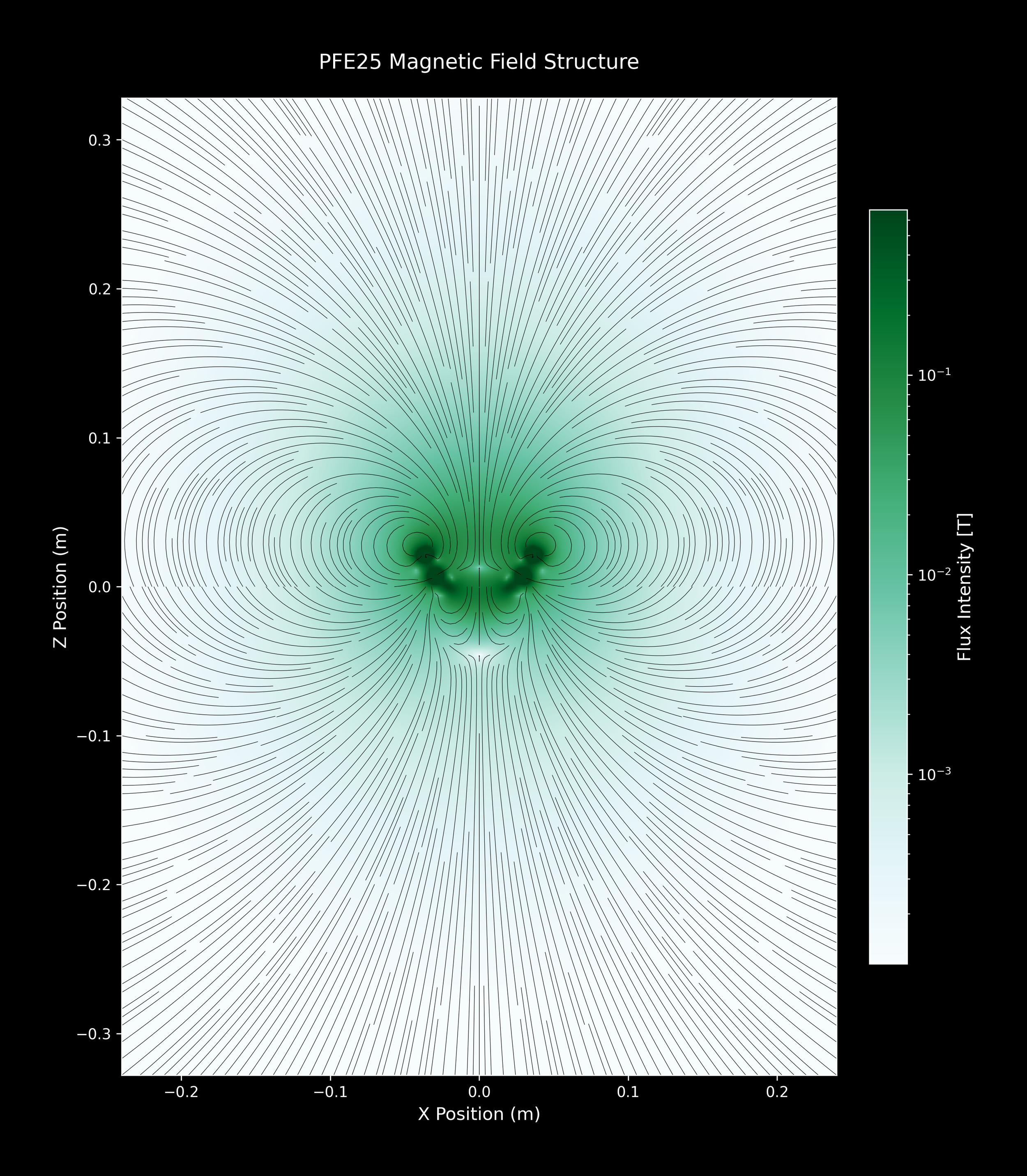
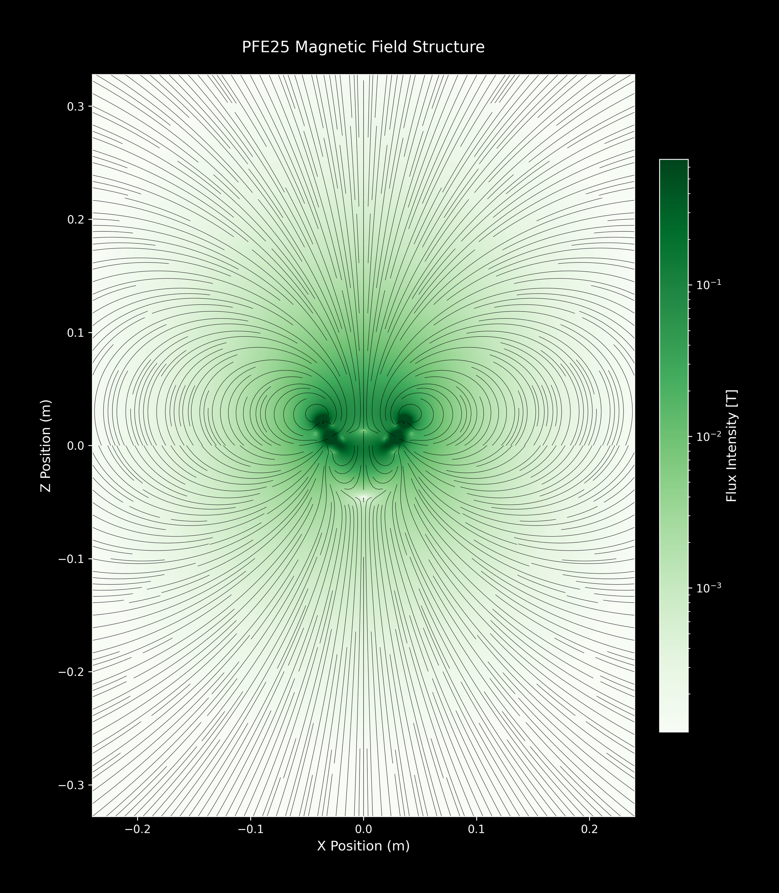
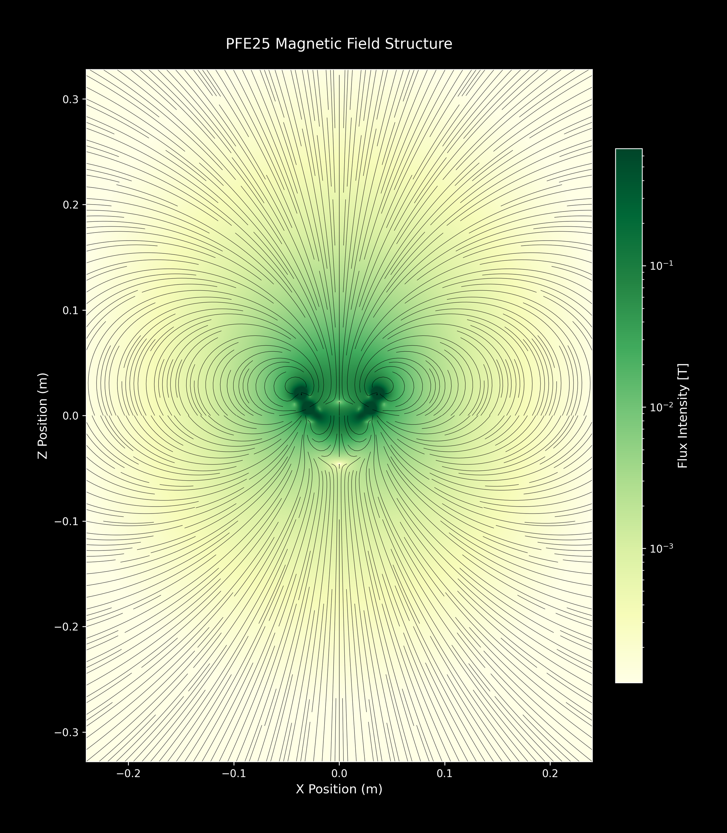
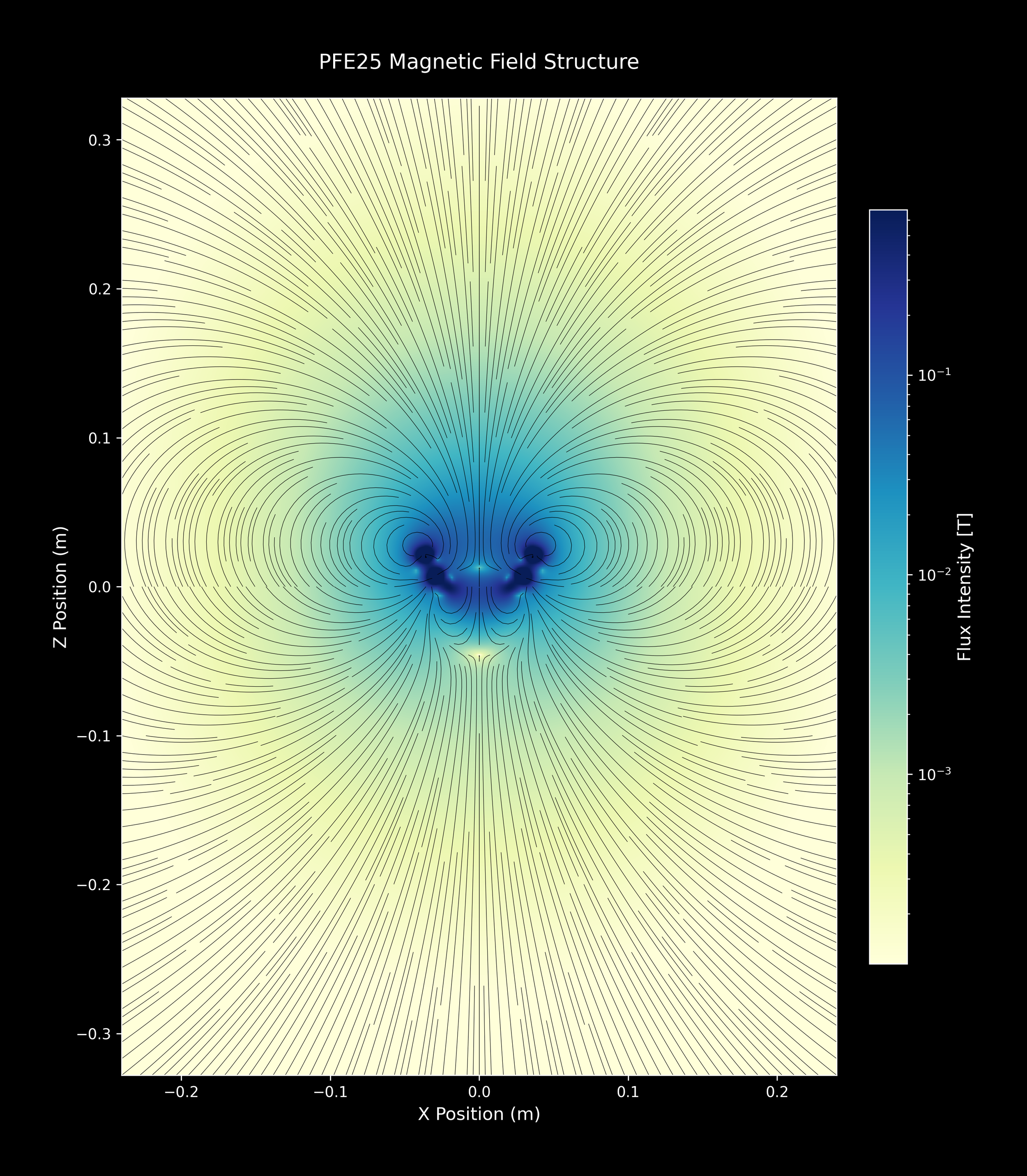
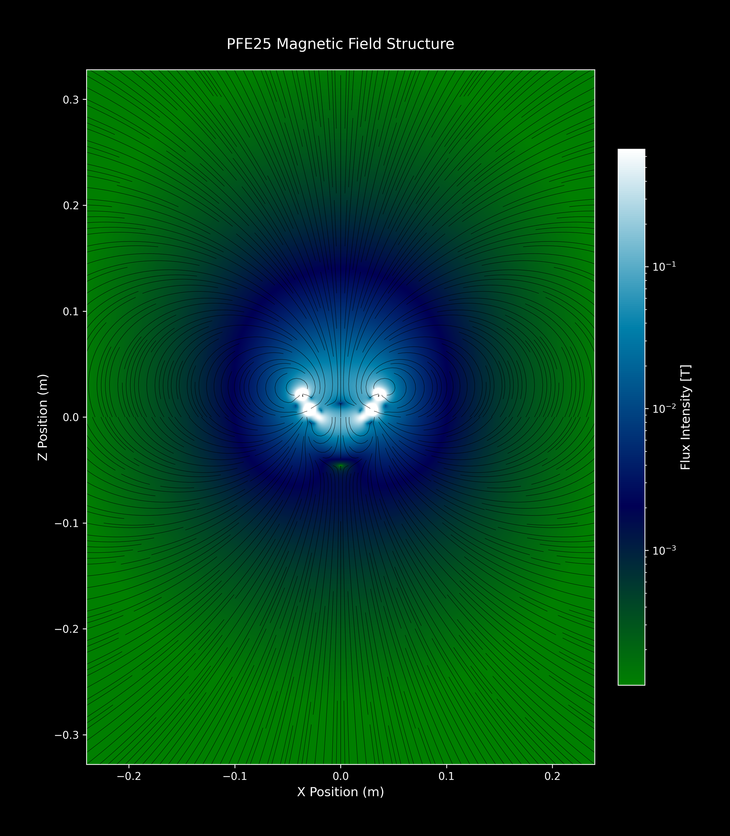
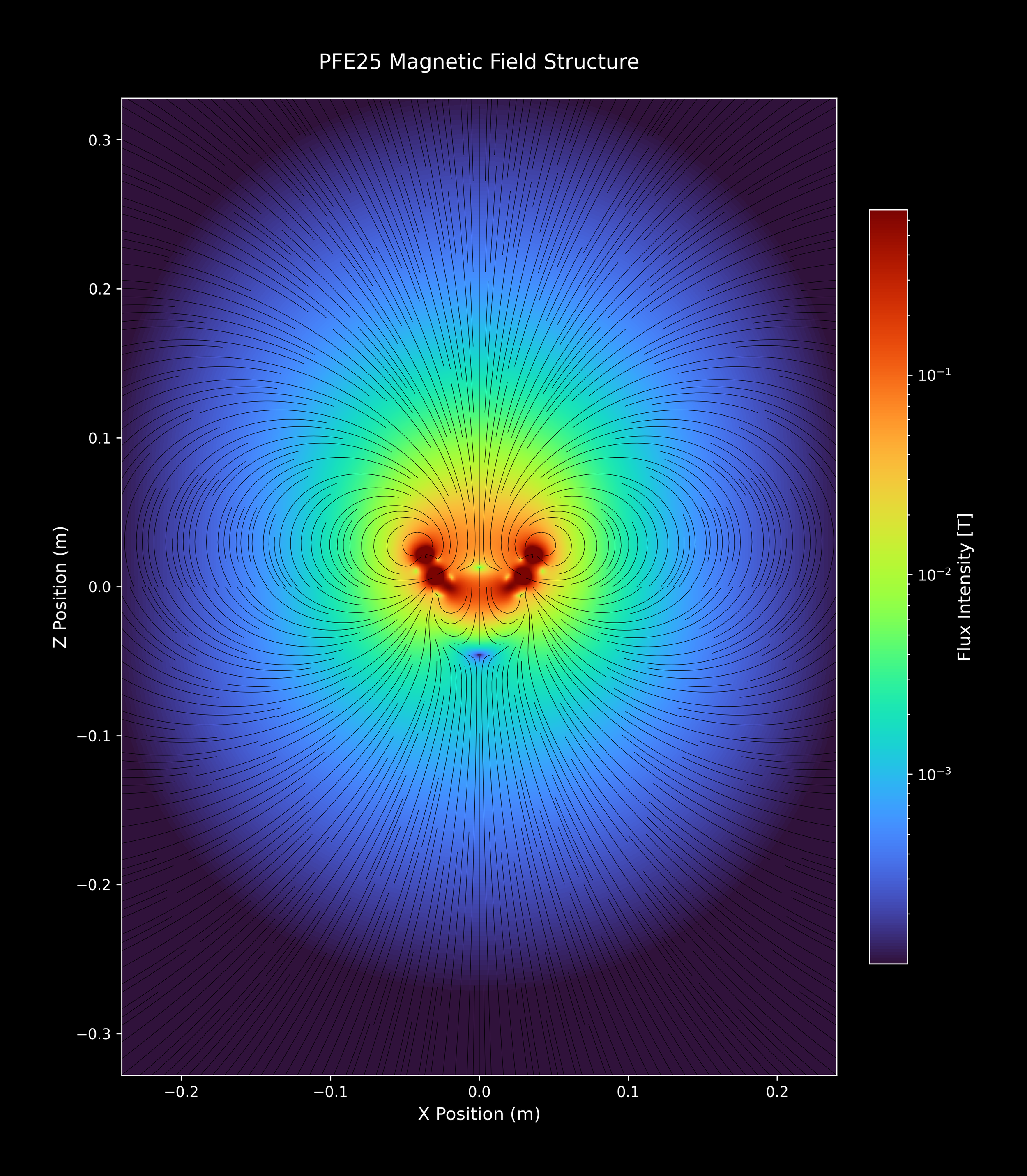
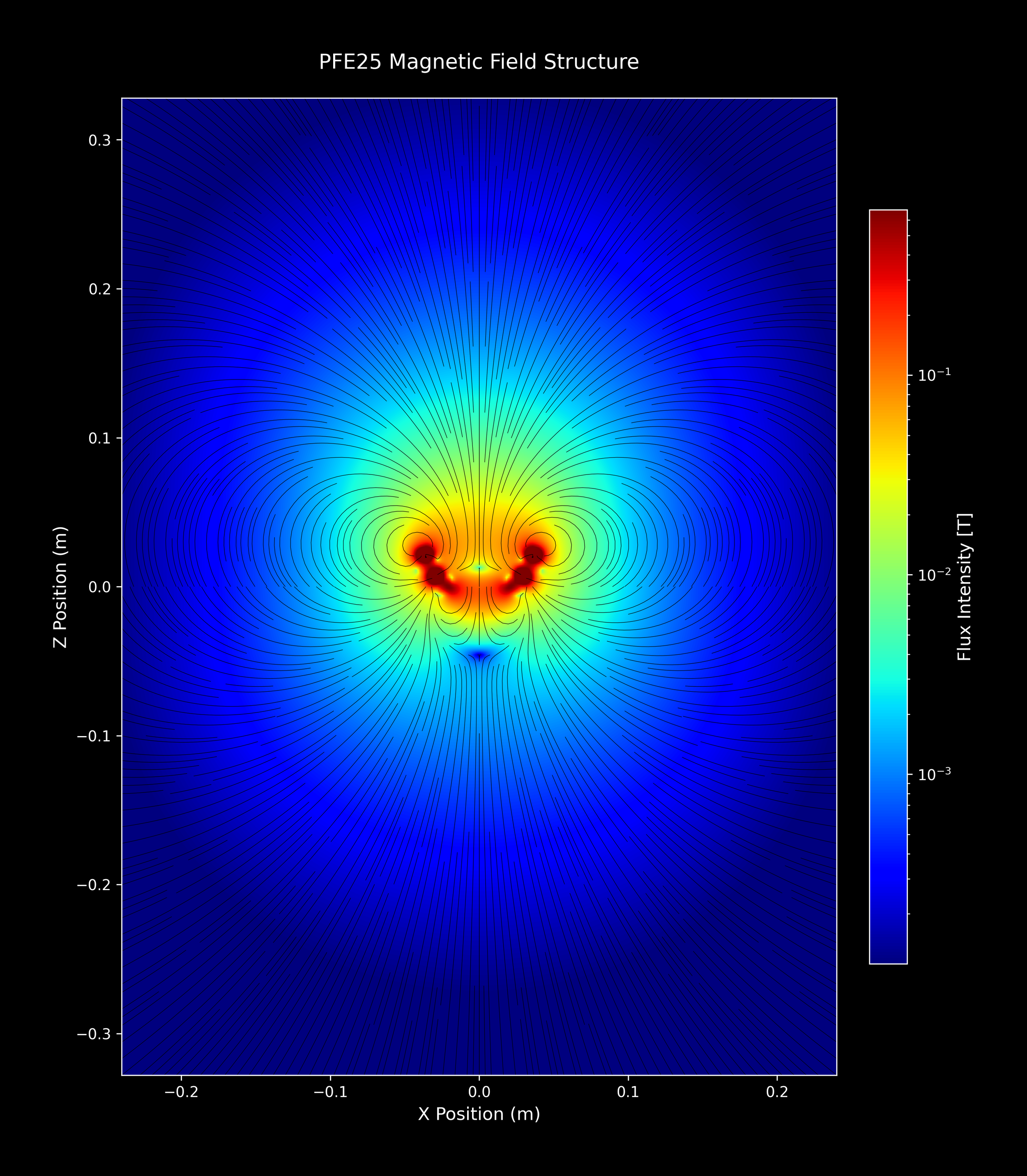
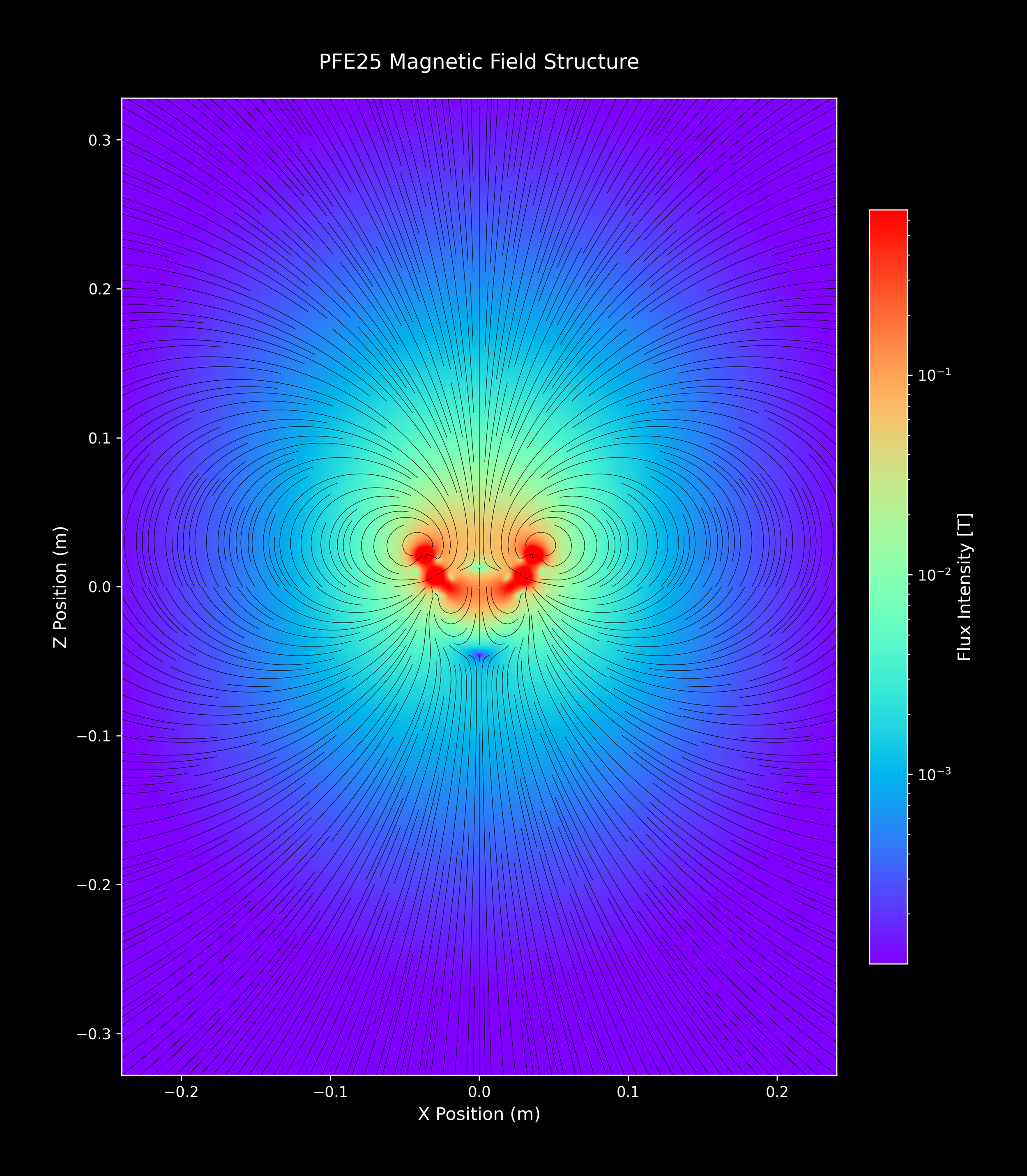
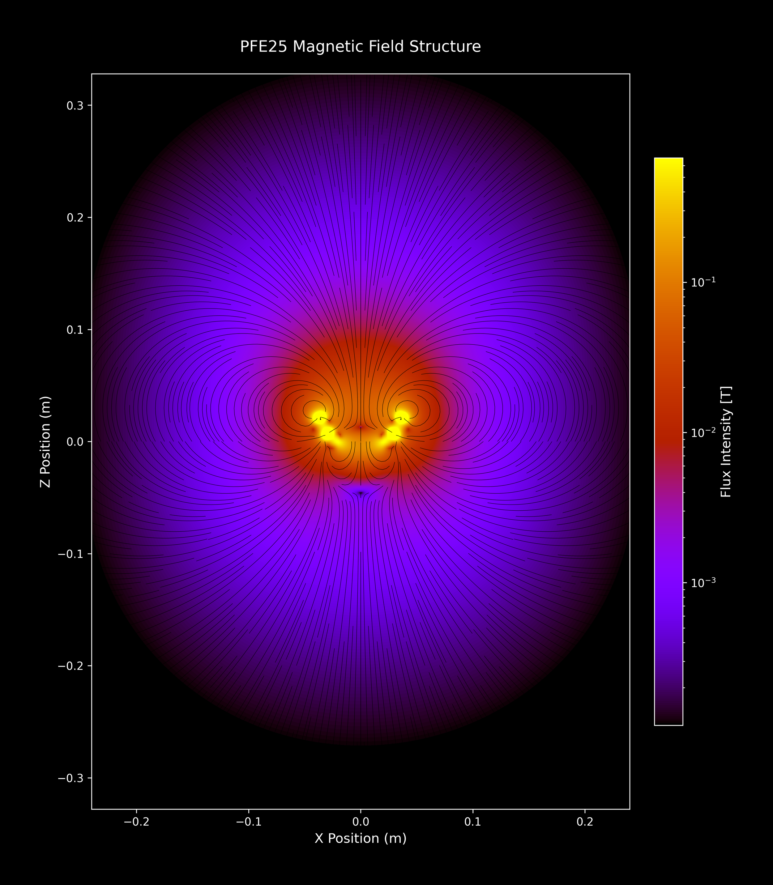
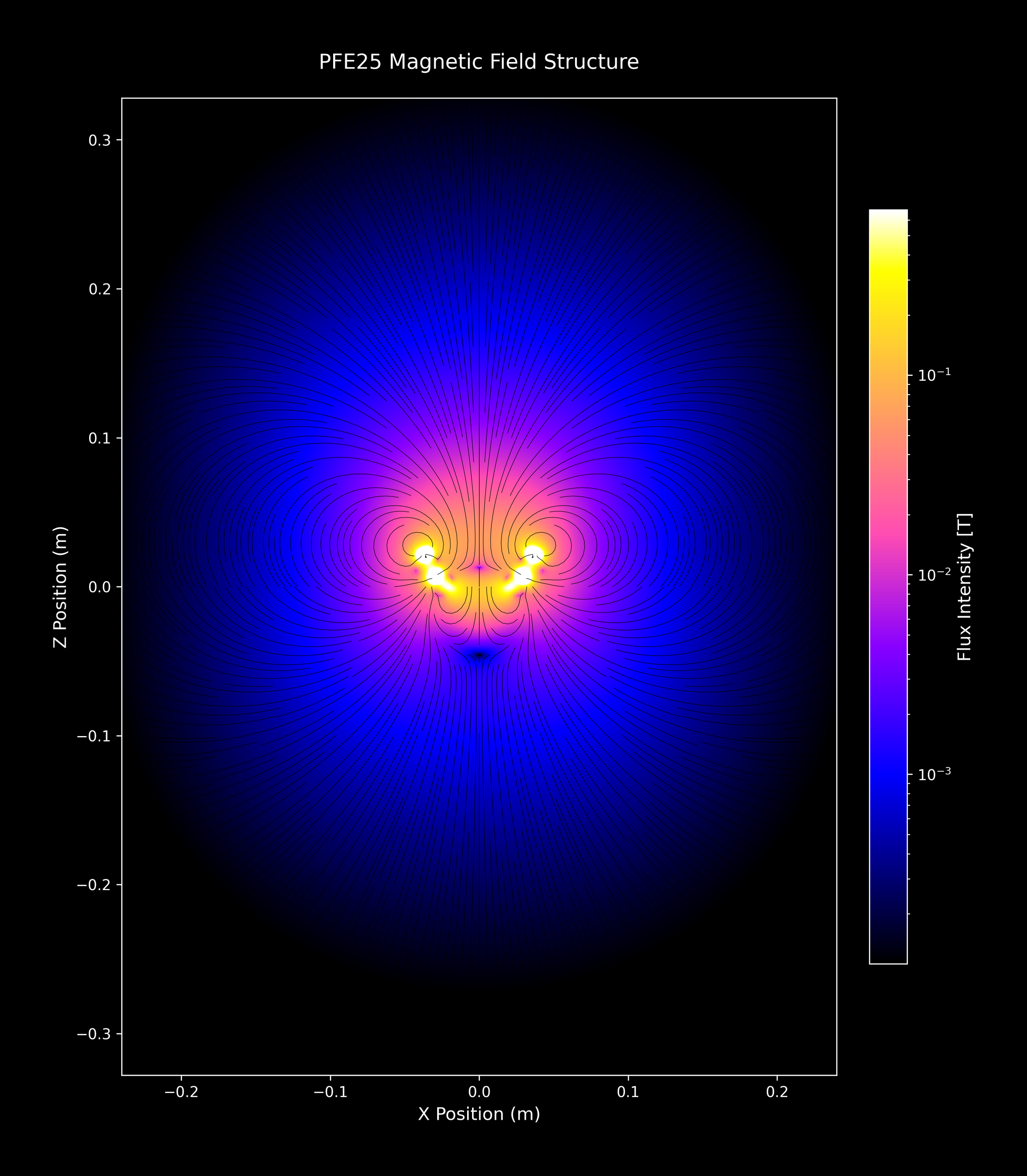
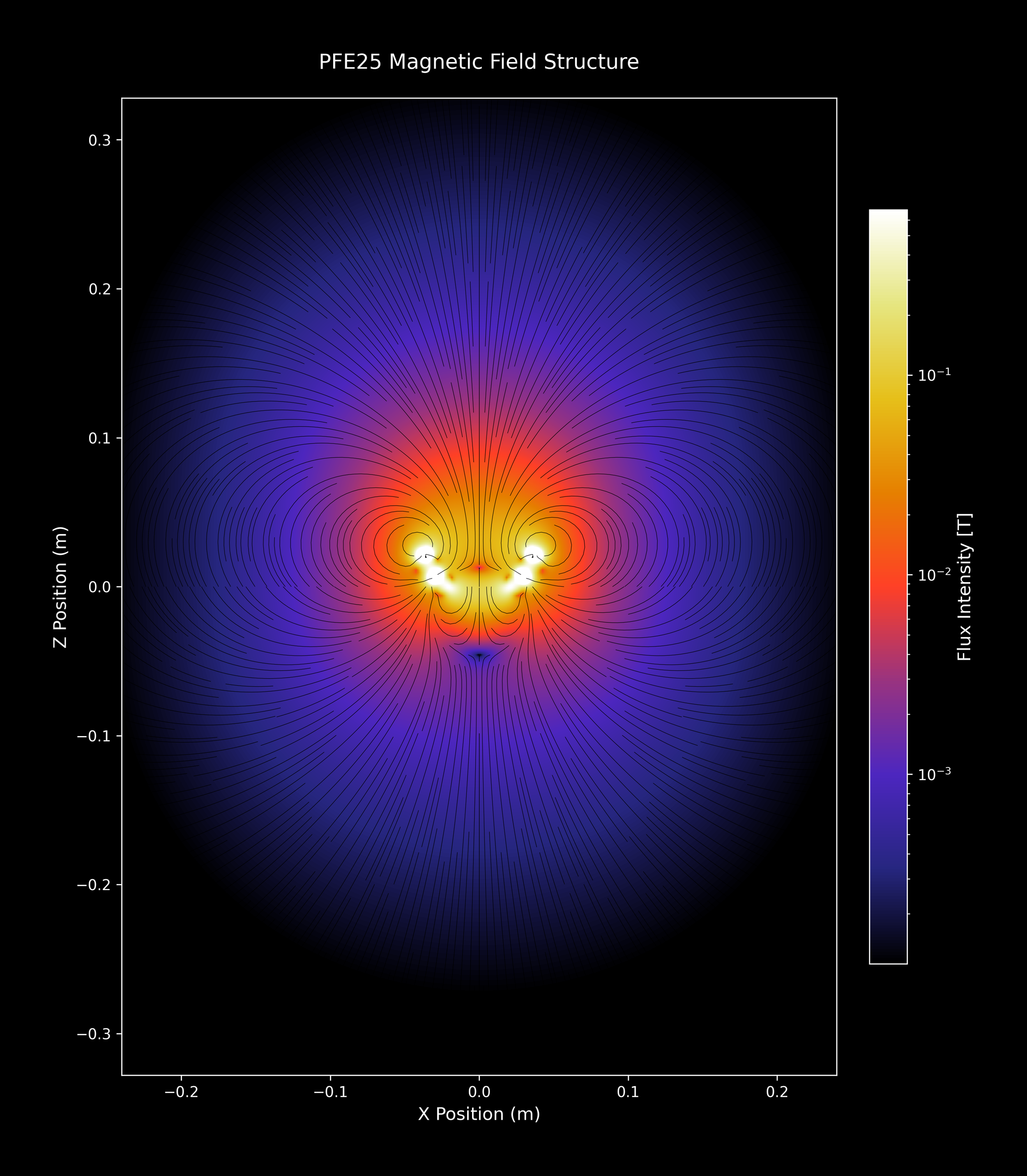
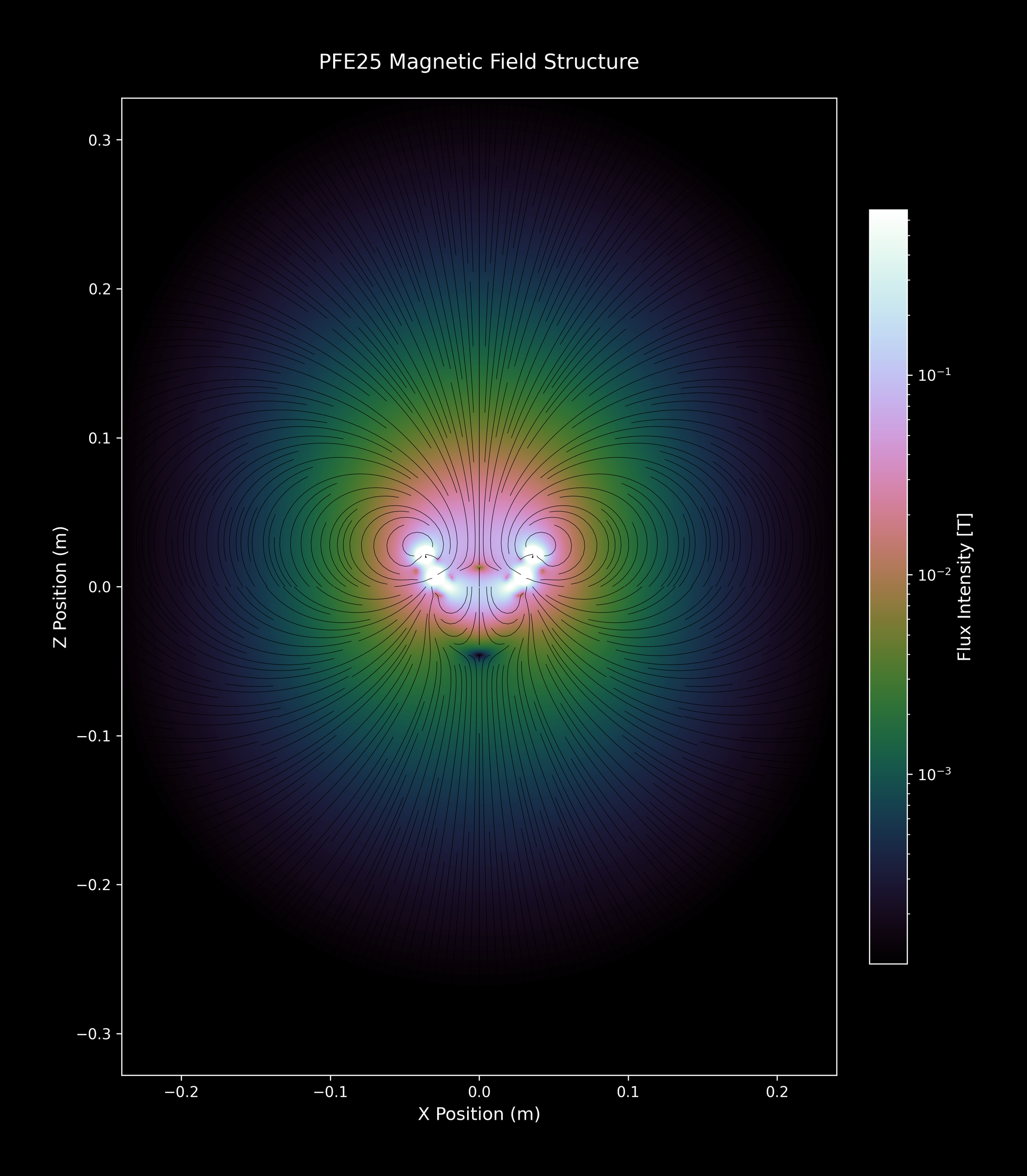
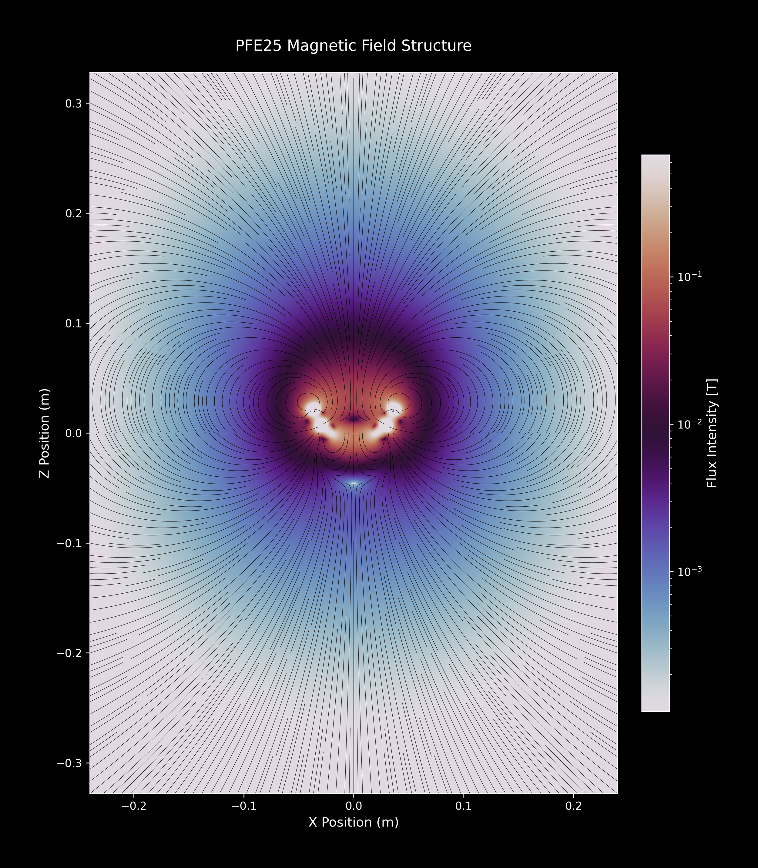
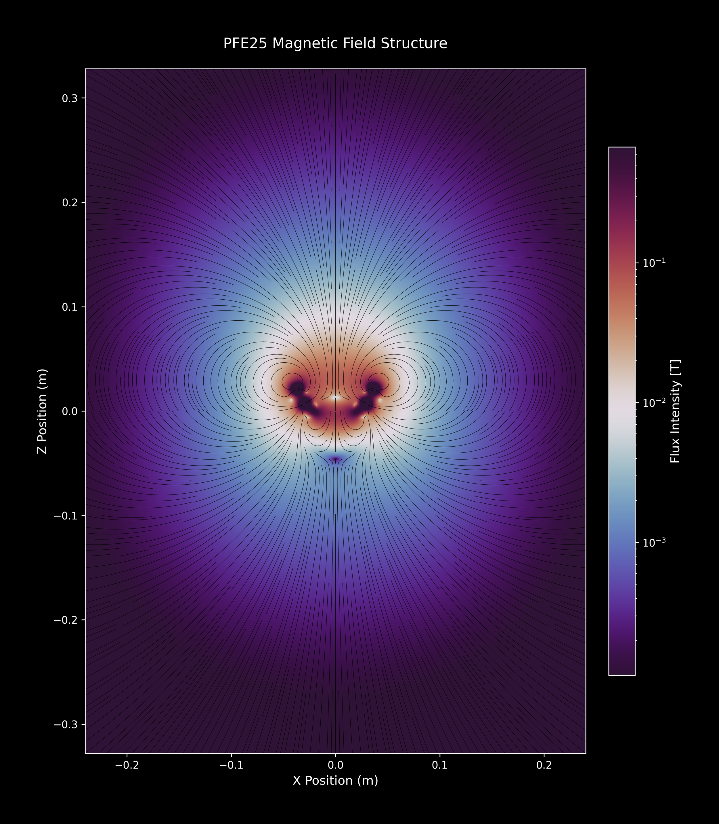
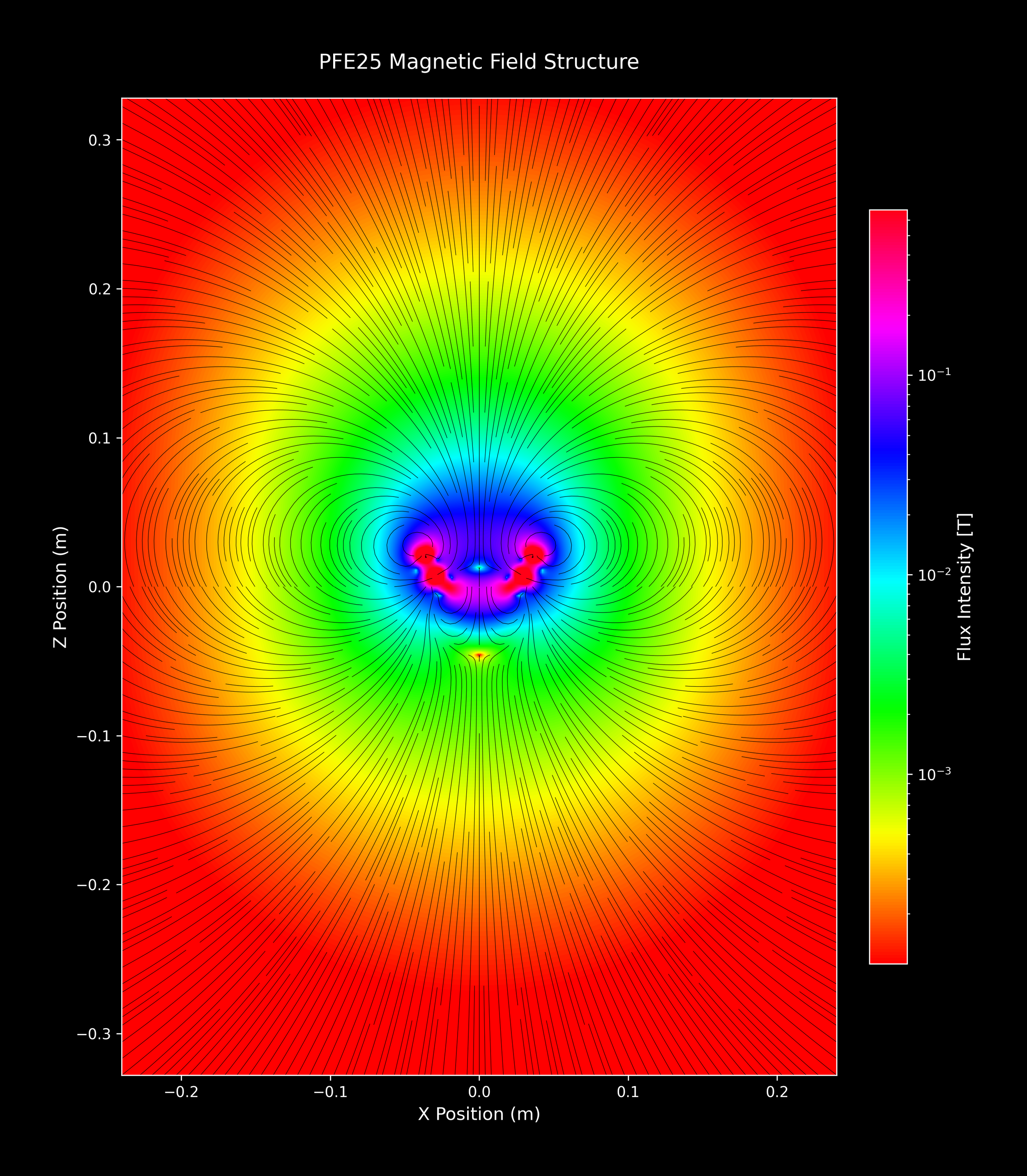
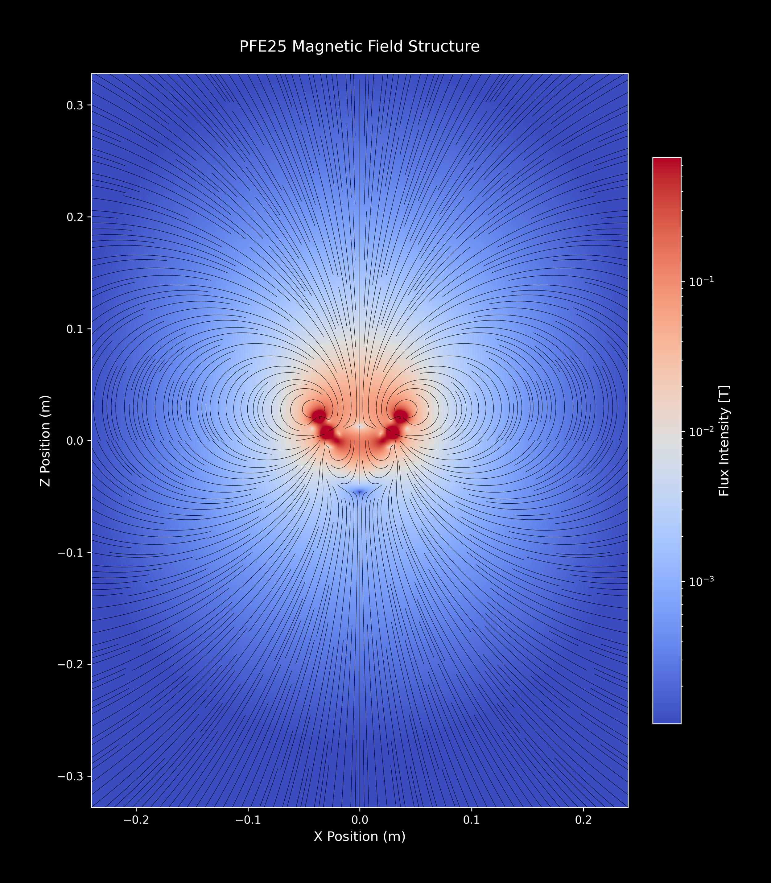
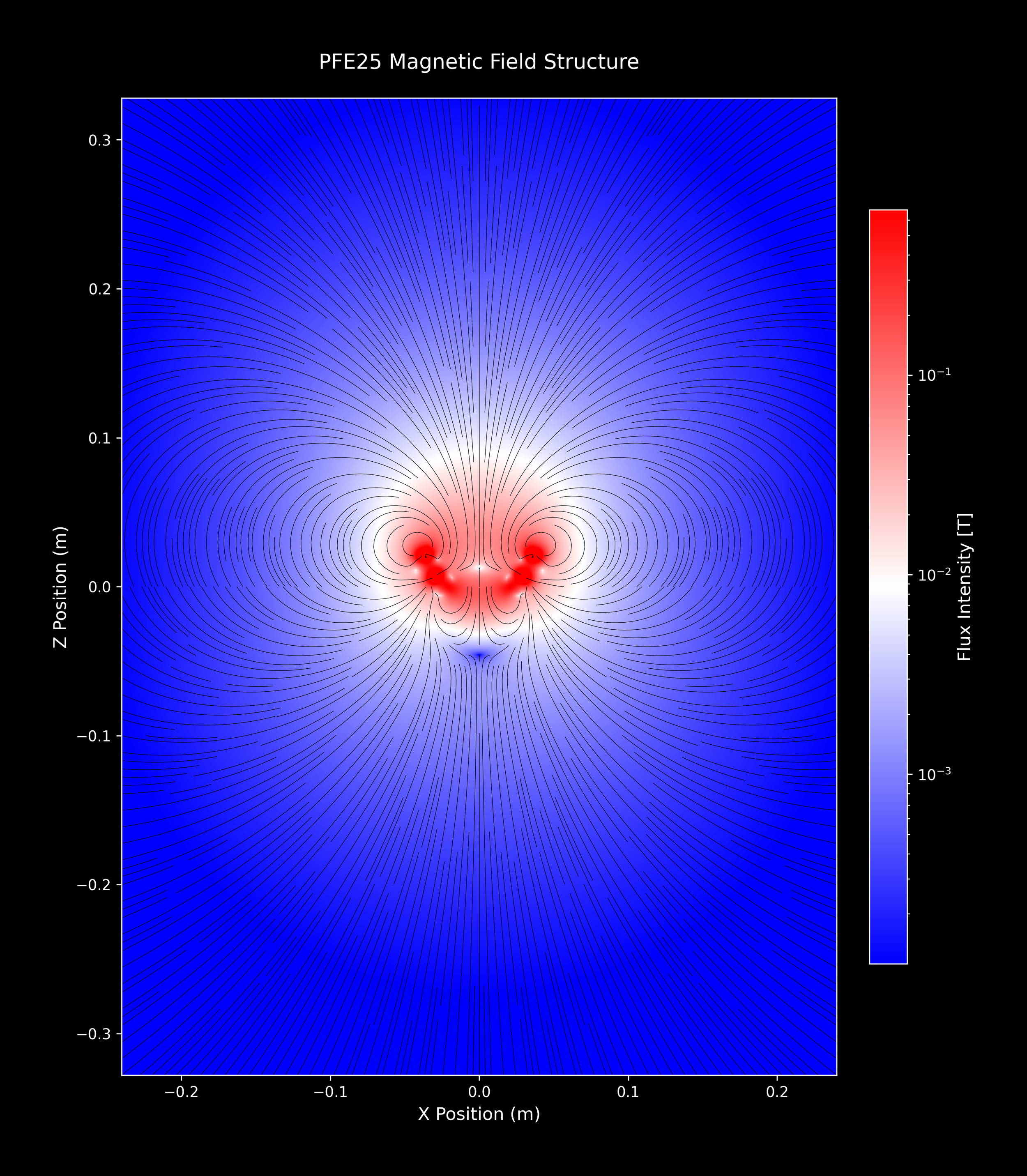
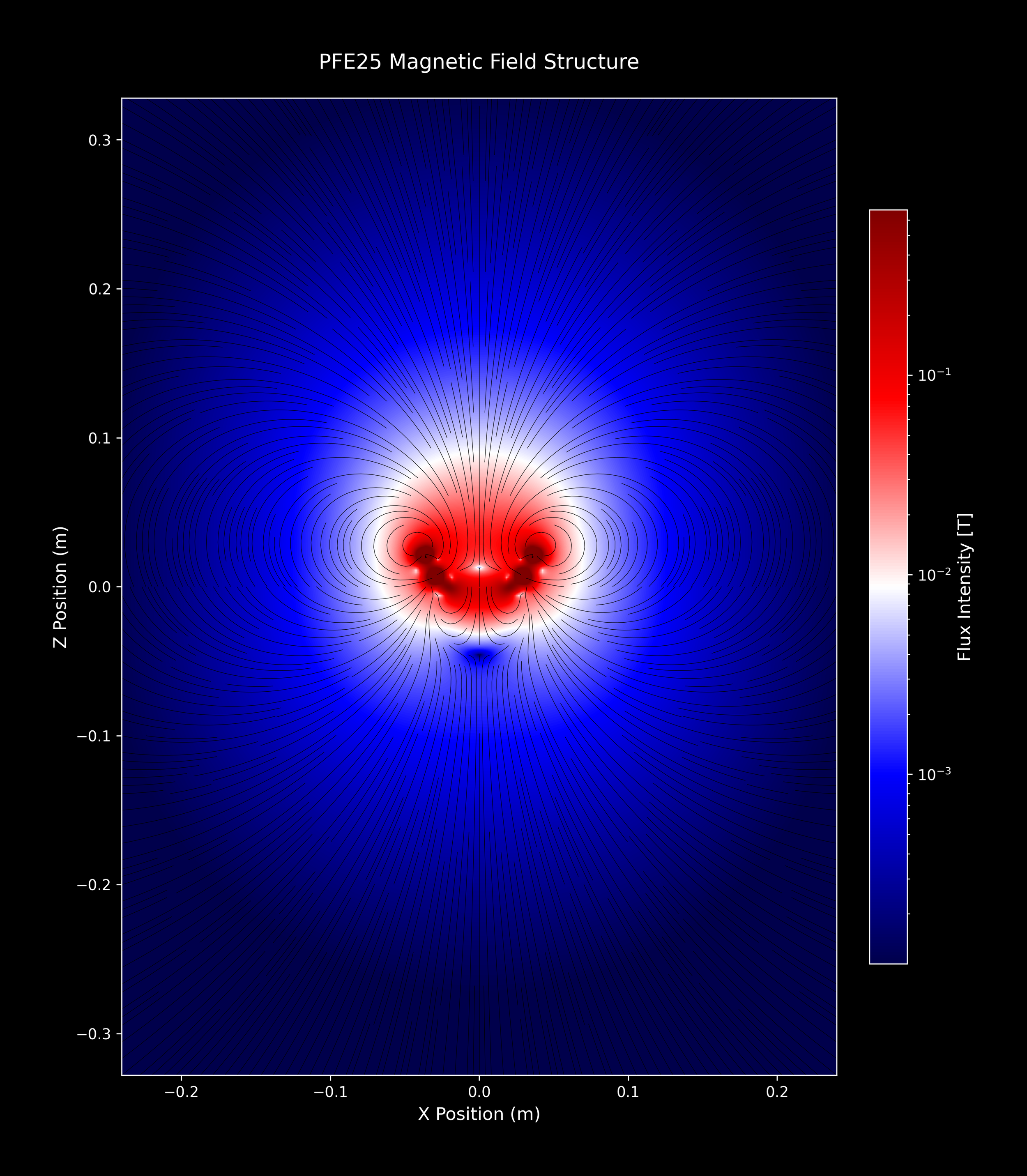
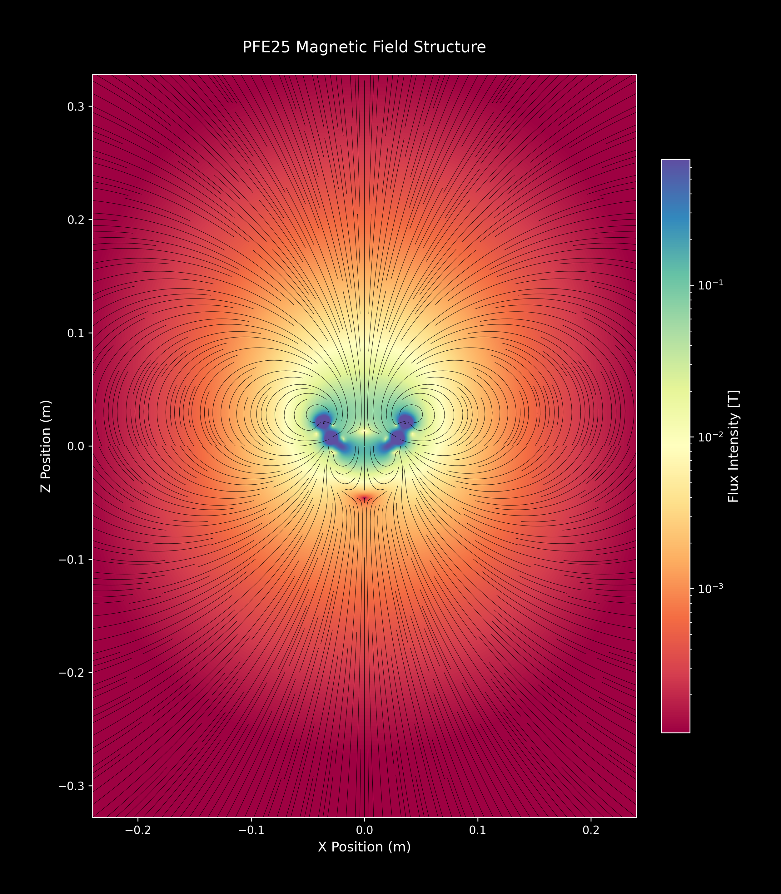
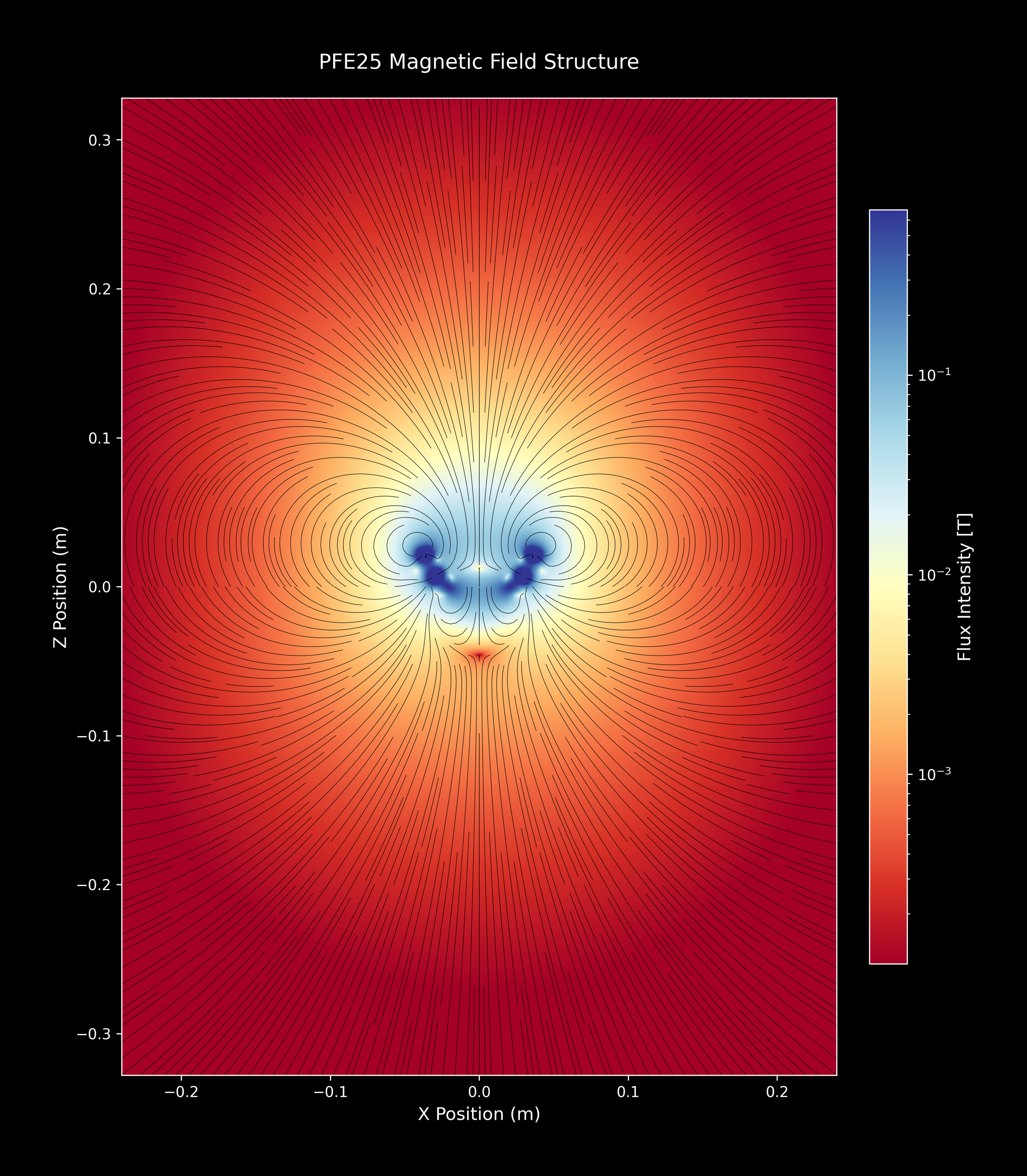
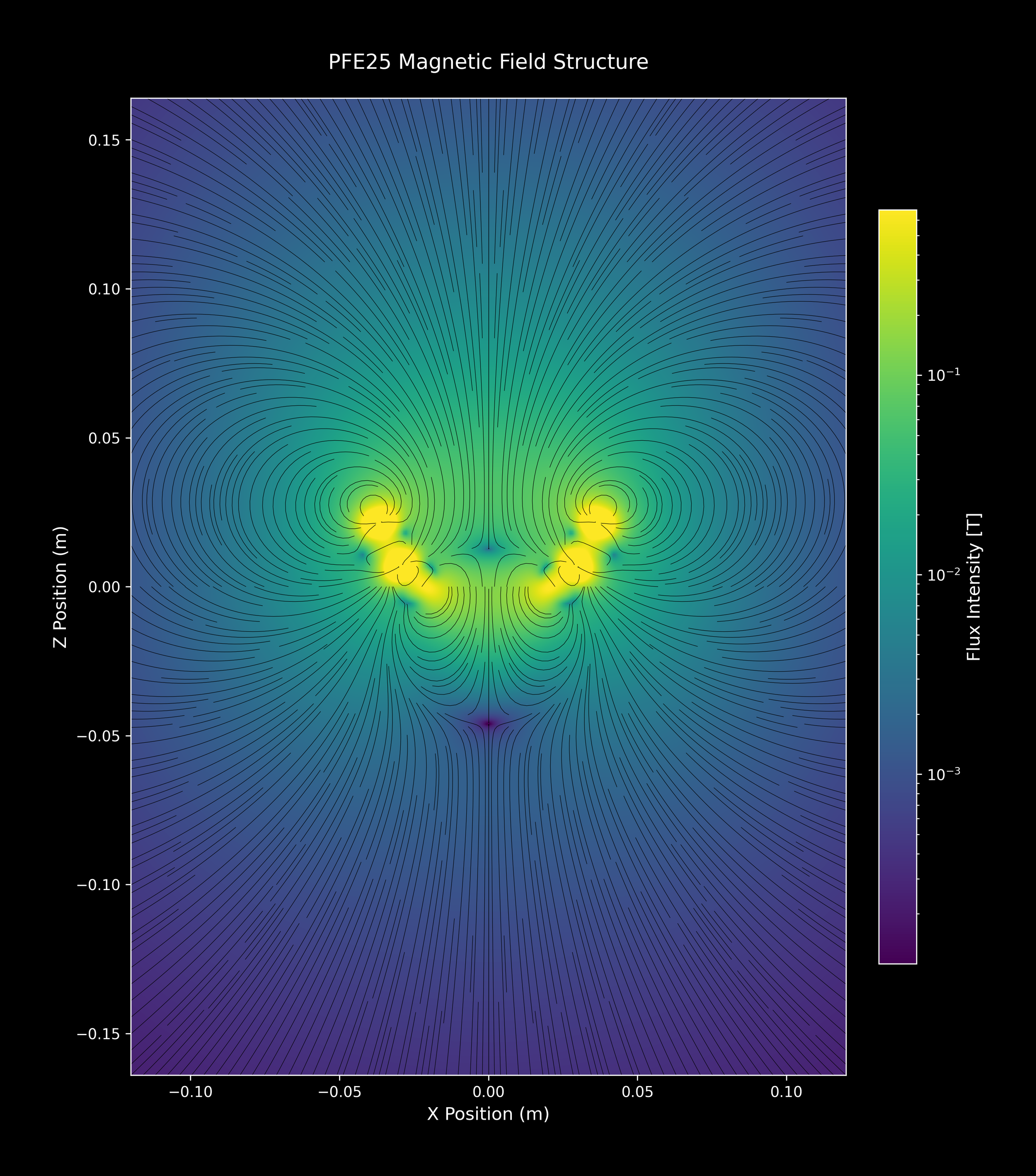
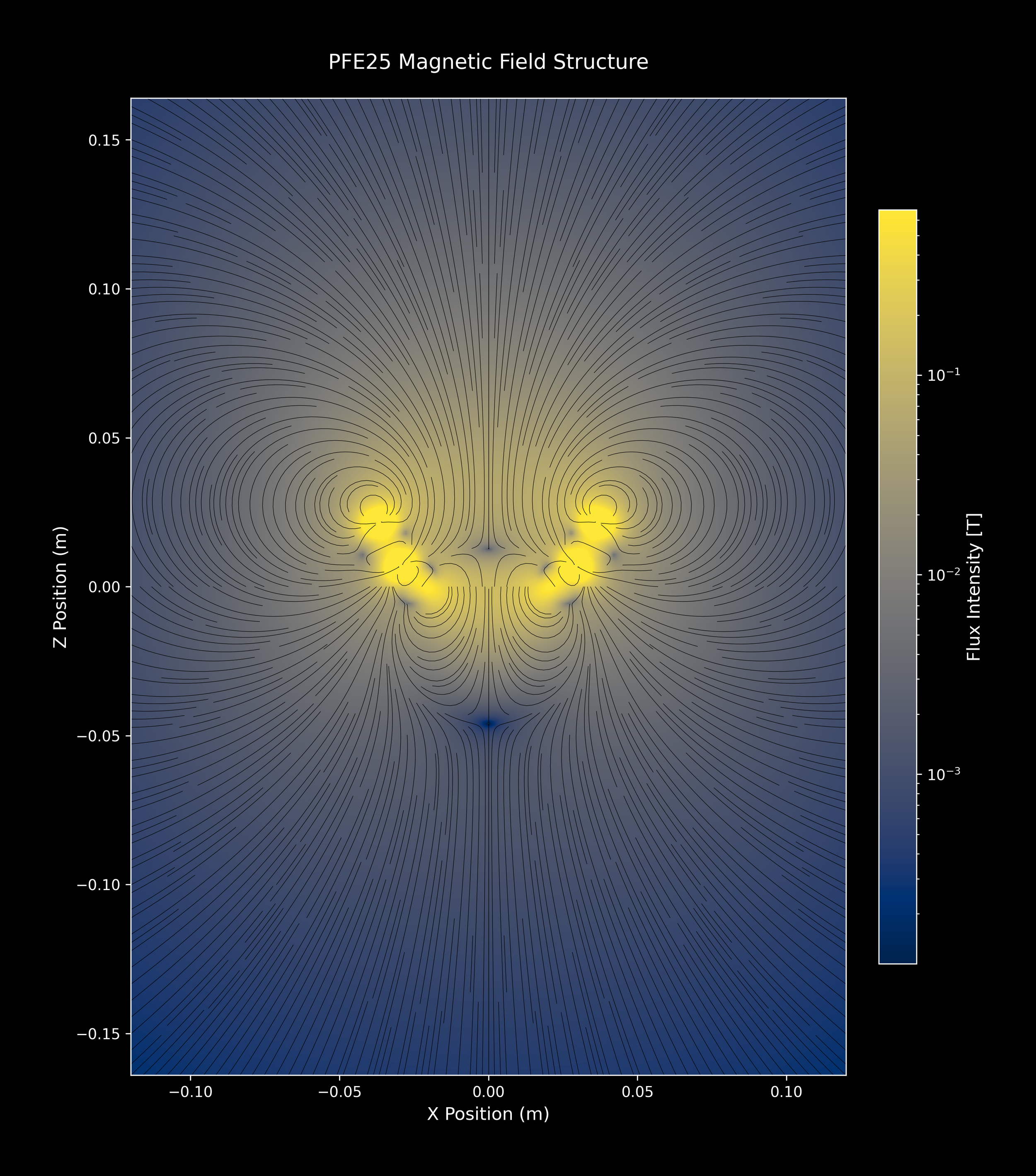
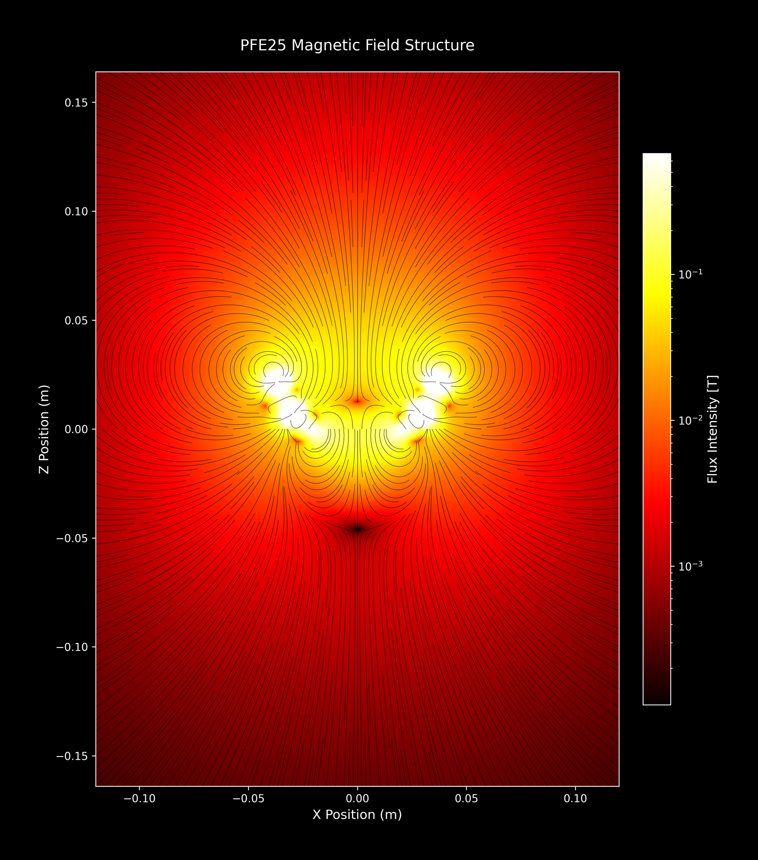
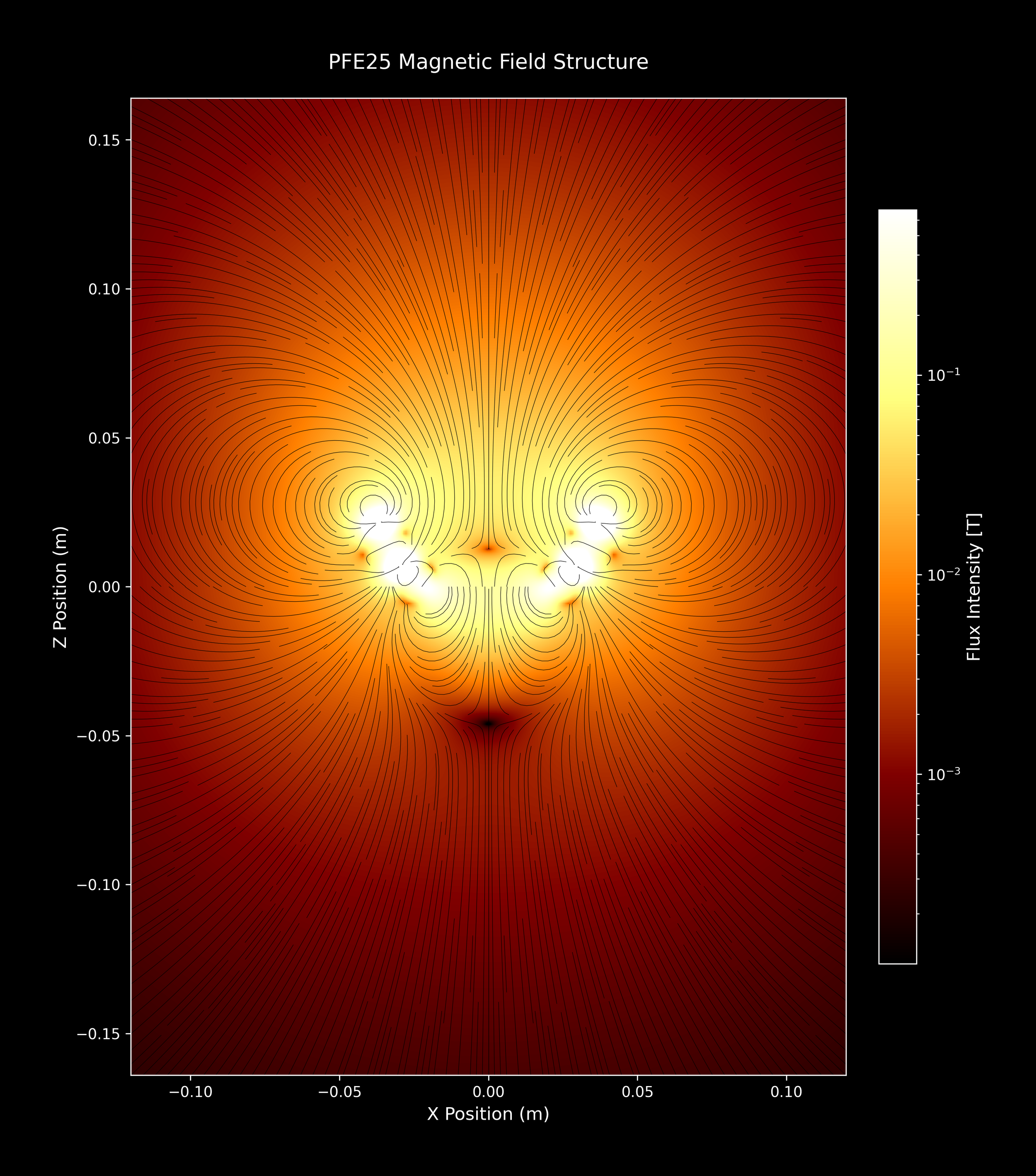
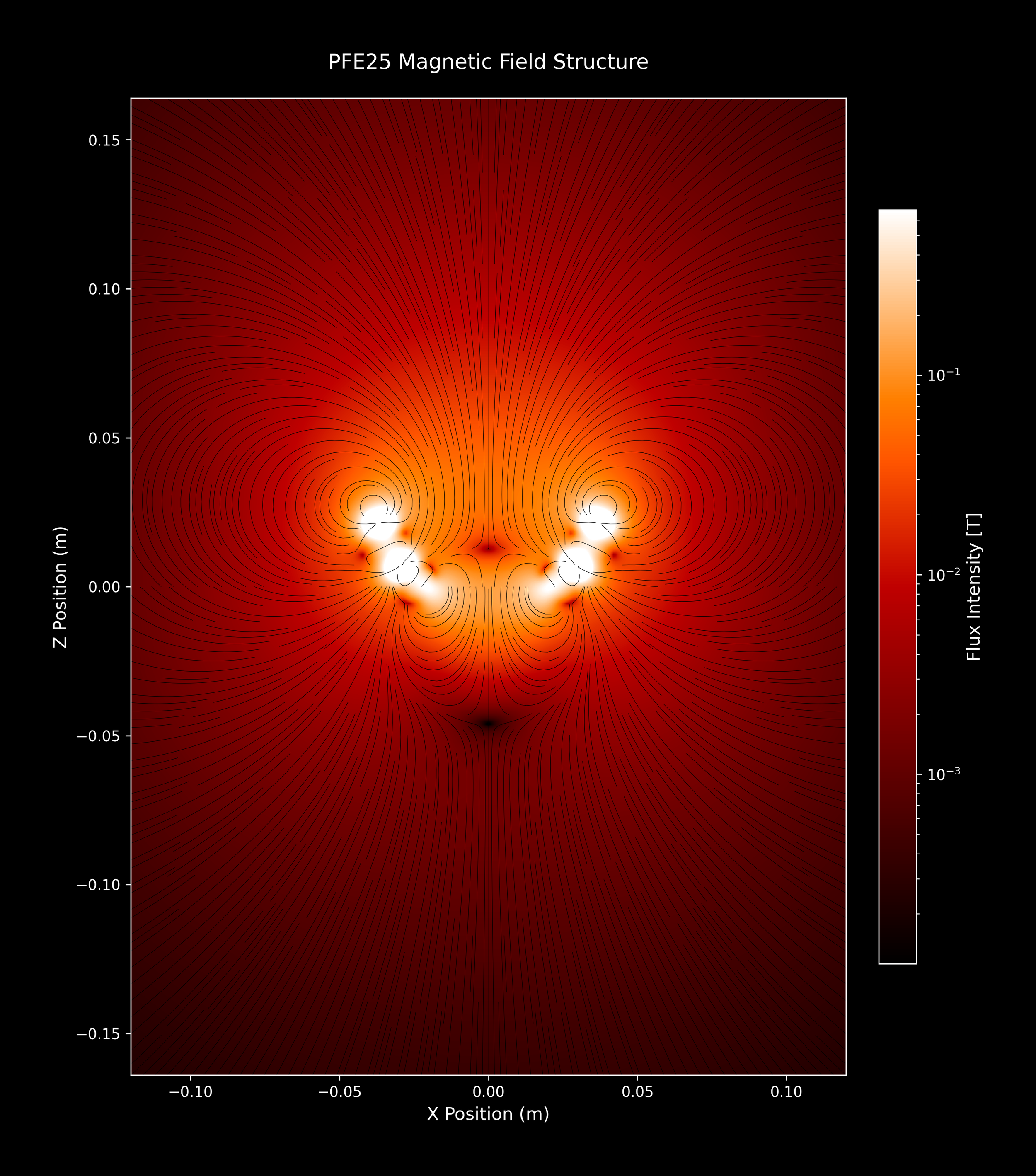
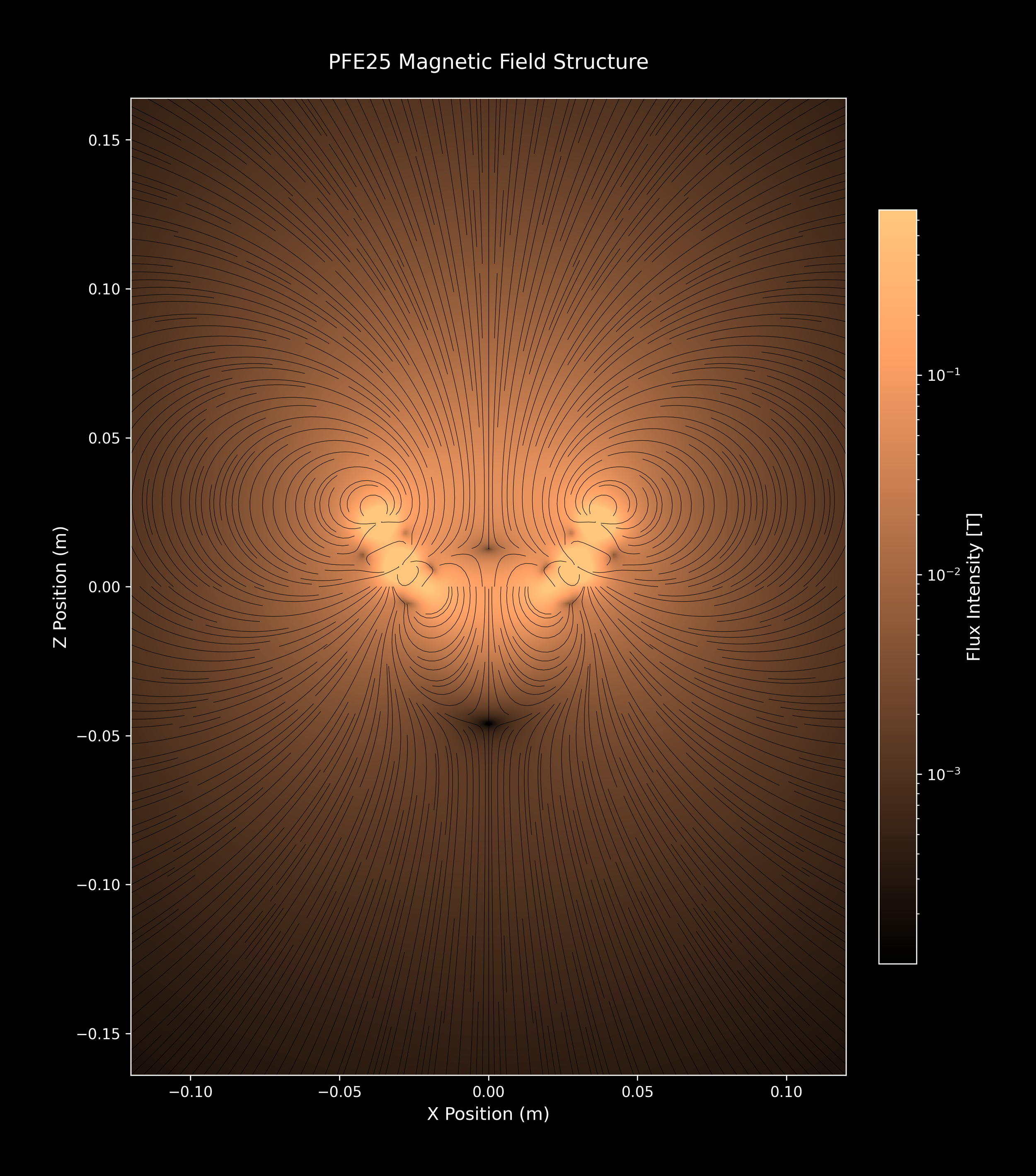
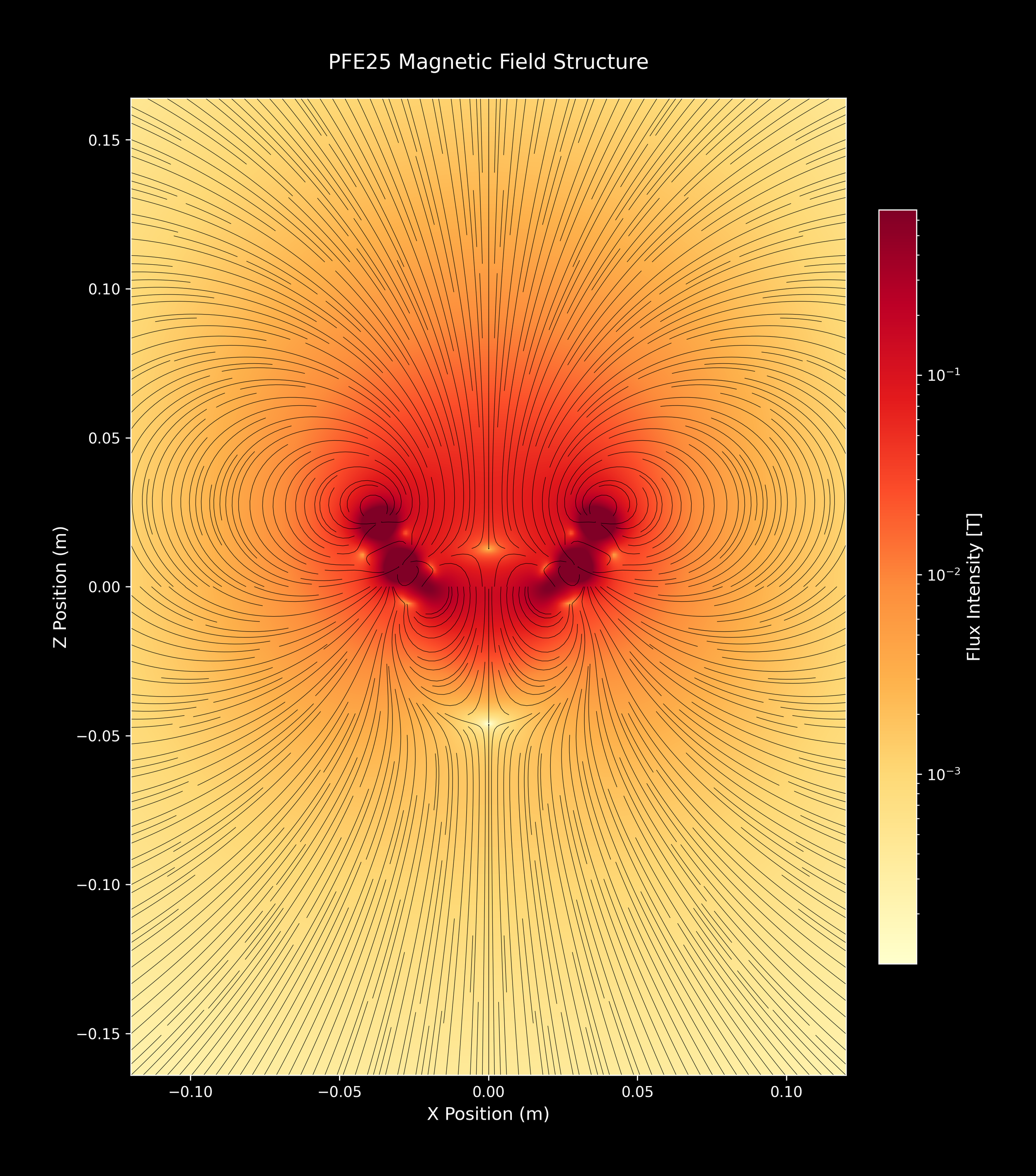
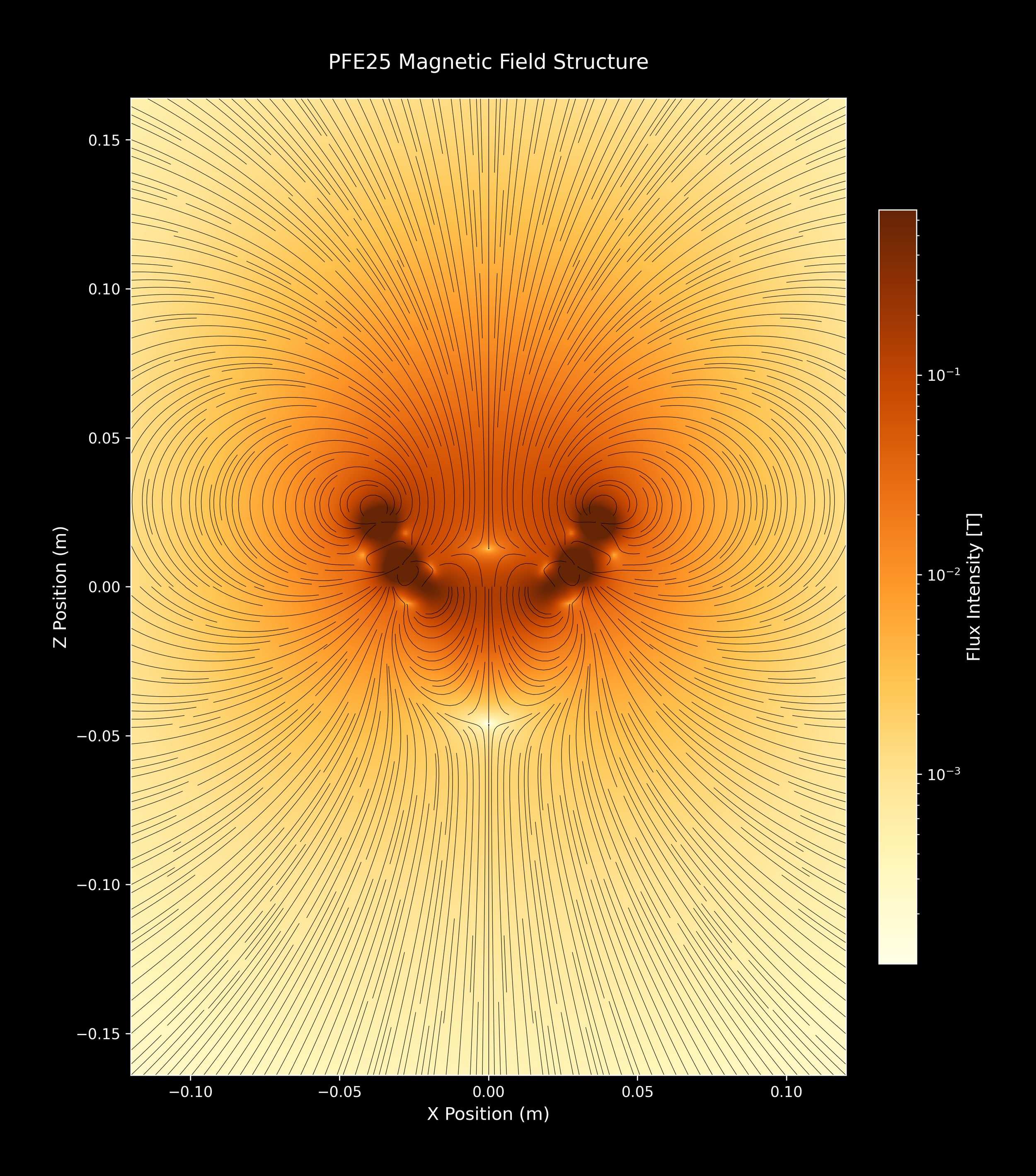
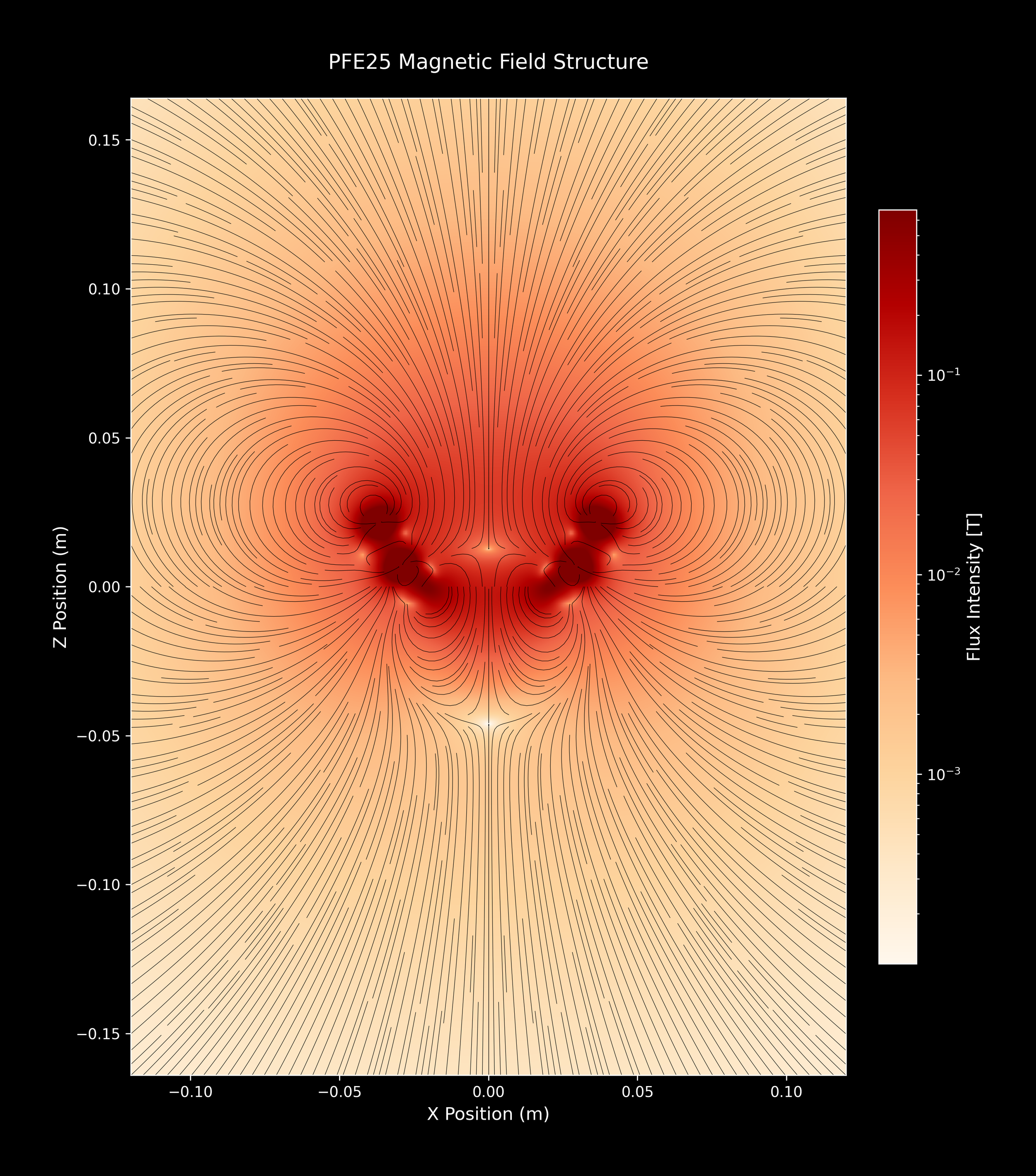
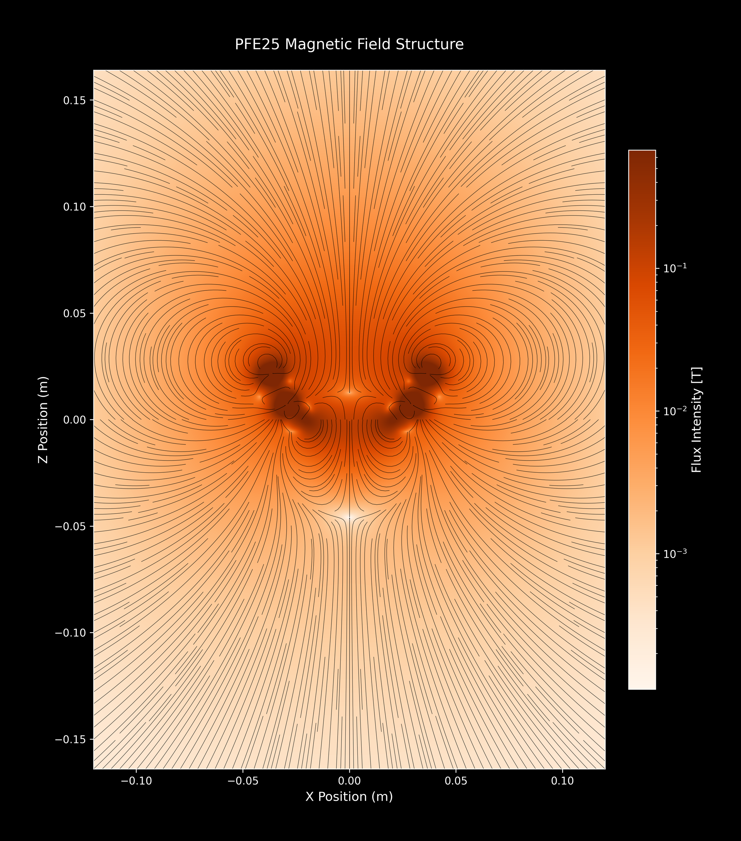
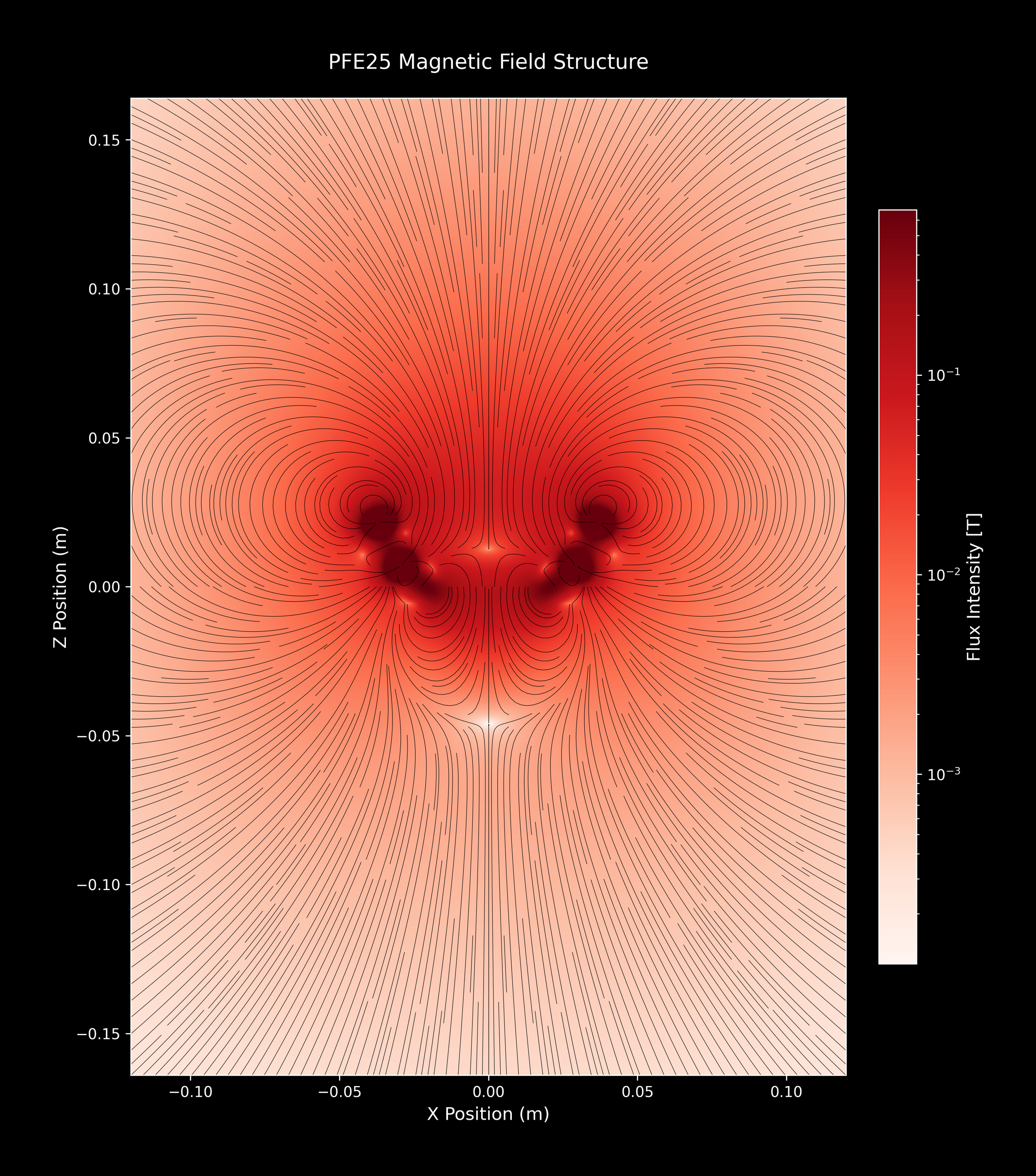
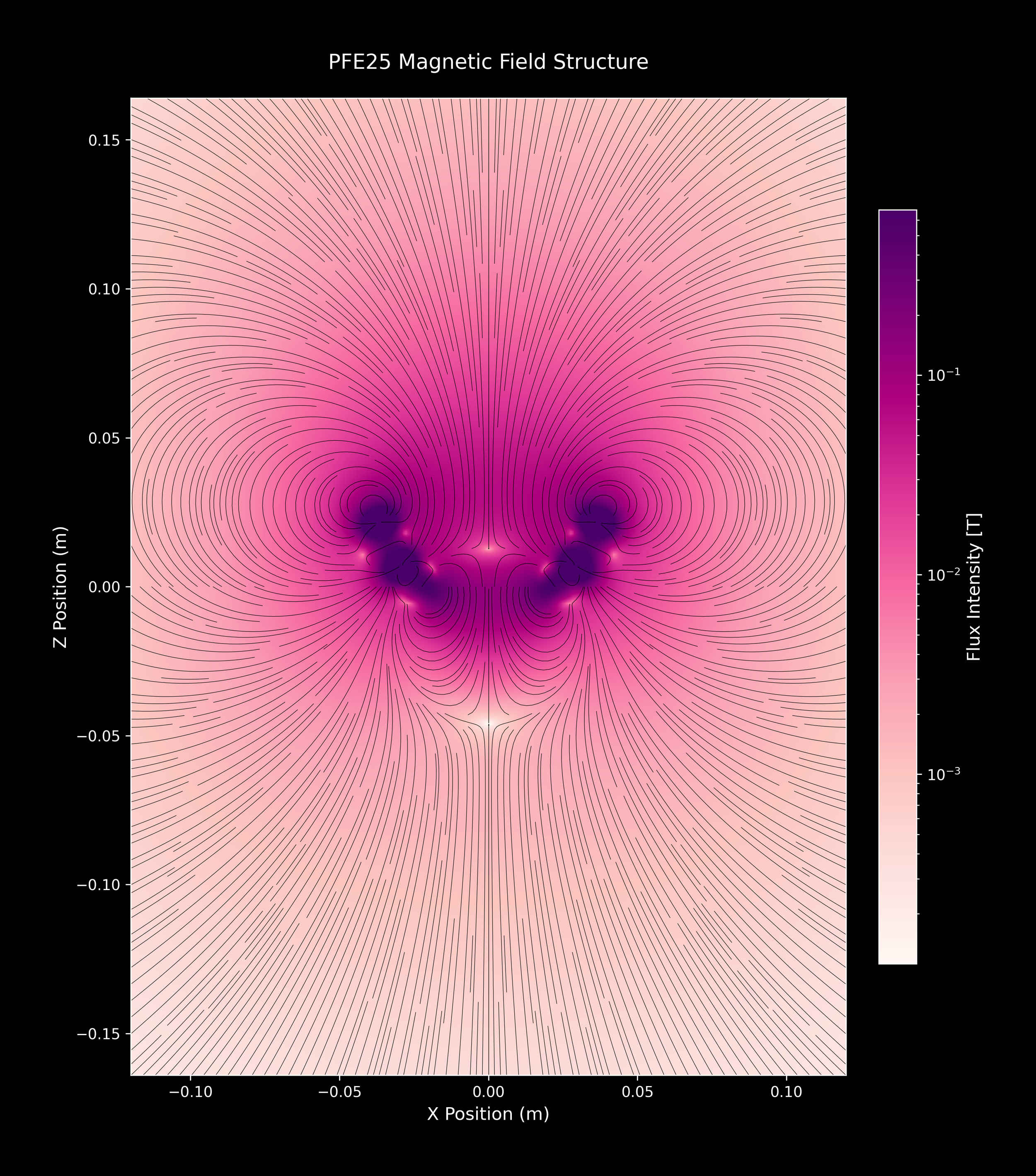
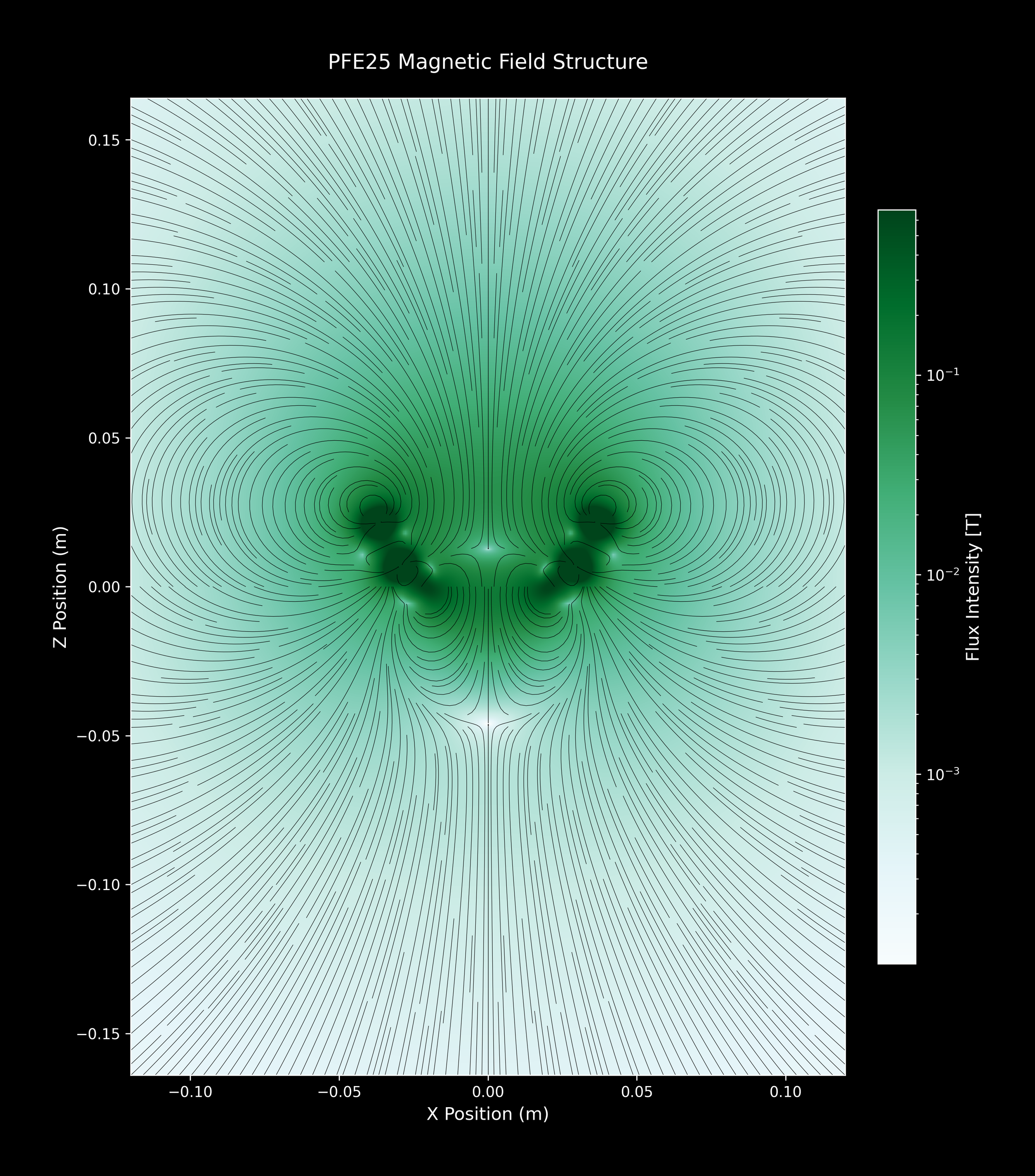
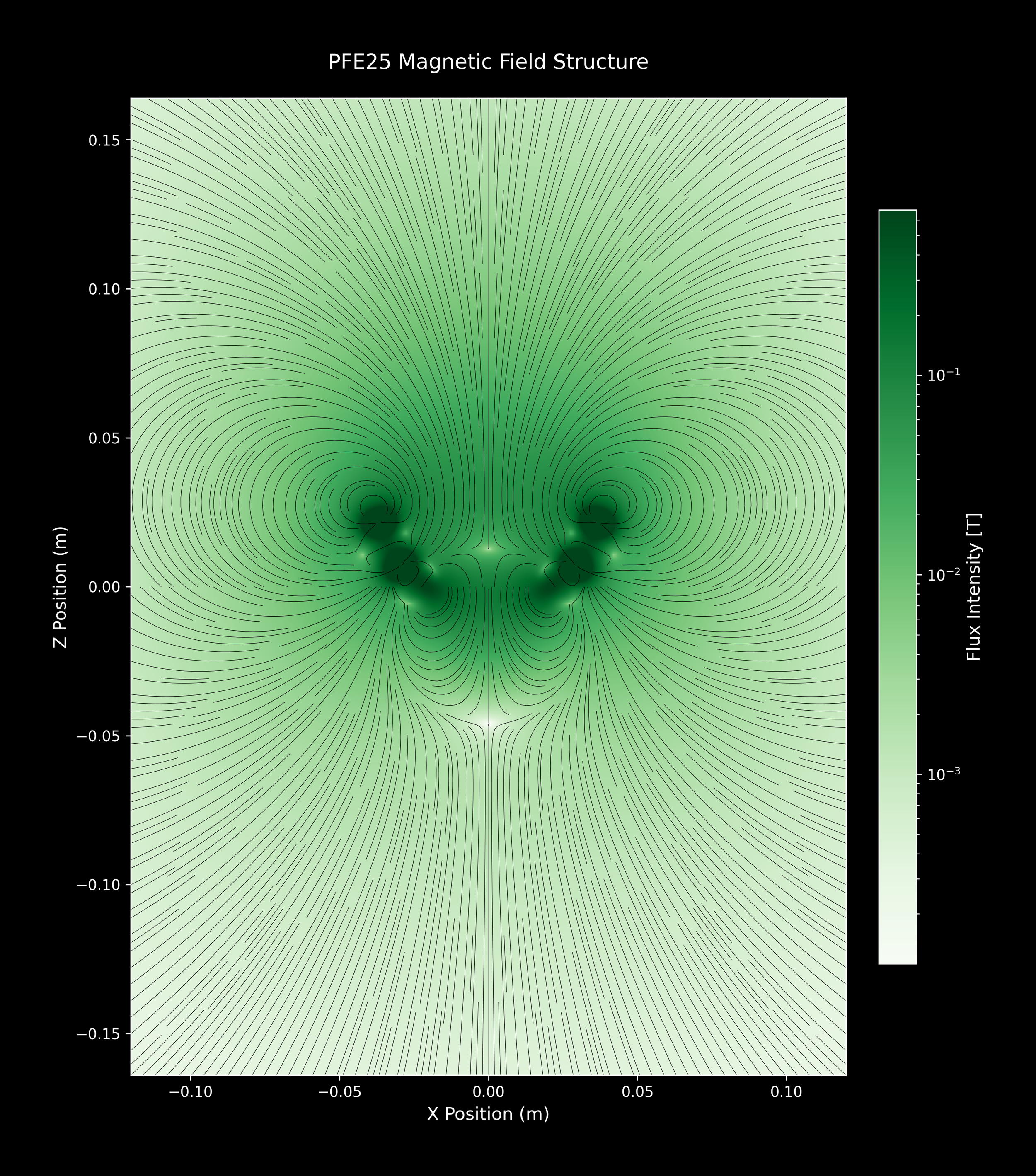
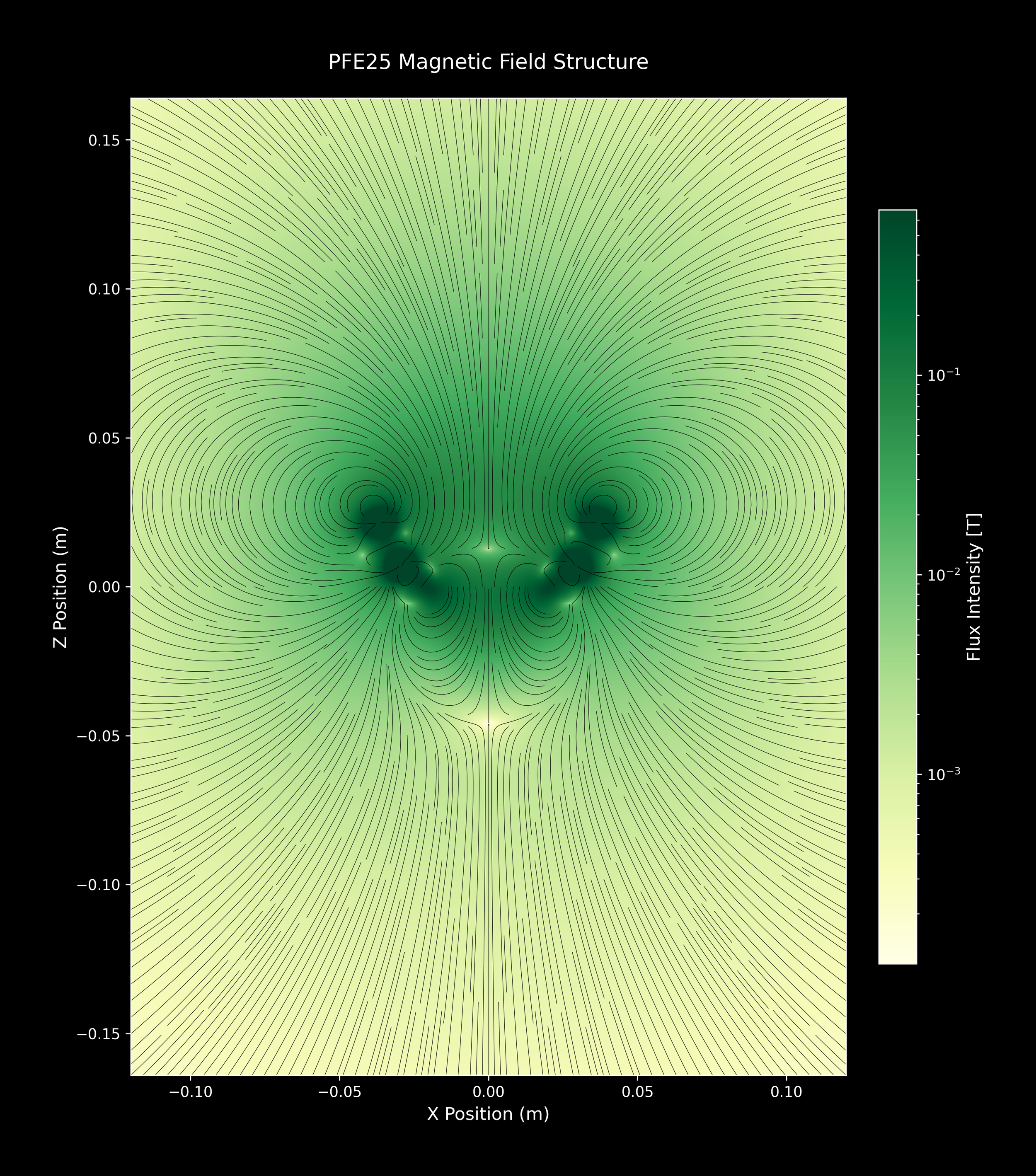
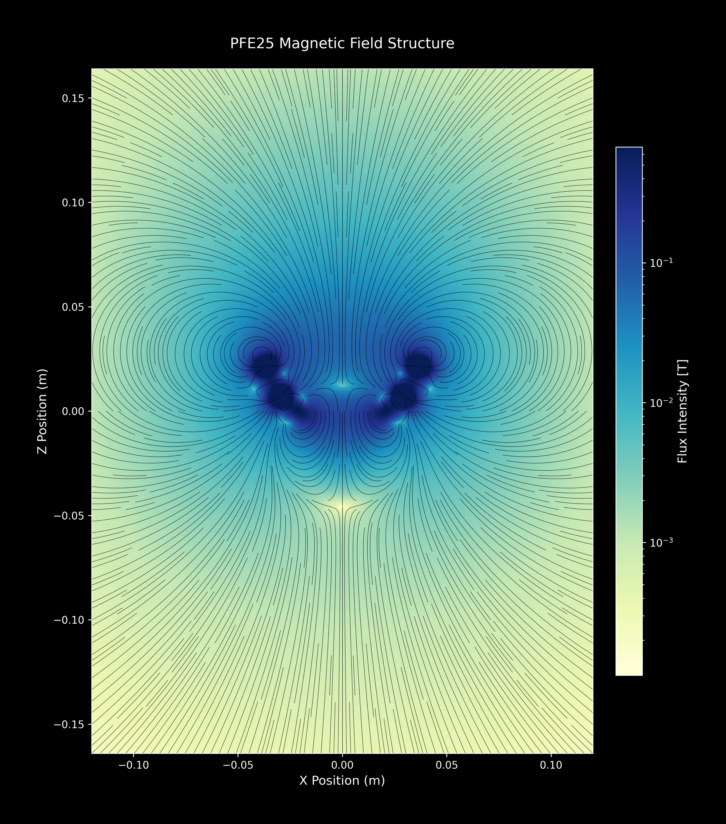
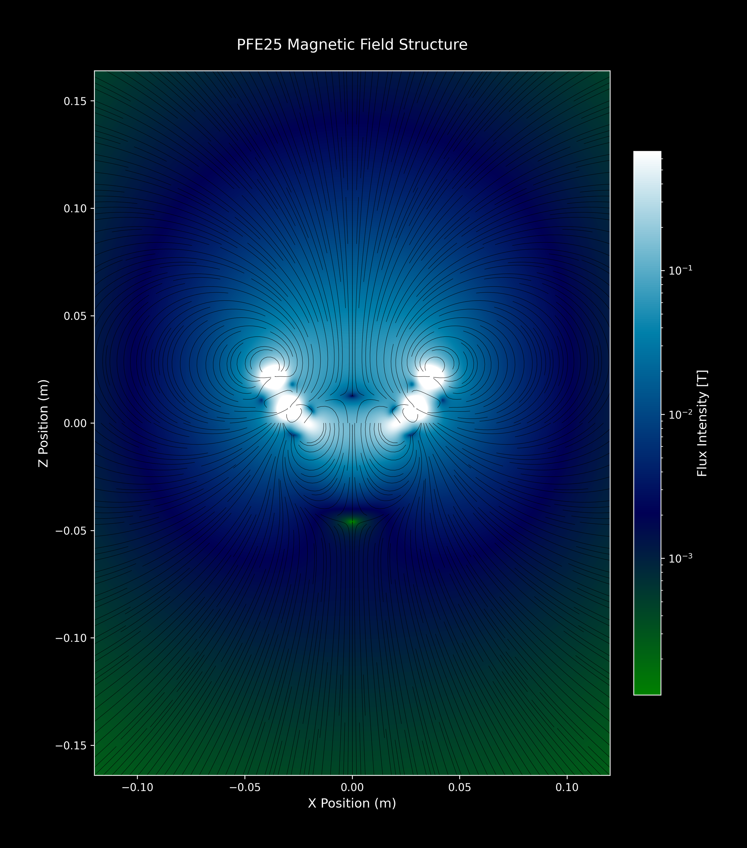
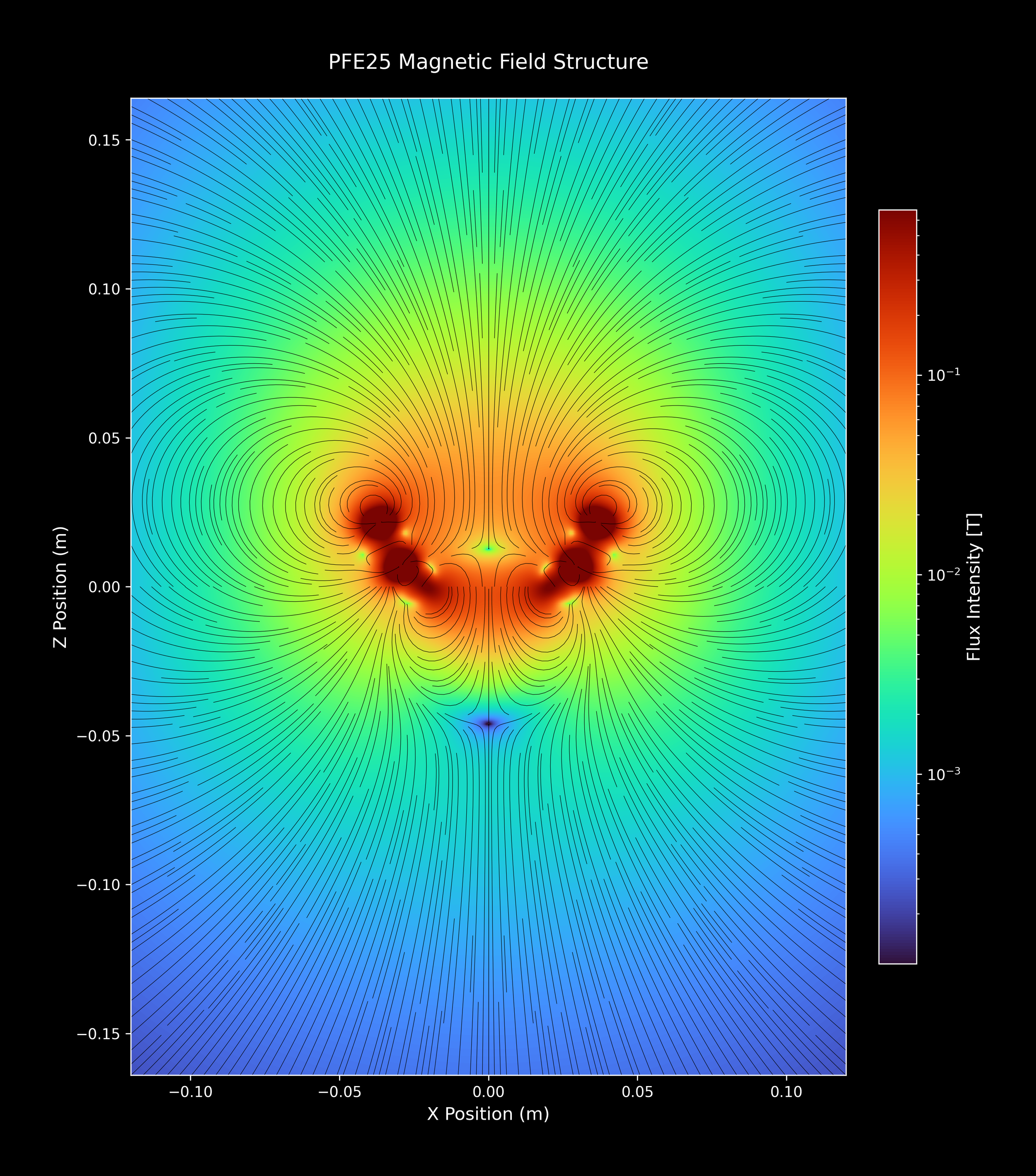
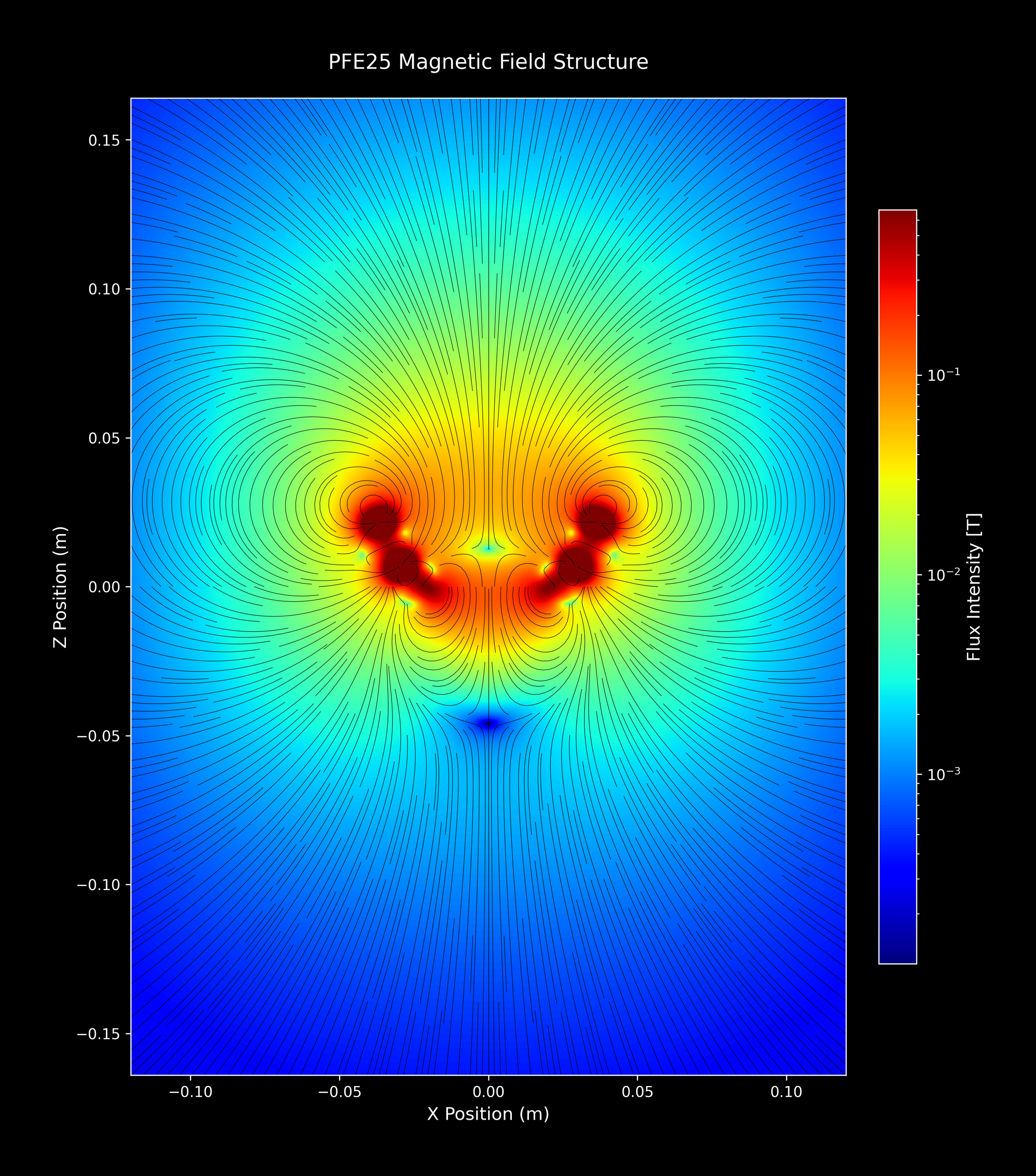
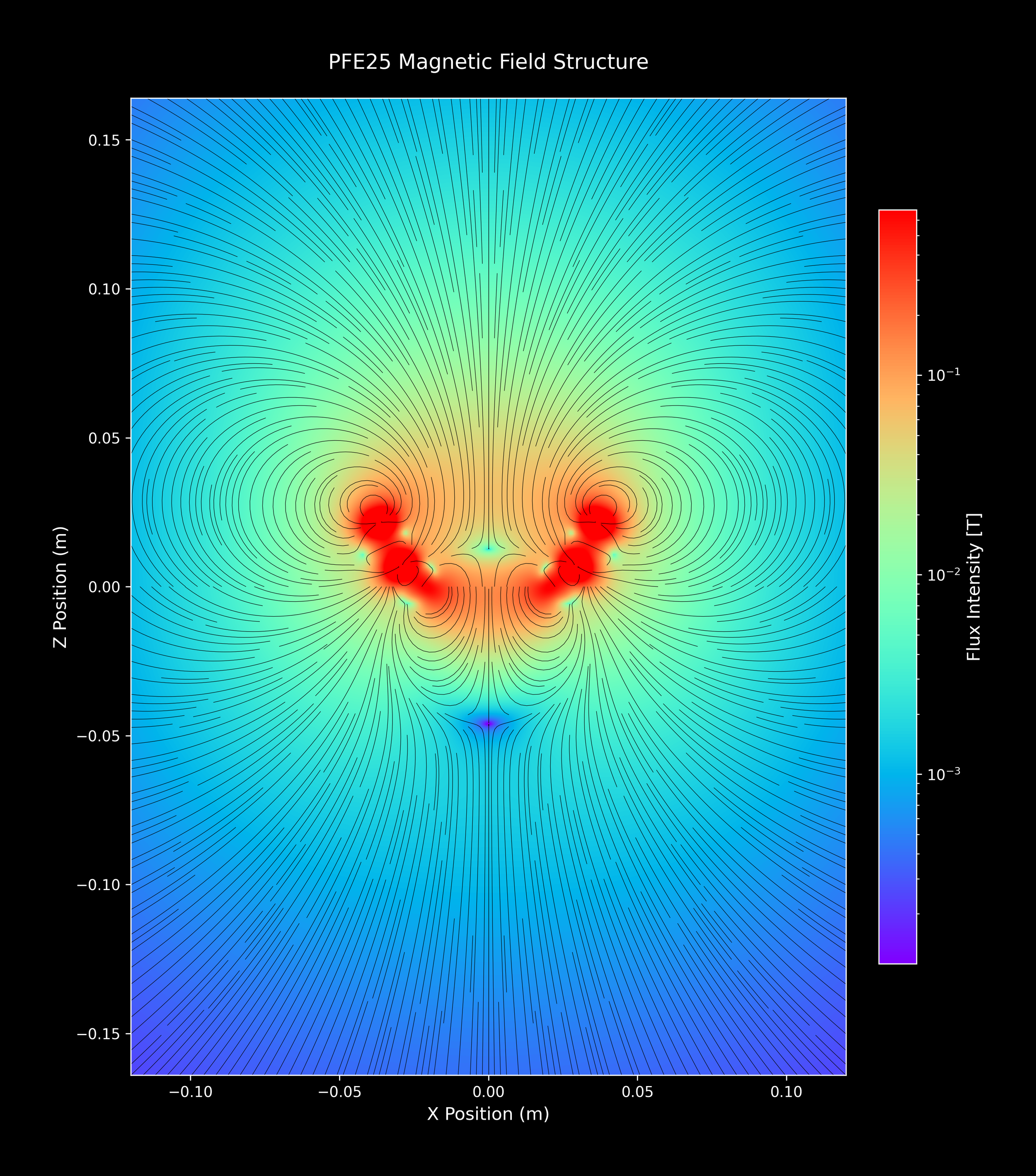
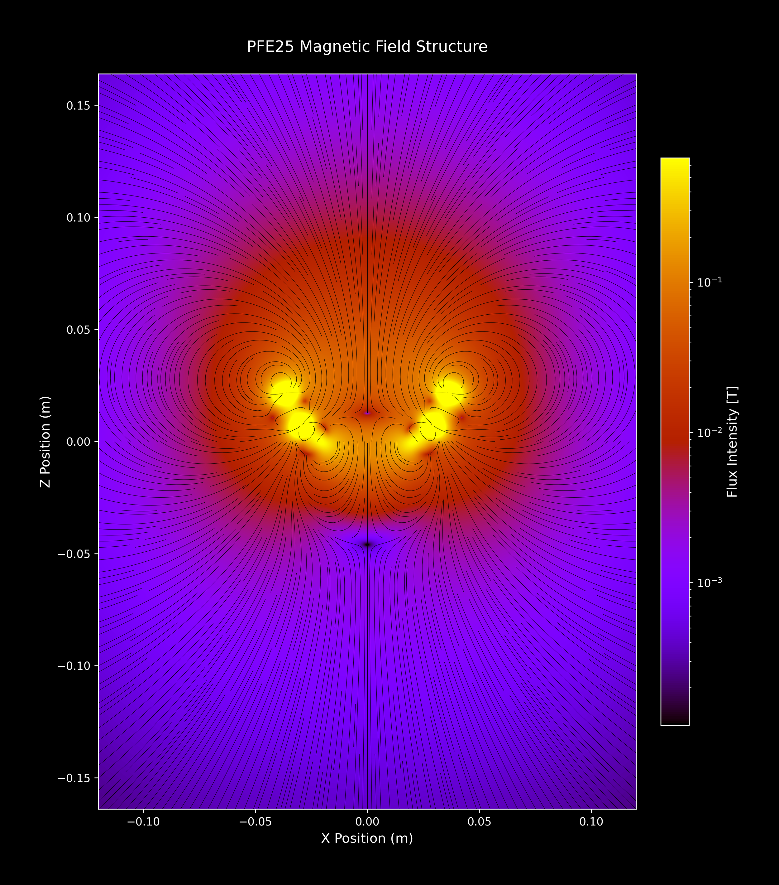
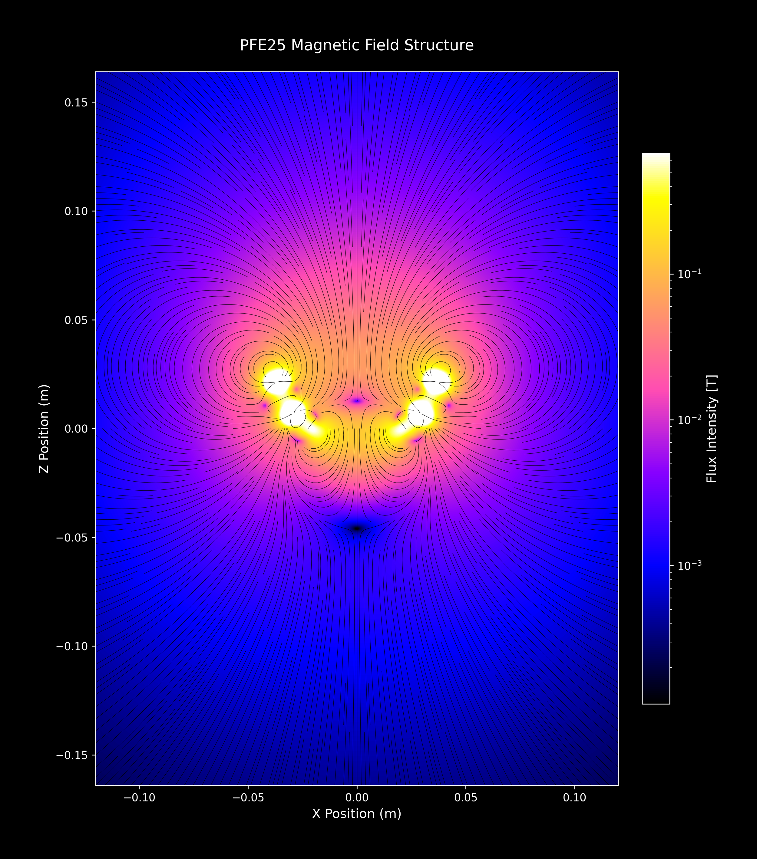
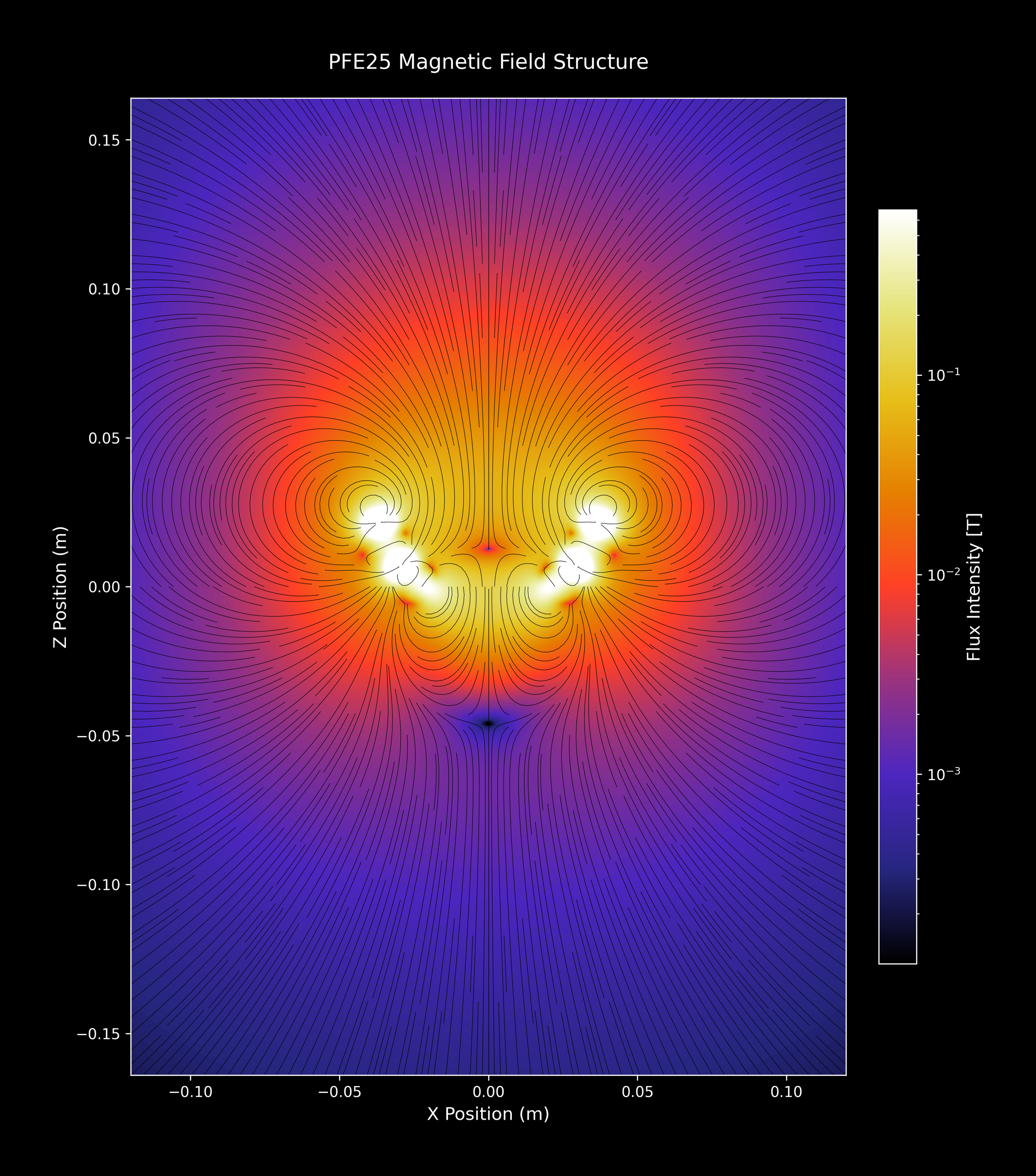
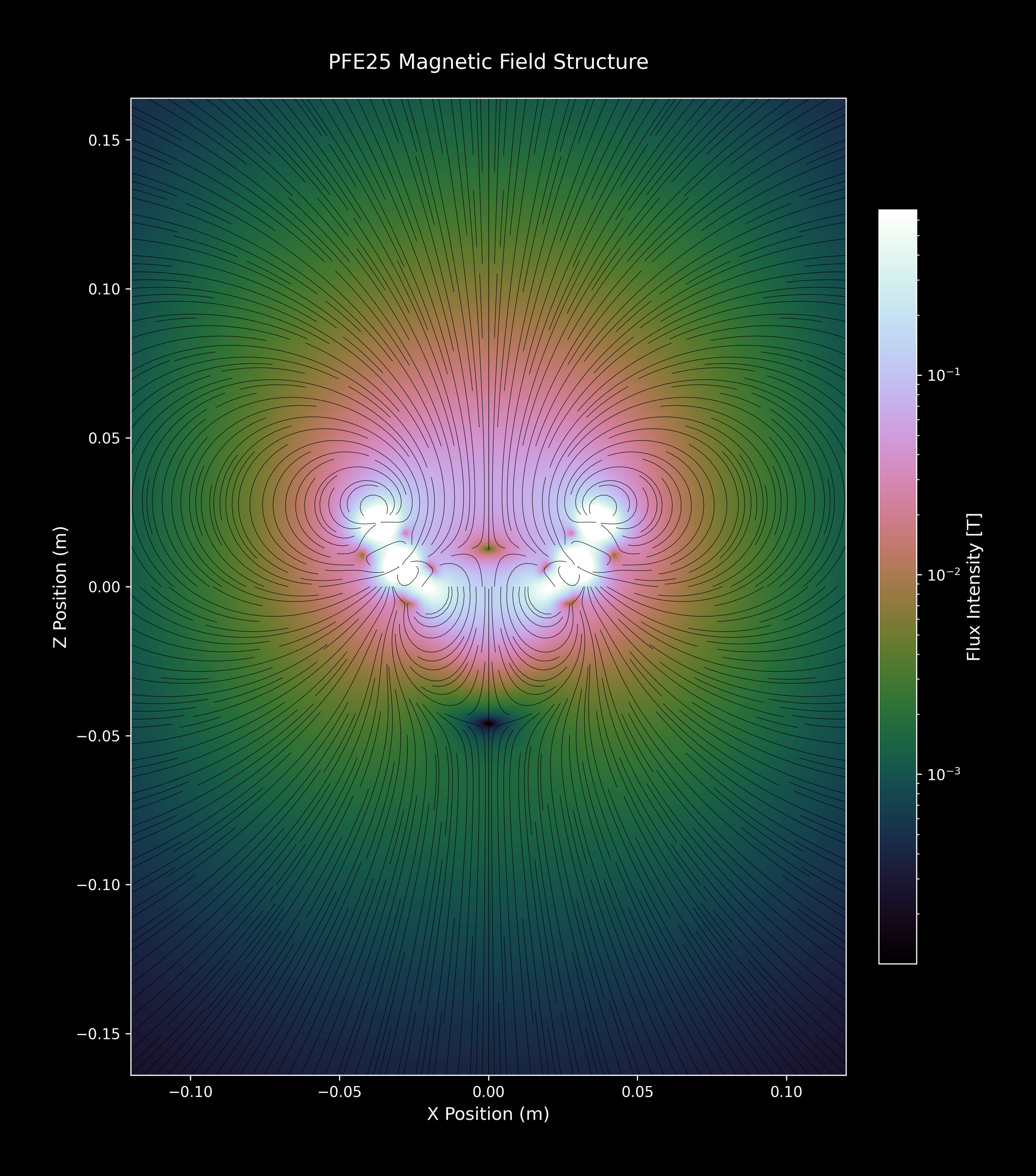
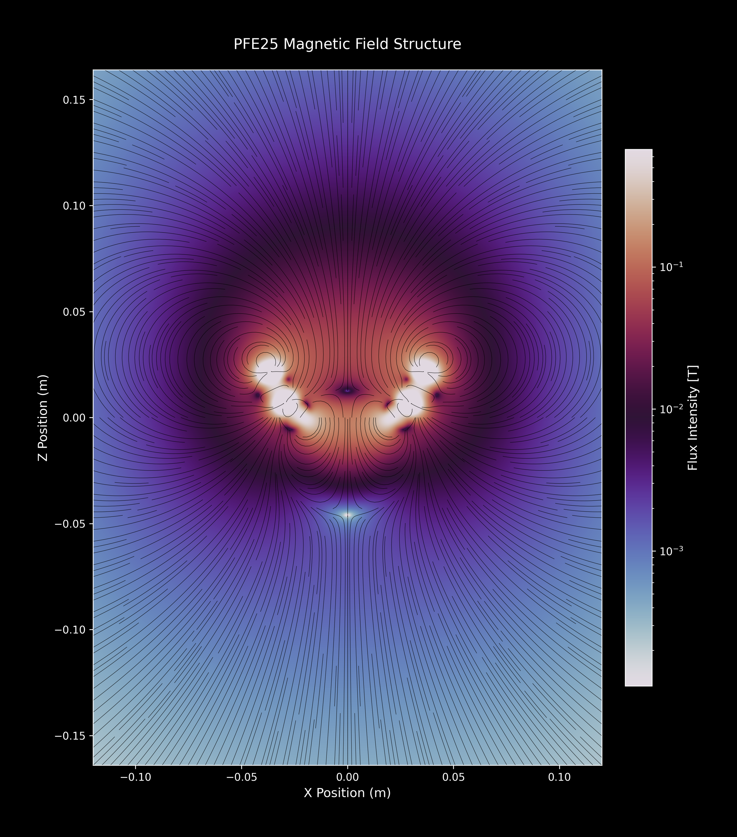
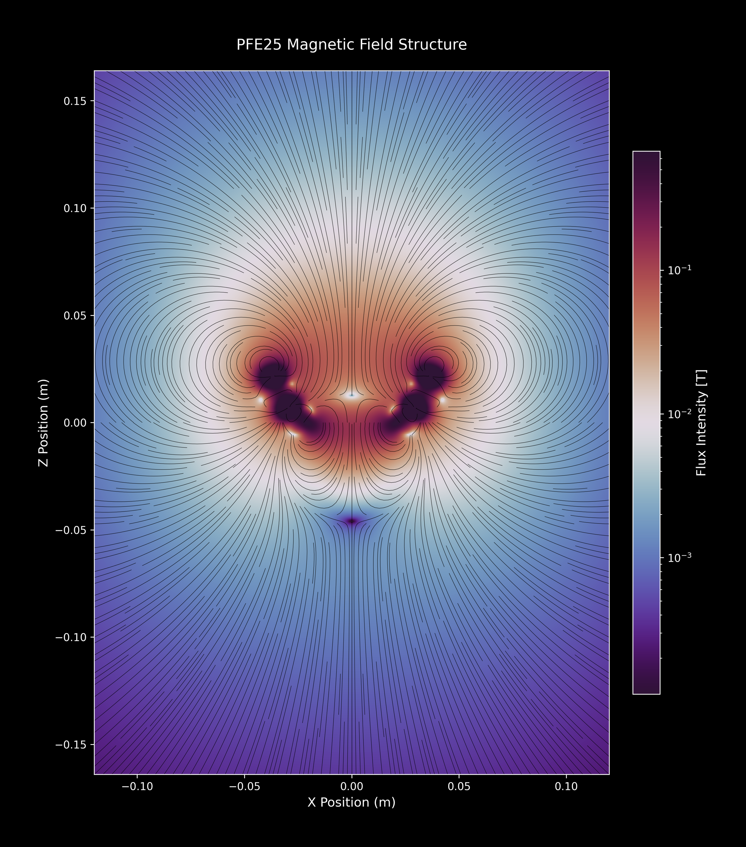
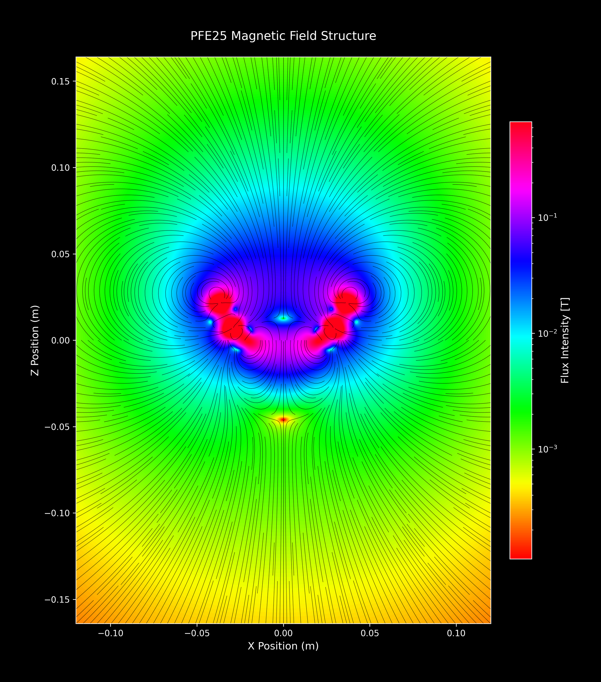
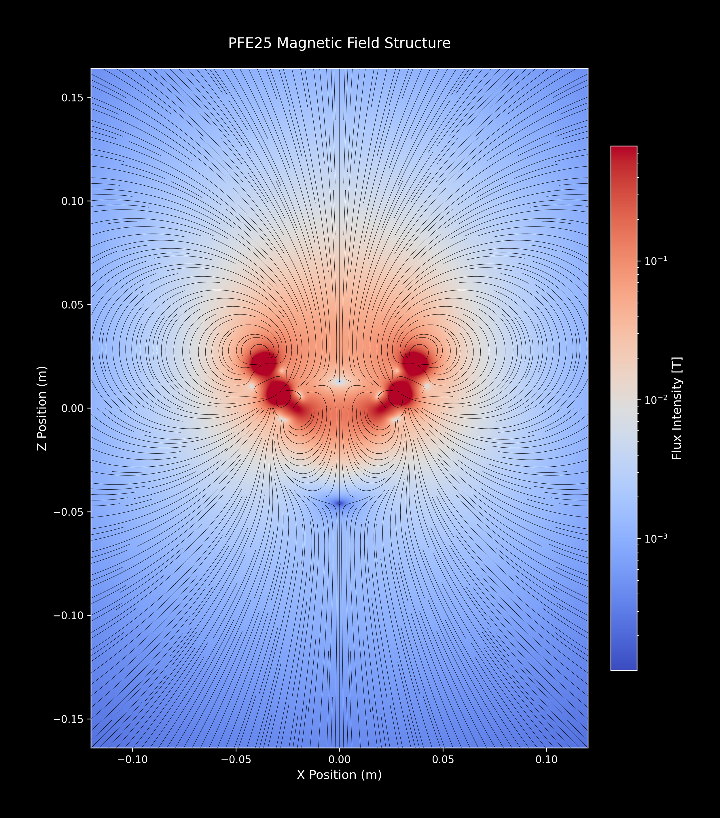
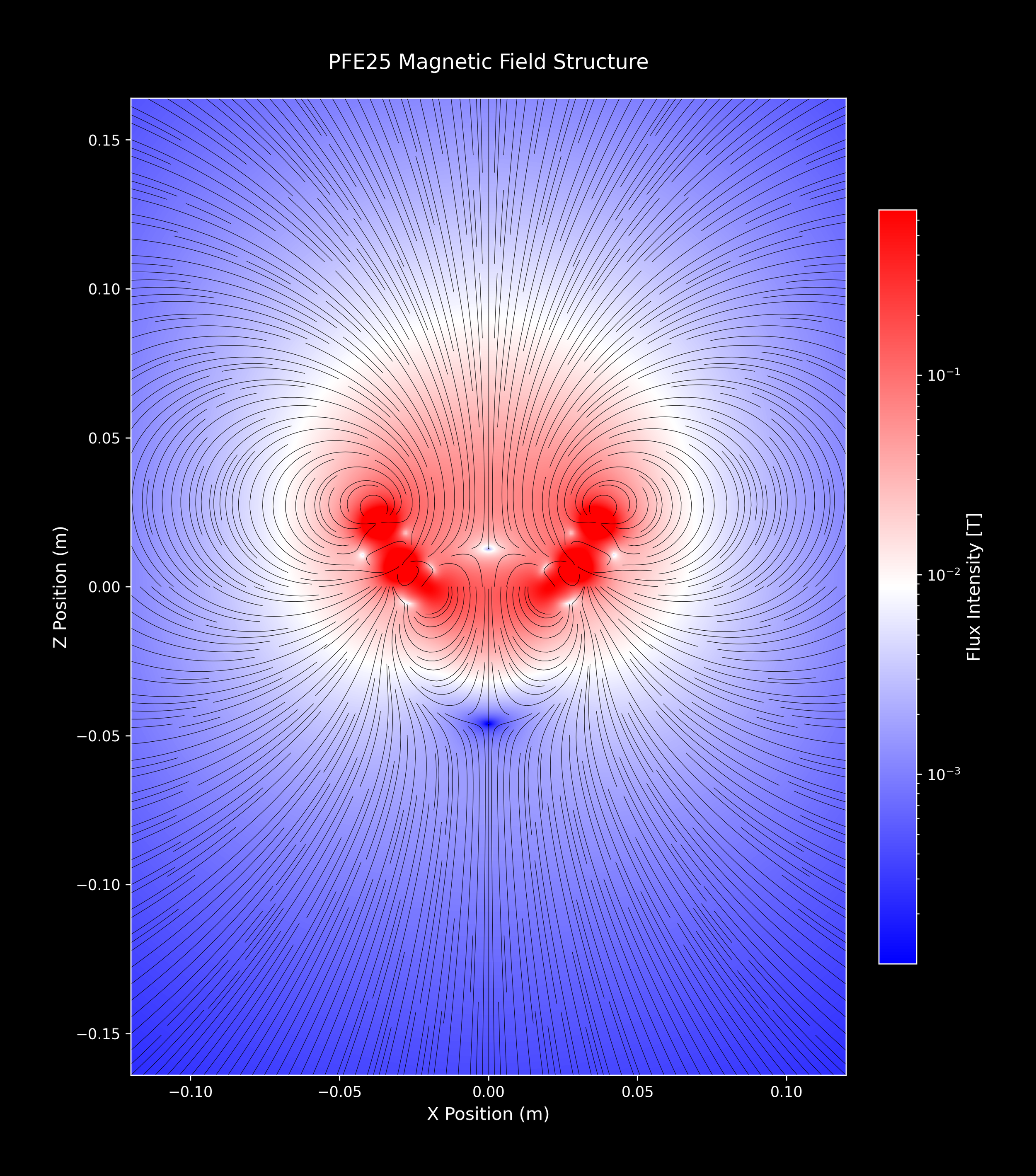
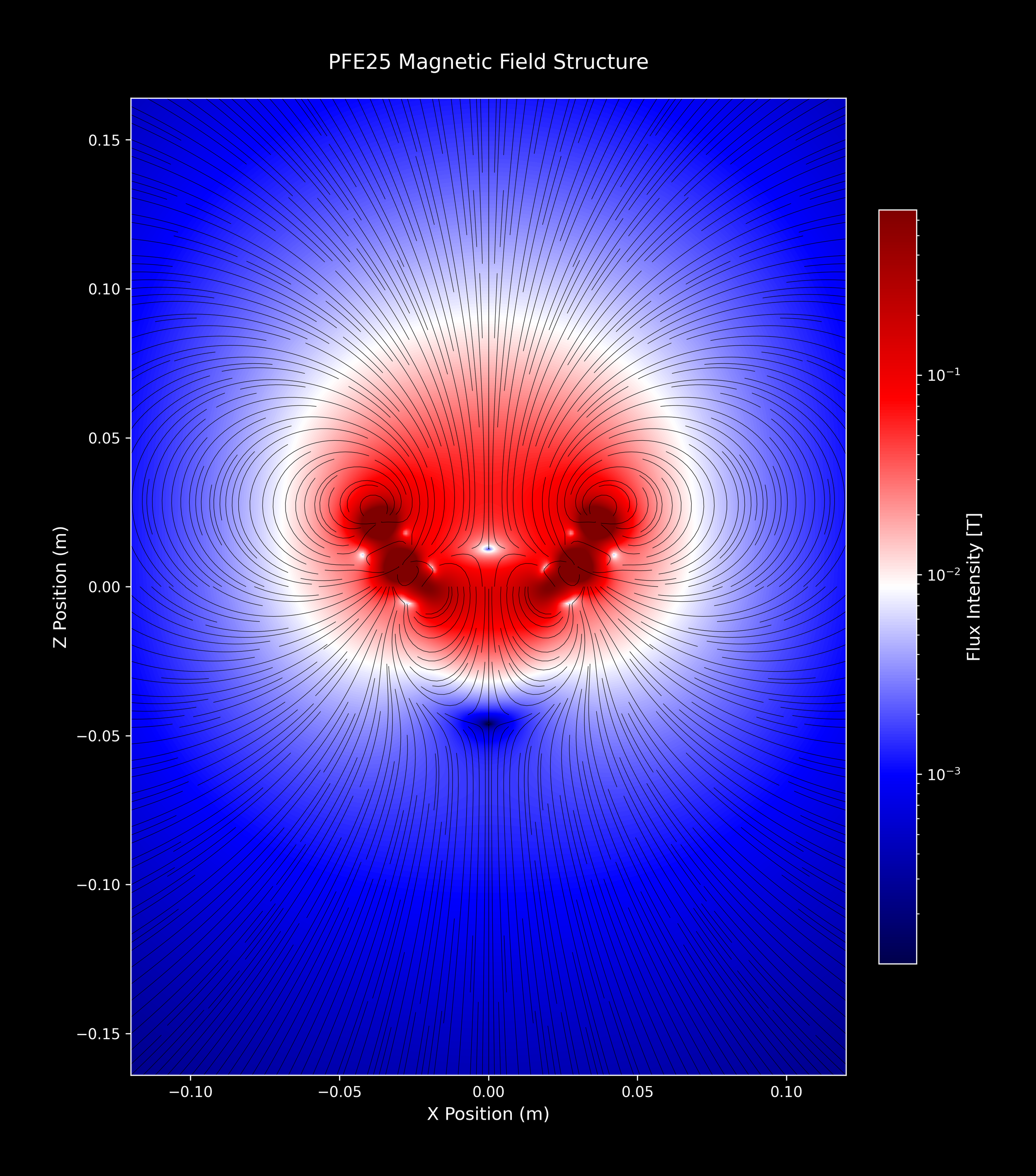
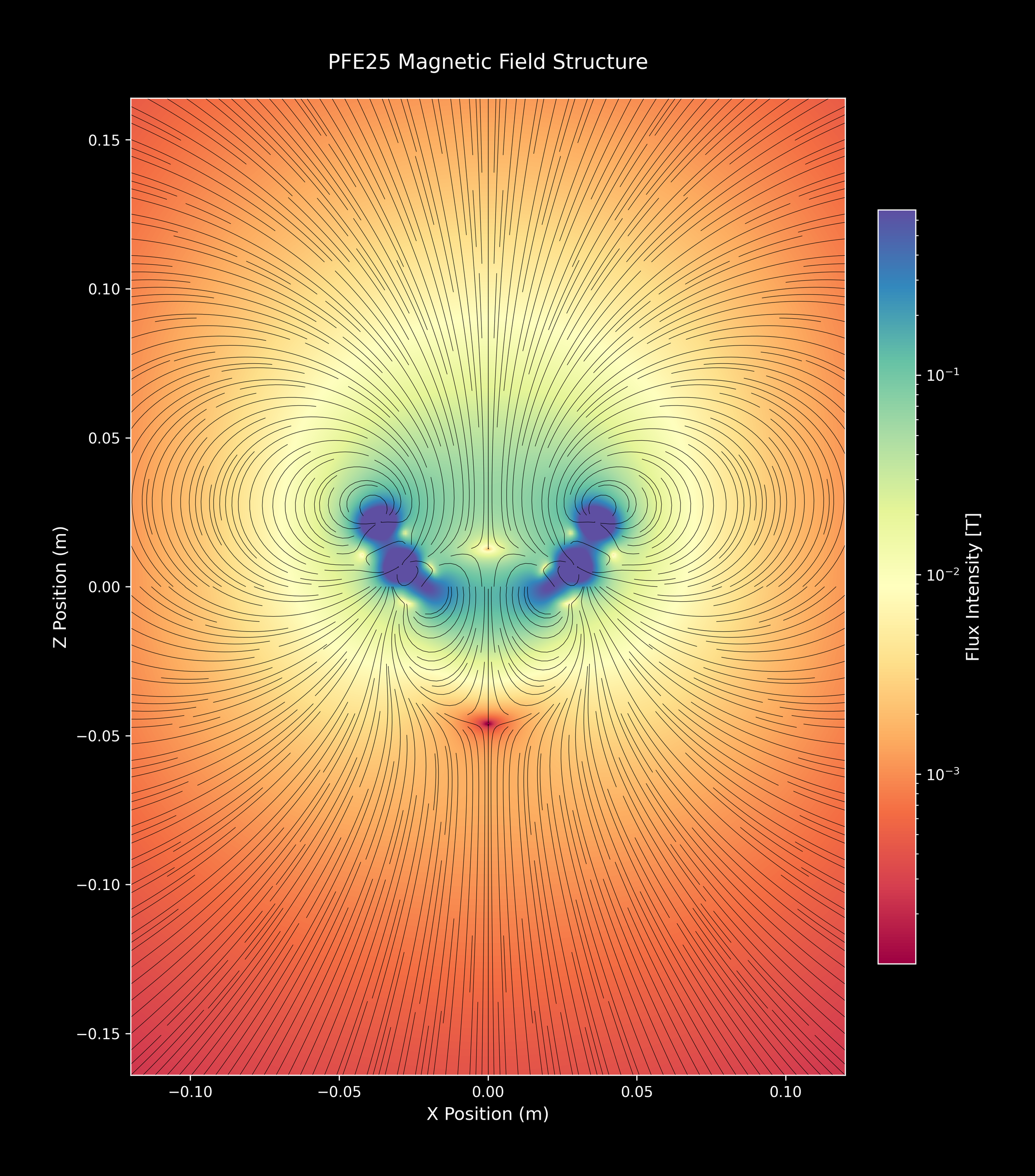
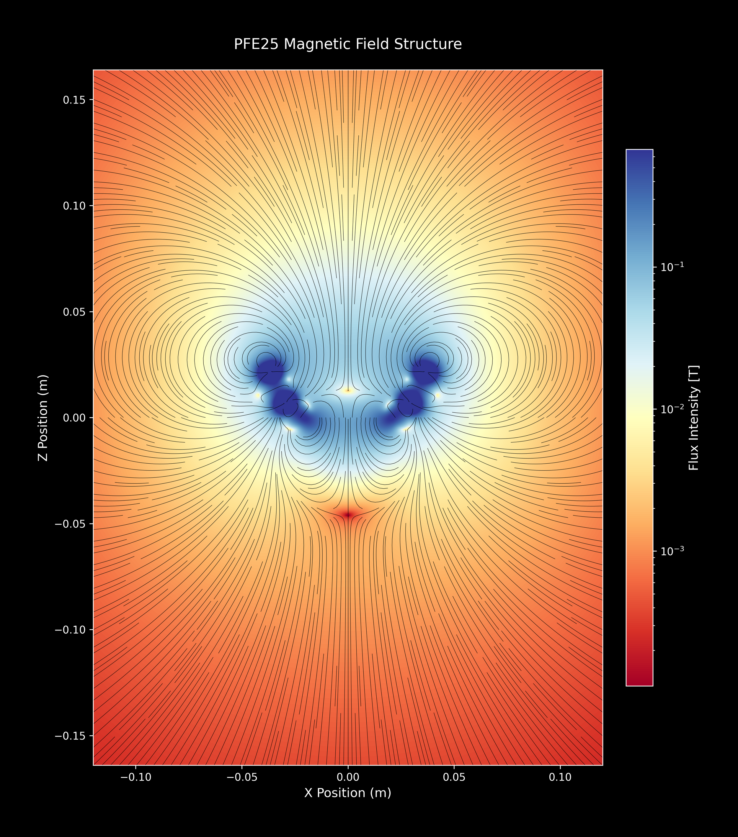
The plots below show the magnetic field of a single PFE25™ array, seen in cross section and zoomed in on the array itself. Each image is the same field data; only the color scale changes. The color scale on the right side of each plot shows how field strength maps to color, with the strongest field at the top of the scale. The same field is shown in forty different color maps because different scales bring out different features: some make the strongest region near the bowl stand out, others show the shape of the field as it spreads outward. Click any image to see it full size.
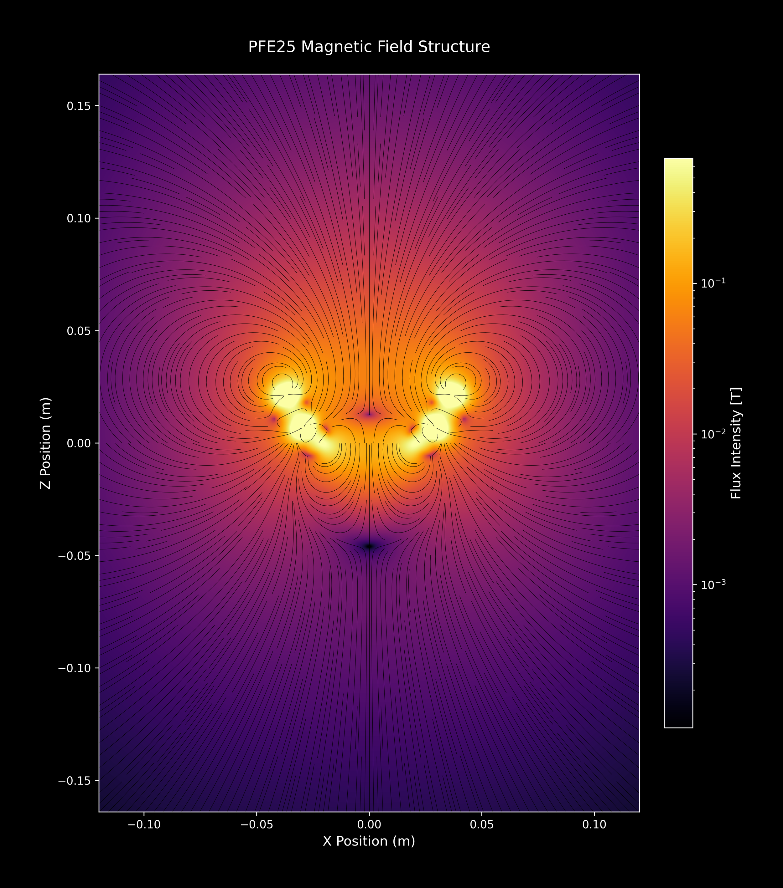
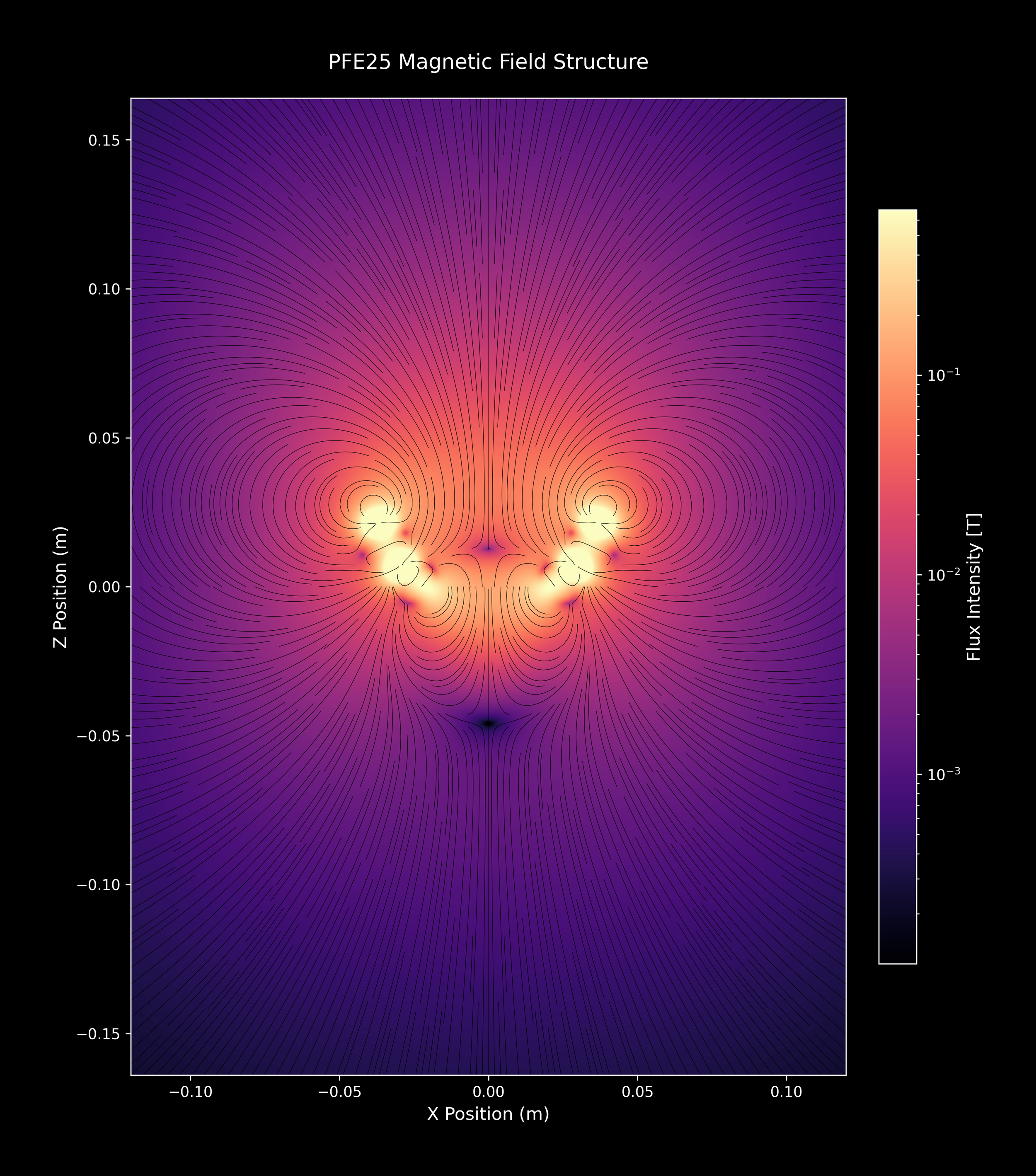
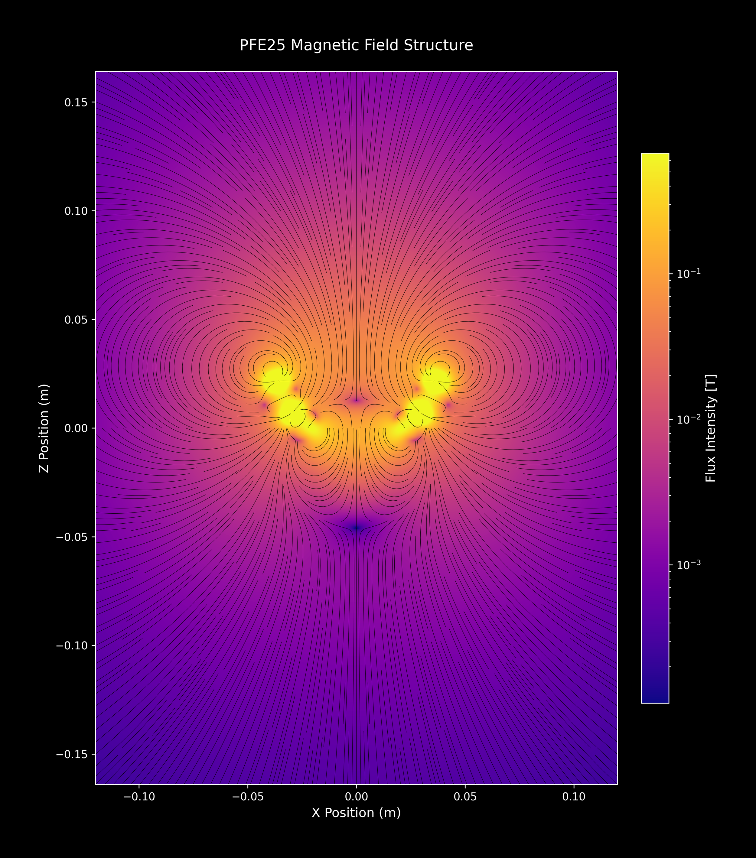
PFE25™ Wide field plots:
The plots below show the same single PFE25™ array zoomed out four times, so the array itself is small near the center and the surrounding field fills the frame. This view shows the overall shape of the field at a distance from the array rather than the detail close to the bowl. As above, every image is the same field data in a different color map, with the color scale on the right showing field strength. Click any image to see it full size.